Draw a graph showing the variation of decay rate with number of active nuclei.
To draw a graph showing the variation of decay rate with the number of active nuclei, follow these steps:
Step 1: Understand the Relationship
The decay rate (dn/dt) is proportional to the number of active nuclei (n). This relationship can be expressed mathematically as:
dndt∝n
This means that as the number of active nuclei decreases, the decay rate also decreases.
Step 2: Set Up the Axes
- X-axis: Represent the number of active nuclei (n).
- Y-axis: Represent the decay rate (dn/dt).
Step 3: Determine the Direction of the Graph
Since the decay process implies that the number of active nuclei decreases over time, the decay rate will also decrease. Therefore, the graph will start at a higher value when n is at its maximum and will slope downwards as n decreases.
Step 4: Plot the Graph
- Start by plotting a point at the maximum number of active nuclei (n) on the X-axis.
- At this point, the decay rate (dn/dt) will be at its maximum.
- As you move to the right (decreasing n), the value of dn/dt will decrease, resulting in a downward slope.
Step 5: Label the Graph
- Label the X-axis as "Number of Active Nuclei (n)".
- Label the Y-axis as "Decay Rate (dn/dt)".
- Indicate that the graph is a downward sloping curve, showing that as n decreases, dn/dt also decreases.
Final Graph Representation
The graph will look like a straight line sloping downwards from left to right, indicating that the decay rate decreases as the number of active nuclei decreases.
The decay rate (dn/dt) is proportional to the number of active nuclei (n). This relationship can be expressed mathematically as:
dndt∝n
This means that as the number of active nuclei decreases, the decay rate also decreases.
- X-axis: Represent the number of active nuclei (n).
- Y-axis: Represent the decay rate (dn/dt).
Since the decay process implies that the number of active nuclei decreases over time, the decay rate will also decrease. Therefore, the graph will start at a higher value when n is at its maximum and will slope downwards as n decreases.
- Start by plotting a point at the maximum number of active nuclei (n) on the X-axis.
- At this point, the decay rate (dn/dt) will be at its maximum.
- As you move to the right (decreasing n), the value of dn/dt will decrease, resulting in a downward slope.
- Label the X-axis as "Number of Active Nuclei (n)".
- Label the Y-axis as "Decay Rate (dn/dt)".
- Indicate that the graph is a downward sloping curve, showing that as n decreases, dn/dt also decreases.
The graph will look like a straight line sloping downwards from left to right, indicating that the decay rate decreases as the number of active nuclei decreases.
Topper's Solved these Questions
Similar Questions
Draw graph showing the variation of displacement with time of a body executing (i) free oscillation (ii) damped oscillations.
View SolutionDraw a graph to show the variation in density of water with temperature in the temperature range from 0∘C to 10∘C.
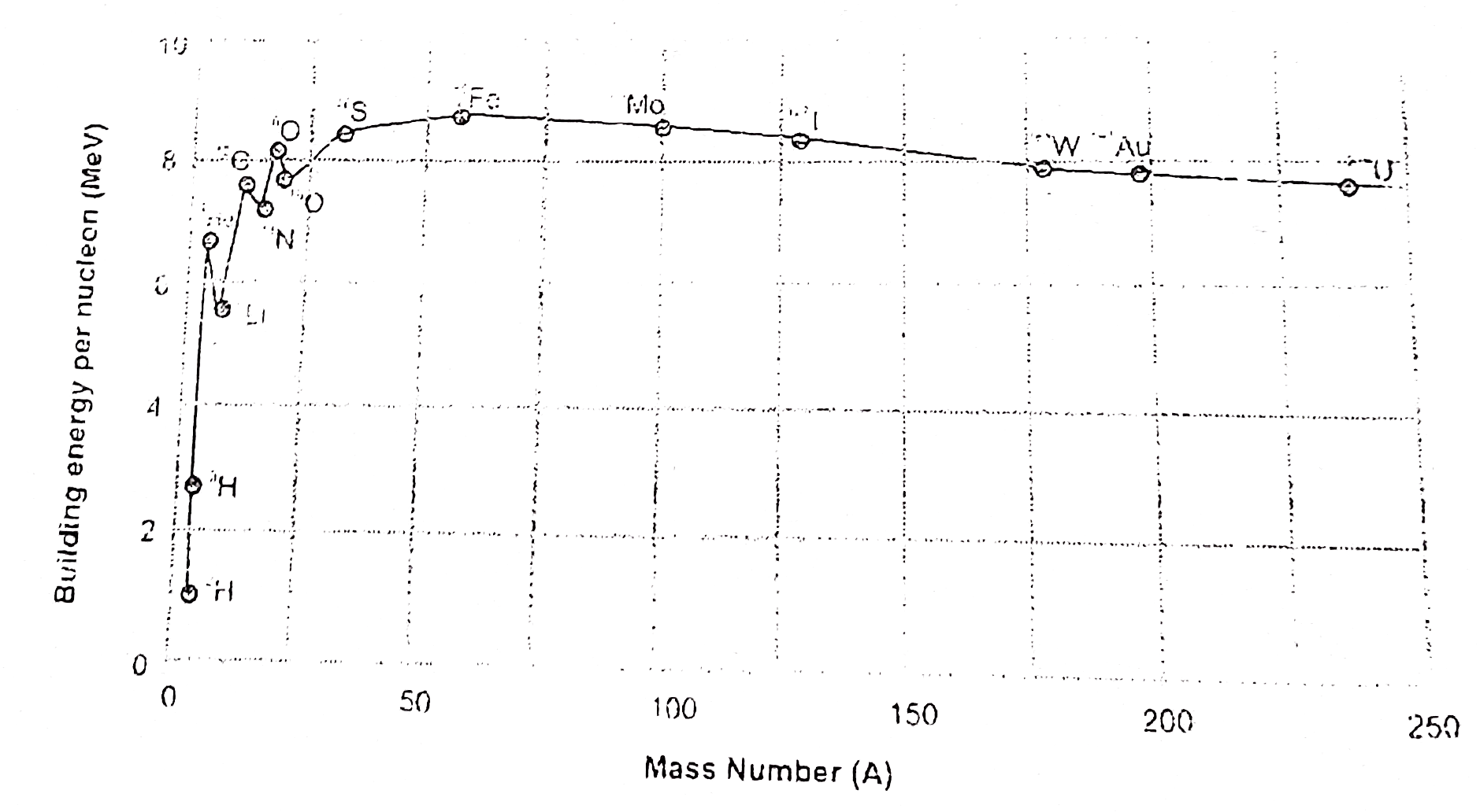
View SolutionDraw the graph showing thervariation of binding energy per nucleon with mass number. Give therason for the decrease of binding energy per nucleon for nuclei with high mass numbers.

The binding energy per nucleon for nuclei with high mass number is low due to the large coulomb repulsion between the protons inside these nuclei.View SolutionHow does the angle of deviation formed by a prism change with the increase in the angle of incidence ?
Draw a graph showing the variation in the angle of deviation with the angle of incidence at a prism surface.View SolutionDraw a graph showing variation of resistivity with temperature for nichrome. Which property of nichrome is used to make standard resistance coils?
View SolutionThe figure shows the graphical variation of the reactance of a capacitor with frequency of ac source. (a) find the capacitance of the capacitor (b)an ideal inductor has the same reactance at 100 Hz frequency as the capacitor has the same frequency find the value of the inductor. (c) draw the graph showing the variation of the reactance of this inductor with frequency
 View Solution
Draw the graph showing thervariation of binding energy per nucleon with mass number. Give therason for the decrease of binding energy per nucleon for nuclei with high mass numbers.

The binding energy per nucleon for nuclei with high mass number is low due to the large coulomb repulsion between the protons inside these nuclei.View SolutionHow does the time period (T) of a simple pendulum depend on its length (l)? Draw a graph showing the variation of T2 with l. How will you use this graph to determine the value of g (acceleration due to gravity) ?
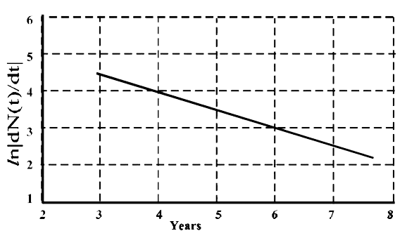
View SolutionTo determine the half life of a radioactive element , a student plote a graph of in ∣∣∣dN(t)dt∣∣∣versust,Here∣∣∣dN(t)dt∣∣∣ is the rate of radioatuion decay at time t , if the number of radoactive nuclei of this element decreases by a factor of p after 4.16 year the value of p is
 View Solution
To determine the half life of a radioactive element , a student plot a graph of in ∣∣∣dN(t)dt∣∣∣ versus t , Here ∣∣∣dN(t)dt∣∣∣ is the rate of radiation decay at time t , if the number of radioactive nuclei of this element decreases by a factor of p after 4.16year the value of p is
 View Solution
