The given graph shows the number of fishes that died in a certain lake as a result of industrial pollution, between the years 2001-2006. The number of fishes that died as a result of industrial pollution over the years has
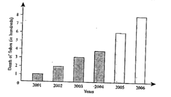
increased continuously
decreased continuously
first increased and then decreased
first decreased and then increased
The correct Answer is:A
Step by step video & image solution for The given graph shows the number of fishes that died in a certain lake as a result of industrial pollution, between the years 2001-2006. The number of fishes that died as a result of industrial pollution over the years has by Biology experts to help you in doubts & scoring excellent marks in Class 8 exams.
Updated on:21/07/2023Topper's Solved these Questions
- POLLUTION OF AIR AND WATERBOOK - BETOPPERSCHAPTER - POLLUTION OF AIR AND WATEREXERCISE - WORKSHEET 2
11 Videos
- MICROORGANISMS : FRIENDS AND FOEBOOK - BETOPPERSCHAPTER - MICROORGANISMS : FRIENDS AND FOEEXERCISE - COMPETITIVE WORKSHEET
15 Videos
- REACHINGN THE AGE OF ADOLESECENCEBOOK - BETOPPERSCHAPTER - REACHINGN THE AGE OF ADOLESECENCEEXERCISE - COMPETITIVE WORKSHEET
16 Videos
Similar Questions
The line graph shows the number of vacancies for sales officers in a certain company. Study the diagram and answer the following questions.
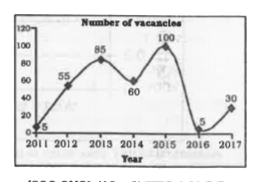
In which year was the number of vacancies less than that of the previous year?
View SolutionThe line graph shows the number of deaths due to road accidents in a certain state. Study the diagram and answer the following questions.
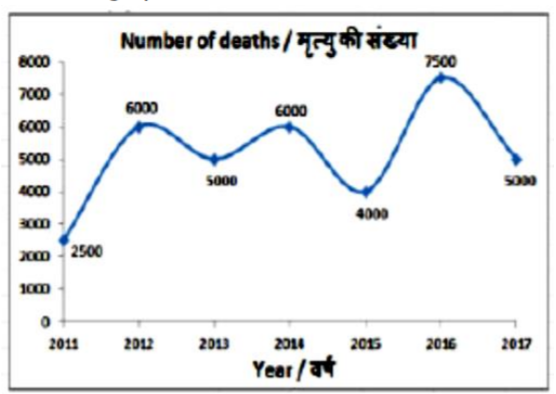
In which year were the number of deaths lesser than that of the previous year?
View Solution
Knowledge Check
The line graph shows the number of deaths due to rail accidents in a certain state. Study the diagram and answer the following questions.
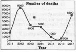
In which year was the number of deaths greater than that of the previous year?A2013B2012C2014D2015The line graph shows the number of deaths due to rail accidents in a certain state. Study the diagram and answer the following questions.
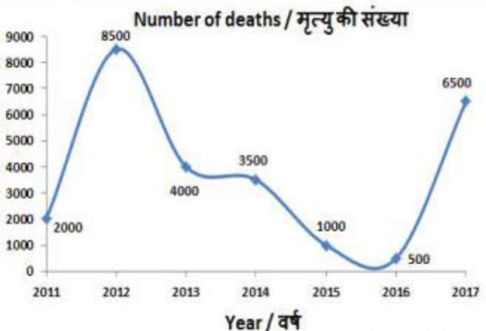
In which year were the number of details greater than that of the previous year?Aa. 2013Bb. 2012Cc. 2014Dd. 2015The line graphs shows the number of vacancies for executives in a certain compnay. Study the diagram and answer the following questions.
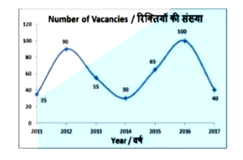
In which year were the number of vacancies lesser than that of the previous year?A2015B2014C2016D2012
The line graph shows the number of vacancies for sales officers in a certain company. Study the diagram and answer the following questions.

In which year was the number of vacancies less than that of the previous year?
View SolutionThe line graph shows the number of vacancies for sales officers in a certain company. Study the diagram and answer the following questions.

In which year was the number of vacancies less than that of the previous year?
View SolutionThe line graphs shows the number of vacancies for executives in a certain compnay. Study the diagram and answer the following questions.

In which year were the number of vacancies lesser than that of the previous year?
View SolutionThe line graph shows the number of vacancies for management trinees in a certain company. Study the diagram and the answer the following questions.
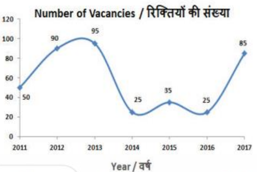
In which year were number of vacancies lesser than that of the previous year?
View SolutionThe line graph shows the number of deaths due to rail accidents in a certain state. Study the diagram and answer the following questions.
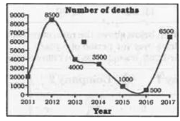
What was the difference between the number of deaths between the years 2012 and 2015?
View Solution
