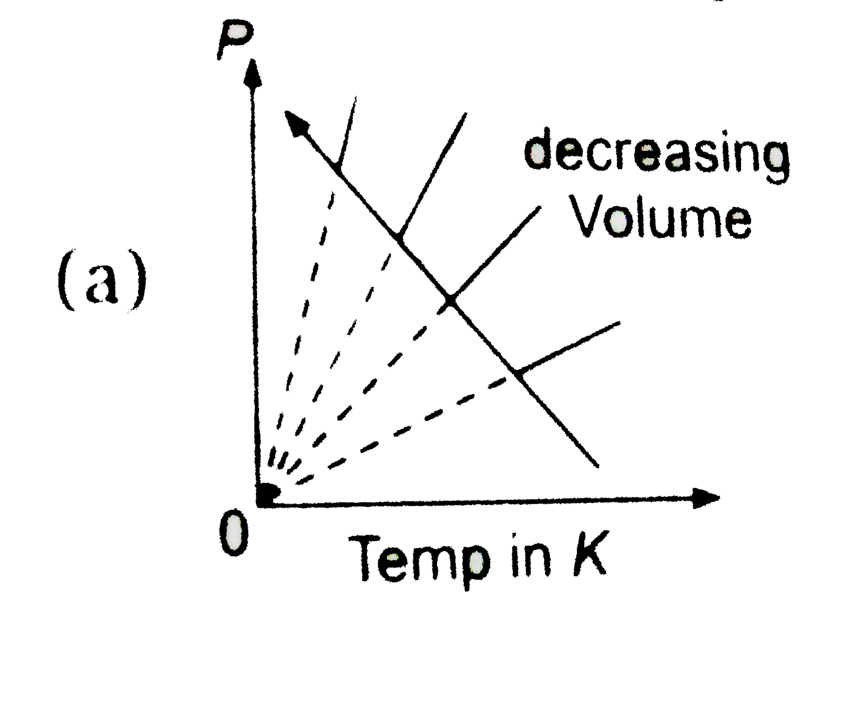
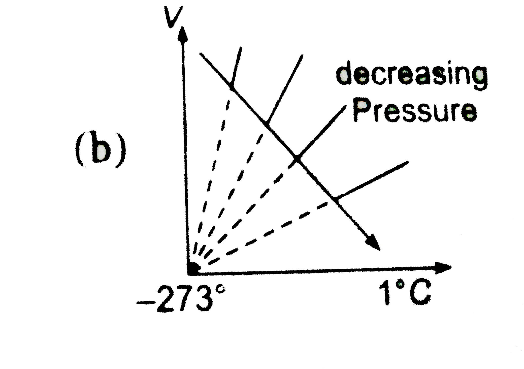
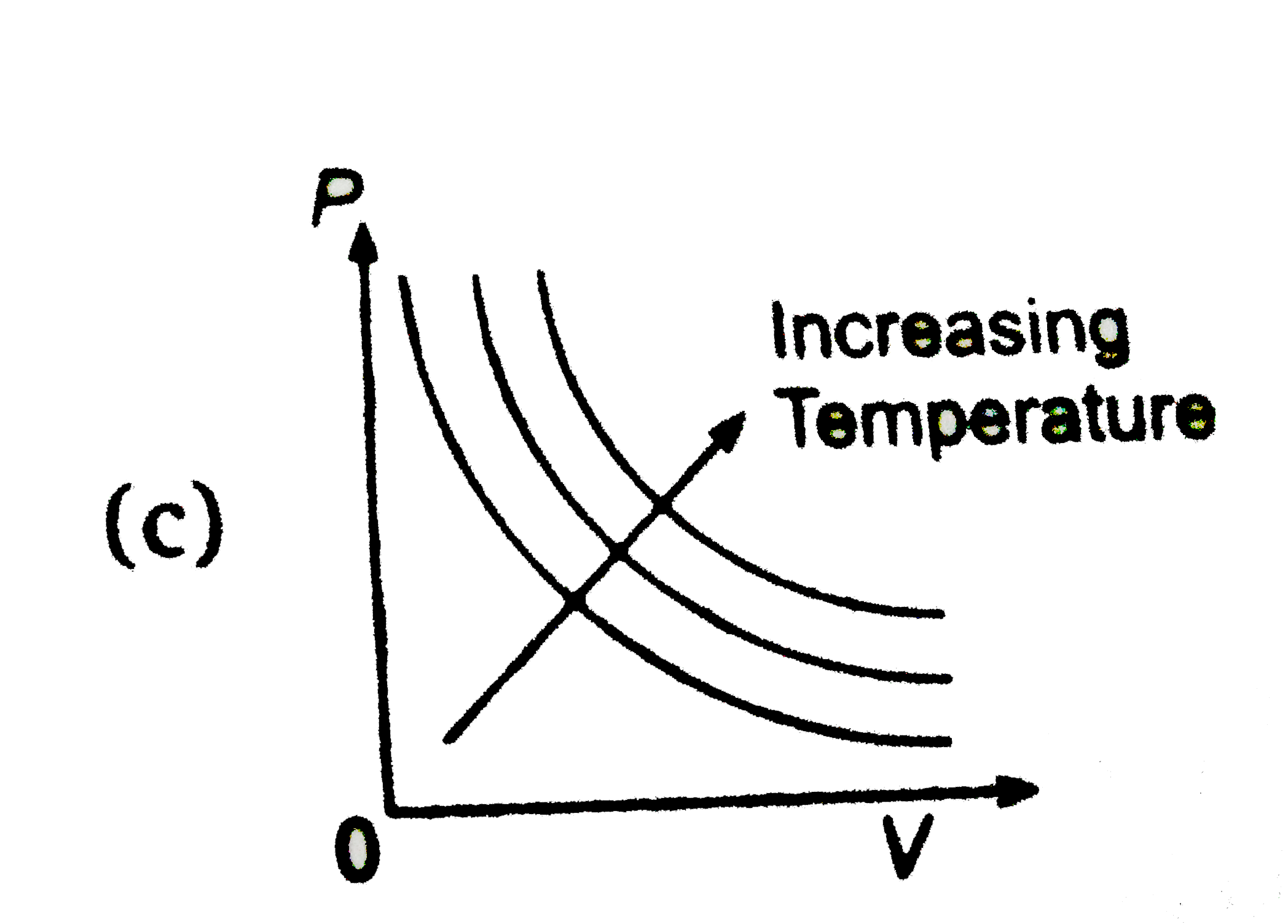
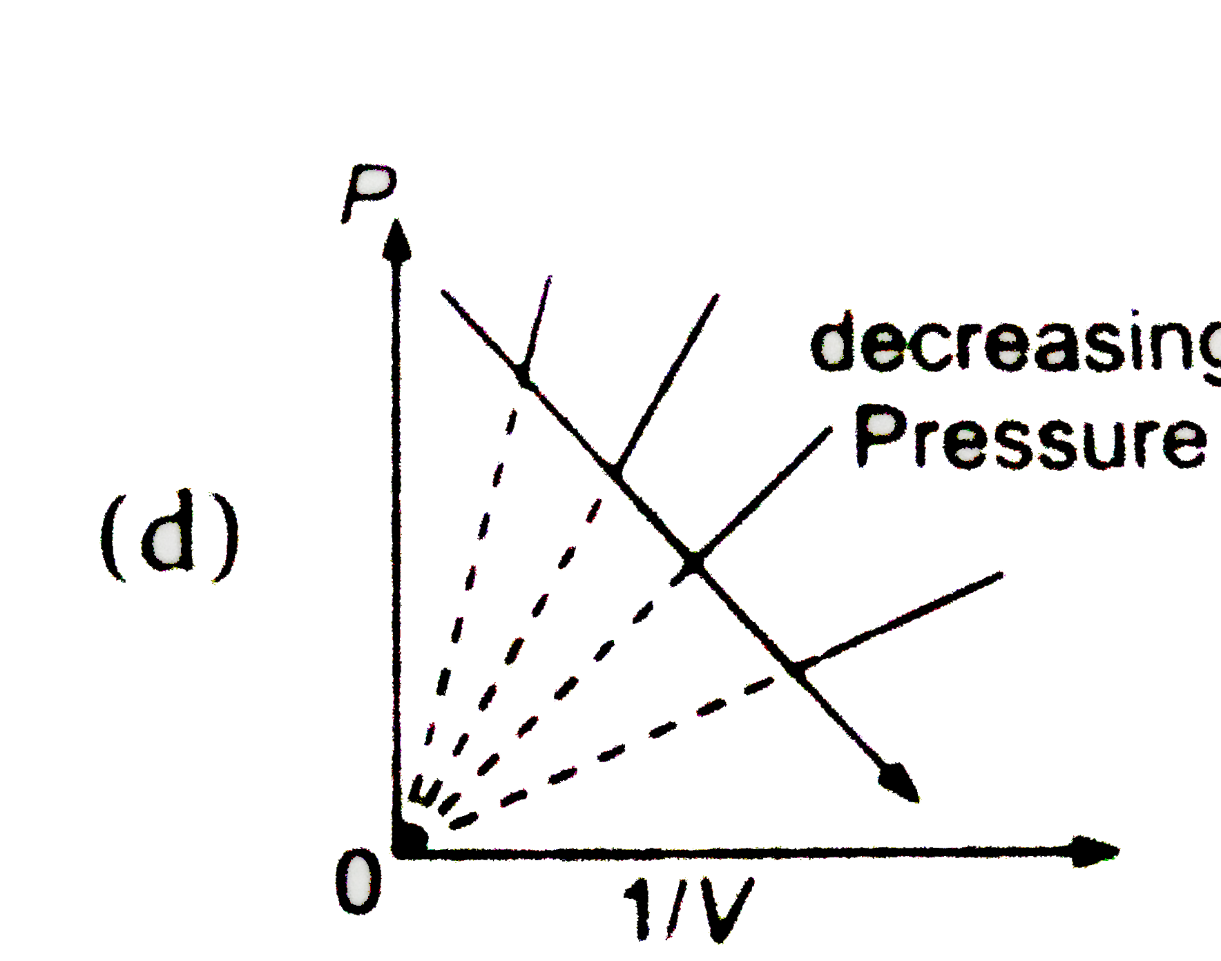
Which one of these graphs for an ideal gas havinga fixed amount, the arrow indication, is incorrectly marked ?


The correct Answer is:b
To determine which graph for an ideal gas with a fixed amount is incorrectly marked, we will analyze the relationships between pressure (P), volume (V), and temperature (T) based on the ideal gas law, PV = nRT.
1. Understand the Ideal Gas Law: The ideal gas law states that PV = nRT, where P is pressure, V is volume, n is the number of moles, R is the ideal gas constant, and T is temperature in Kelvin.
2. Graph Analysis: We need to analyze the relationships depicted in the graphs:
- Graph 1: Pressure vs. Temperature (P-T graph)
- Graph 2: Volume vs. Temperature (V-T graph)
- Graph 3: Pressure vs. Volume (P-V graph)
3. Graph 1 (P-T graph):
- For a fixed amount of gas, if the volume is held constant, increasing the temperature will increase the pressure. This graph should show a positive slope.
- If the graph shows a decreasing slope or negative correlation, it is incorrectly marked.
4. Graph 2 (V-T graph):
- This graph represents the relationship between volume and temperature. If we consider the equation in terms of V and T, we can derive that volume increases with temperature at constant pressure.
- If the graph shows that volume decreases with increasing temperature, it is incorrectly marked.
5. Graph 3 (P-V graph):
- According to Boyle's Law, for a fixed amount of gas at a constant temperature, pressure and volume are inversely related. If volume increases, pressure decreases, and vice versa. This graph should show a negative slope.
- If the graph incorrectly shows a positive slope, it is incorrectly marked.
6. Determine Incorrectly Marked Graph:
- After analyzing the graphs, if any graph shows a relationship that contradicts the established gas laws, that graph is incorrectly marked.
- Based on the analysis provided in the transcript, it was concluded that the volume-temperature graph (Graph 2) is incorrectly marked because it suggests that as volume decreases, temperature increases, which contradicts the ideal gas behavior.
Conclusion:
The incorrectly marked graph is the one that shows the relationship between volume and temperature, indicating that volume decreases with increasing temperature.
- Graph 1: Pressure vs. Temperature (P-T graph)
- Graph 2: Volume vs. Temperature (V-T graph)
- Graph 3: Pressure vs. Volume (P-V graph)
- For a fixed amount of gas, if the volume is held constant, increasing the temperature will increase the pressure. This graph should show a positive slope.
- If the graph shows a decreasing slope or negative correlation, it is incorrectly marked.
- This graph represents the relationship between volume and temperature. If we consider the equation in terms of V and T, we can derive that volume increases with temperature at constant pressure.
- If the graph shows that volume decreases with increasing temperature, it is incorrectly marked.
- According to Boyle's Law, for a fixed amount of gas at a constant temperature, pressure and volume are inversely related. If volume increases, pressure decreases, and vice versa. This graph should show a negative slope.
- If the graph incorrectly shows a positive slope, it is incorrectly marked.
- After analyzing the graphs, if any graph shows a relationship that contradicts the established gas laws, that graph is incorrectly marked.
- Based on the analysis provided in the transcript, it was concluded that the volume-temperature graph (Graph 2) is incorrectly marked because it suggests that as volume decreases, temperature increases, which contradicts the ideal gas behavior.
The incorrectly marked graph is the one that shows the relationship between volume and temperature, indicating that volume decreases with increasing temperature.
Topper's Solved these Questions
- BOOK - NARENDRA AWASTHI ENGLISHCHAPTER - GASEOUS STATEEXERCISE - Level 230videos
GASEOUS STATE
- BOOK - NARENDRA AWASTHI ENGLISHCHAPTER - GASEOUS STATEEXERCISE - Level 3 Passage 14videos
GASEOUS STATE
- BOOK - NARENDRA AWASTHI ENGLISHCHAPTER - ELECTROCHEMISTRYEXERCISE - Subjective problems14videos
ELECTROCHEMISTRY
- BOOK - NARENDRA AWASTHI ENGLISHCHAPTER - IONIC EEQUILIBRIUMEXERCISE - Subjective problems1videos
IONIC EEQUILIBRIUM
Similar Questions
Knowledge Check
- Question 1 - Select One
Select an incorrect match
APhycomycetes-Mucor, AlbugoBAscomycetes-Penicilium, AspergiliusCBasicdomycetes-Puccinia,AgaricusDDeuteromycetes-Ustiliago, Collectorichum - Question 2 - Select One
Which one is paired incorrectly?
AAuxin - Isolated from human urineBZeatin - Isolated from corn kernels and coconut milkCGibberellins - Isolated from fungus G. fujikoriDAbscisic acid - Isolated from ripened oranges
Which one is incorrectly matched pair
View SolutionWhich one of the following is incorrectly matched ?
View SolutionWhich one of the following pair is incorrectly matched ?
View SolutionWhich one of the following paise is incorrectly matched ?
View SolutionWhich one of the following pairs is incorrectly matched ?
View SolutionWhich one of the following is incorrectly matched?
View Solution
