INTRODUCTION TO GRAPHS for Class 8 MATHS
INTRODUCTION
Hello bachcho aaj hum padhenge introduction to graph iss topic mai hum janege ki graph kya hota hai or kese graph draw kiya jata hai or sath hi sath types of graph.
Basically aap ne newspaper , magazines , books mai graph dekhe honge graph ka purpose hota hai ki numerical data ko visual form mai show kare. Graph iss liye draw kare jate hai taki hum data ko easily , quickly and clearly samajh sake.
Collection of data table ki form mai represent kiya jata hai jab ki data ko graphically present kiya jata jo ki easily to understand hota hai graph mai hum data ko easily compare bhi kar sakte hai. Aage hum types of graph padhenge .
1st A bar graph
2nd A Pie graph (or a circle-graph)
3rd A histogram
4th A line graph
Explanation
Baccho graph hamari life mai bahot important role play karte hai jaise ki jab hum stock market mai paisa lagate hai to graph ko dekh kar hume ek idea mil jata hai ki hume paise lagane chhahiye ya nahi ishi ki tarah bahot sare examples ke through aapko ye chapter mai graph ki importance samajh aayengi.
GRAPHS
In math, a graph can be defined as a pictorial representation or a diagram that represents data or values in an organized manner.
A Bar graph
Hum bar graph padhne se pehle graph ke bare mai samjhlete hai ki graph draw kaise karte hai.
Graph mai 2 type ki line hoti hai vertical and horizontal line vertical line 90∘ wali hote hai or vertical line ko hum Yaxis bhi kehte hai and horizontal line 180∘ wali hote hai or horizontal line ko hum Xaxis bhi kehte hai .
Graph mai hum ko bhot sare square draw hoge har ek square mai 10−10 line hoge vertical and horizontal jo ki aap ko help karege data ko visual karne mai.
1st Bar garph = Iss topic mai hum data ko bar ki help se represent karte hai or bar rectangular shape kai hote hai jo ki parallel hote hai y axis kai or draw hote hai x axis par.
Bar graph basically use hote comparison among categories. Bar garph mai hum 1 bar ya fer more than one bar ka bhi use kar skte hai. jo ki humare question par depend karta hai.
Ab hum samjhte hai ki bar graph draw kaise draw karte hai. Like hum ko monday and tuesday ki sale ka data given hai jo ki ek fruit shop ka hai hum ko verity of fruits given hai mango , apple , orange , papaya , banana
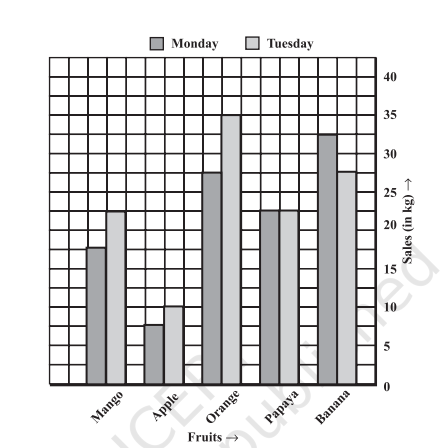
Monday ki sale banana = 32.5kg , papaya = 22.5kg , orange = 27.5kg , apple = 7.5kg , mango = 17.5kg
Tuesday ki sale banana = 27.5kg , papaya = 22.5kg , orange = 35kg , apple = 10kg , mango = 22.5
Ab hum graph draw krna sikhte hai pehle hum x axis and y axis draw kerte hai x axis par hum fruits ko show kerege and y axis par sale show karege in kg but hum is question ko solve karne kai liye 2 bar ka use karege ek bar ko hum dark and second bar ko light show karege dark bar monday ko show kerega and light bar tuesday ko show karega. Aap dekh skte hai hum ne fruit ki sailing quantity ko y axis pr show ki hai jo ki 0−40 hai jo ki 5−5 ke difference par hai. Ab hum given data ko analyze karte hue bar draw karege.
Example 1
A point whose x co-ordinate is zero and y co-ordinate is non-zero will lie on the _______.
y - axis
Example 2
A Pie graph (or a circle-graph)
Ab hum padhege pie graph = pie graph ko pie chart bhi bolte hai pie chart kai liye hum ko graph sheet ki jarurat nhi hote balki pie chart ko circle form mai show kiya jata hai. Ab hum kuch important fact padhege about pie chart ke bare mai. Pie chart mai 1% = 3.6∘ hota hai.
Hum ko question kise bhi form mai given ho sakta hai degree kai form mai bhi ya percentage kai form mai bhi hum ko according to quetion change karna hoga.
Like hum ko given hai percentage of viewers watching different types of TV channels.
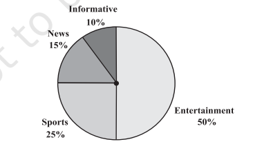
10% = informative , 15% = news , 25% = sports , 50% = entertainment
Ab hum ko graph draw karne ke liye degree ki jarurat honge to hum percentage ko degree mai convert kardege because circle 360∘ ka hota hai or circle ko hum percentage measure nhi kar sakte iss liye hum degree ko percentage mai convert karte hai.
Jaise ki hum ko given hai 10% viewers informative channels dekhte hai to hum 10% ko degree mai change karege
10% = 10×3.6 = 36∘ informative channel dekhte hai
15% = 15×3.6 = 54∘ news channel dekhte hai
25% = 25×3.6 = 90∘ sports channel dekhte hai
50% = 50×3.6 = 180∘ entertainment channel dekhte hai.
Ab hum geometric instrument D ki help se degree ko calculate kar ke pie chart draw kerenge.
A histogram
Ab aap padhoge histogram ke bare mai histogram mai bar graph ki tarha bar hote hai data ko visual karne ke liye but histogram mai jo bar hote hai unke kai beech mai gaps nhi hote or histogram data show karta hai interval ke base par.
Aap ko basically question mai data given hoga interval ki form mai interval ko aap yaha group bhi smajh sakte ho jaise aap ko given hoga age group 5−10 saal kai bachche 12 hai or aap ko given ho ki 30−40 kg kai bachche 10 hai.
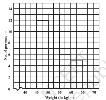
Aap ko data interval mai given hoga jo ki aap ko x axis par show krna hoga and interval ka amount ya number aap ko y axis par show karna hoga
Like aap ko question mai given hoga weight in kg jo ki interval mai hoga and number of person.
Weights (kg) = 40−45,45−50,50−55,55−60,60−65
No. of persons =4,12,13,6,5
Aap ko weight ko x axis par show karna hoga because weight jo hai wo interval mai given hai and number of persons ko y axis par show karna hoga jab aap x axis par bar draw karoge toh aap dekhoge ki jo interval hai wo 40 se start hai to aap x axis kai starting mai zig - zag laga doge than bar draw kroge or bar mai koi gap nhi hoga and number of person ko hum y axis par draw krege jo ki 2 ke gap par hoga.
Ab aap given data kai according data ko graph par show kroge jaise hum ko 40−45 kg mai 4 person given hai toe hum x axis par 40−45 dekhege and bar draw kare or dekhege ki y axis par 4 kaha tak hai use point tak draw karege iss hi tarha hum 45−50 kg ke interval ko draw karege but without gap ke jo ki x axis par draw karege and y axis par dekhege ki 12 kha tak hai or use point tak bar draw karege iss hi trha baki bhi draw karege.
Example 3
The given graph shows Nisha's trip to mall by car. Observe the graph carefully and find what she was doing between 5 pm and 7 pm. 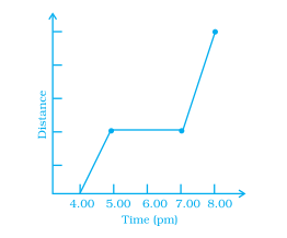
Was not driving
Example 4
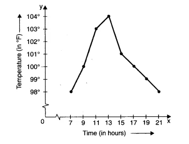
What is the temperature at 9 hours?
A line graph
Ab hum padhege line graph ke bare mai iss graph mai data show karne kai liye lines draw ki jate hai basically line graph show karta hai data kai continuously change ko hum ko line graph mai bar draw nahi karne hote hai balki given data ke accordingly data ko analyze karte hue x axis and y axis par hum ko ek point lgana hota hai aise hi hum ko data ko analyze karte hue sare point graph par show karne hote hai and in points ko connect karna hota line segment se.
Line graph use for profit and loss , growth , compare between two company etc.
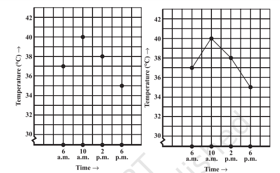
Time = 6 a.m. , 10 a.m. , 2 p.m. , 6 p.m.
Temperature(°C) = 37 , 40 , 38 , 35
Hum ko question time given hai or time kai accordingly temperature given hai aap time ko x axis par show kroge or temperature ko y axis par. Jaise ki 6 a.m. ko aap x axis par dekhoge and 37 temperature ko y axis par dekhoge fir aap graph par aisa point dhundoge jaha par dono point intersect karte ho aise hi hum given data ko analyze karte hue baki points draw karege and abhi points ko line segment y join karege .
Example 5
Study the table given below and draw a line graph for it.

Is the graph drawn, a linear graph ?
Yes, the graph drawn is a linear graph.
Example 6
Study the table given below and draw a line graph for it.

Is the graph drawn, a linear graph ?
No, the graph drawn is not a linear graph.
Linear Graphs
A line graph consists of bits of line segments joined consecutively. Sometimes the graph may be a whole unbroken line. Such a graph is called a linear graph.
Location of a point
Class mai teacher ne board par ek point draw kiya aur bola ki iss point ki location ka pta karo tabhi bahot sare baccho ne alag alag response diye tabhi ek baccha utha aur bola He measured the distance of the dot from the left edge of the board and said, “The dot is 90 cm from the left edge of the board”. Fir ek aur baccha aata hai with a modified statement : “The dot is 90 cm from the left edge
and 160 cm from the bottom edge”. That solved the problem completely!.
Example 7
A car is travelling from city P to city Q which are 350 km apart. The line graph given below describes the distances of the car from the city P at different times .
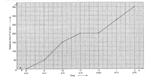
Study the above graph and answer the questions given below.
(i) What information is given on the two axes ?
(ii) From where and when did the car begin its journey ?
(iii) How far did the car go in the first hour ?
(iv) How far did the car go during (a) the 2nd hour and (b) the 3rd hour?
(v) Was the speed same during first three hours? How do you know it ?
(vi) Did the car stop for some duration at any place ? Justify your answer.
(vii) When did the car reach city Q ?
(i) The x-axis shows the time and the y-axis shows the distance of the car from city P.
(ii) From city P, at 8 a.m.
(iii)50km
(iv)(a)100km (b)50km
(v) No. because the distance covered per hour is not uniform.
(vi) Yes, the car stopped during the interval 11 a.m. to 12 noon , as is indicated by the horizontal line segment during this period.
(vii)2 p.m.
Example 8
The following line graph shows the temperature forecast and the actual temperature for each day of a week.
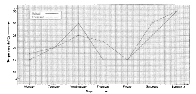
Study the above double line graph carefully and answer the questions given below:
(i) On which days was the forecast temperature the same as the actual temperature?
(ii) What was the maximum forecast temperature during the week ?
(iv) On which day did the actual temperature differ the most from the forecast temperature?
(i) Tuesday, Friday and Sunday
(ii) 35∘C
(iii) 15∘C
(iv) Thursday
Some Applications
In everyday life, you might have observed that the more you use a facility, the more you pay for it. If more electricity is consumed, the bill is bound to be high. If less electricity is used, then the bill will be easily manageable. This is an instance where one quantity affects another. Amount of electric bill depends on the quantity of electricity used. We say that the quantity of electricity is an independent variable (or sometimes control variable ) and the amount of electric bill is the dependent variable. The relation between such variables can be shown through a graph.
Example 9
Write the coordinates of the vertices of each of these adjoining figures.
If we look at the graph, coordinates of vertices for each point can ve given as:
O:(0,0)
A:(2,0)
B:(2,3)
C:(0,3)
P:(4,3)
Q:(6,1)
R:(6,5)
S:(4,7)
M:(10,8)
L:(7,7)
K:(10,5).
Example 10
Plot the following points on a graph sheet. Verify if they lie on a line
(a)A(4,0),B(4,2),C(4,6),D(4,2.5)
(b)P(1,1),Q(2,2),R(3,3),S(4,4)
(c)K(2,3),L(5,3),M(5,5),N(2,5)
A) Yes, this is a line
B) Yes, this is a line
C) No, this is not a line. This is a square.
Summary
In this chapter, you have studied the following points: -
- Graphical presentation of data is easier to understand.
- (i) A bar graph is used to show comparison among categories.
(ii) A pie graph is used to compare parts of a whole.
(iii) A Histogram is a bar graph that shows data in intervals. - A line graph displays data that changes continuously over periods of time.
- A line graph which is a whole unbroken line is called a linear graph.
- For fixing a point on the graph sheet we need, x-coordinate and y-coordinate.
- The relation between dependent variable and independent variable is shown through a graph.

