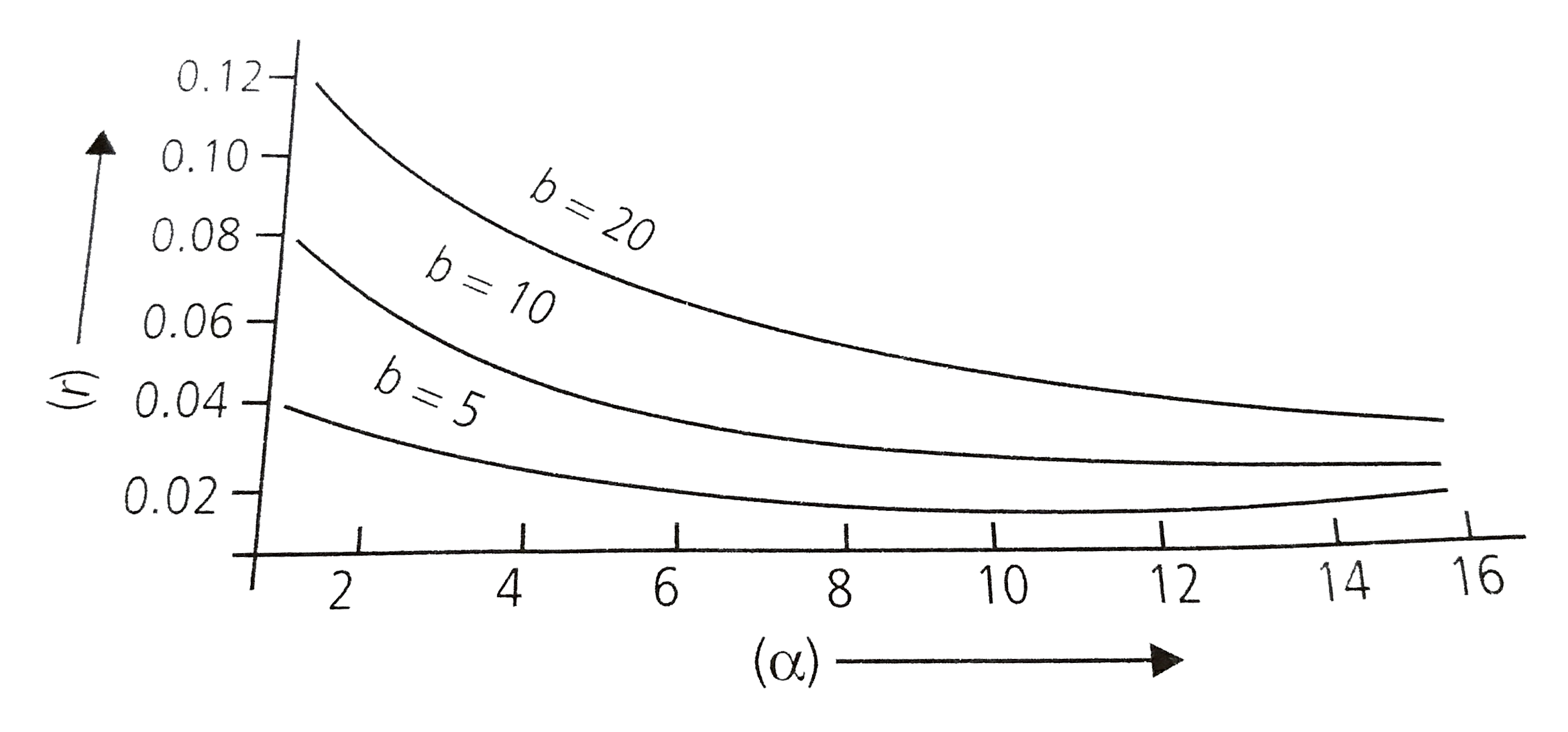
The graph below shows the relationships of per capita population growth rate (r), fecundity (b) and age at first reproduction (α) in an animal speies
What is the most important conclusion to be drawn from the graph ?
The population growth rate decreases as first reproduction in postponed to a later stage, regardless of fecundity
At any α, the higher the fecundity the higher is the population growth rate achieved
As the age at first reproduction is postponed further, the benefits of increasing fecundity on the population growth rate become progressively negligible
None of these
The correct Answer is:A
Fecundity is the reproductive output, usually of an individual or number of offspring produced or the capacity of reproduction . In the given curve, the population growth rate decreases as first reproduction is postponed to a later stage regardless of fecundity.
Topper's Solved these Questions
- REPRODUCTION IN ORGANISMBook:NCERT FINGERTIPSChapter:REPRODUCTION IN ORGANISMExercise:Reproduction In Organism
Explore 138 Videos
- SEXUAL REPRODUCTION IN FLOWERING PLANTSBook:NCERT FINGERTIPSChapter:SEXUAL REPRODUCTION IN FLOWERING PLANTSExercise:Sexual Reproduction In Flowering Plants
Explore 145 Videos
Similar Questions
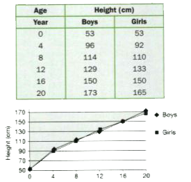
The table below shows the data on likely heights of boys and girls as they grow in age. Draw graphs of height and age for both boys and girls on the same graph paper. What conclusions can be drawn from these graphs?
View SolutionThe bar graph given below shows the data of the production of paper (in lakh tonnes) by three different companies P, Q and R over the years.
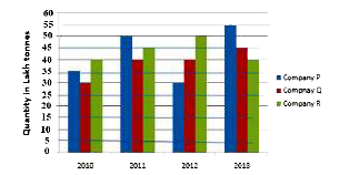
What is the percentage increase in the productionby company Q from 2010 to 2013?
View Solution
Knowledge Check
U.r graph of a particle performing SHM is as shown in figure. What conclusion cannot be drawn from the graph?
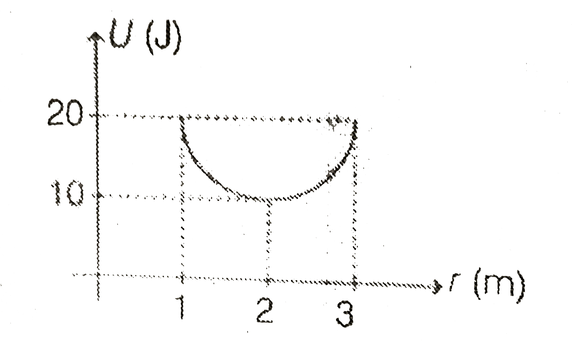 AMean position of the particle is at r=2mBPotential energy of the particle at mean position is 10 JCAmplitude of oscillation is 1mDNone of the above.
In laboratory experiments, two species of the protist Paramecium (species 1 and 2) were grown alond and in the presence of the other species. The following graphs show growth of species 1 and species 2, both alone and when in mixed culture with the other species.
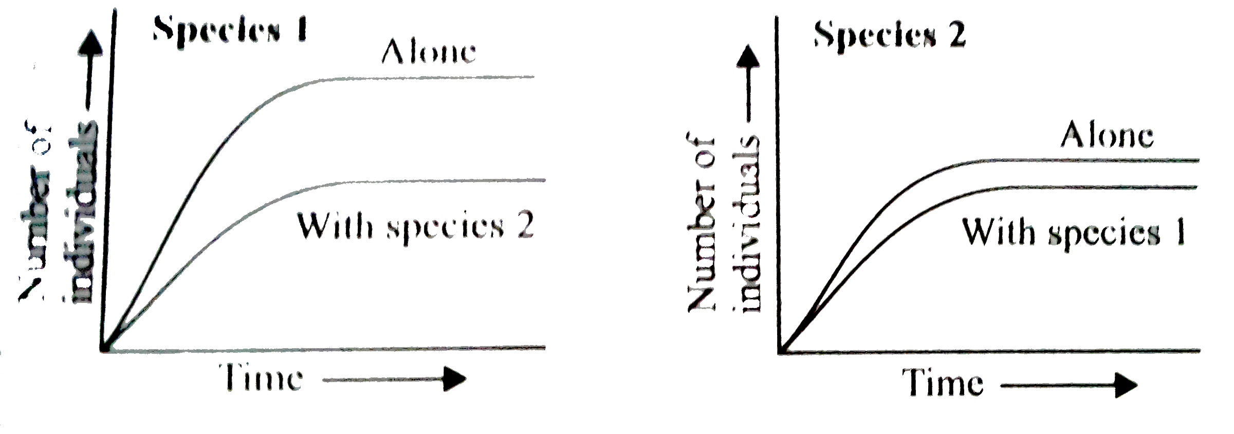 Which of the following conclusions can be drawn from the graphs ? ACompetitive exclusion occurred in these experiments.BBoth species are affected by interspecific competition but species 1 is affected less.CBoth species are affected by interspecific competition but species 2 is affected less.DBoth species are affected equally by interspecific competition.
The relationship between population density (Nt) and population growth rate (R=Nt+1lNt) in a certain animal species is shown below.
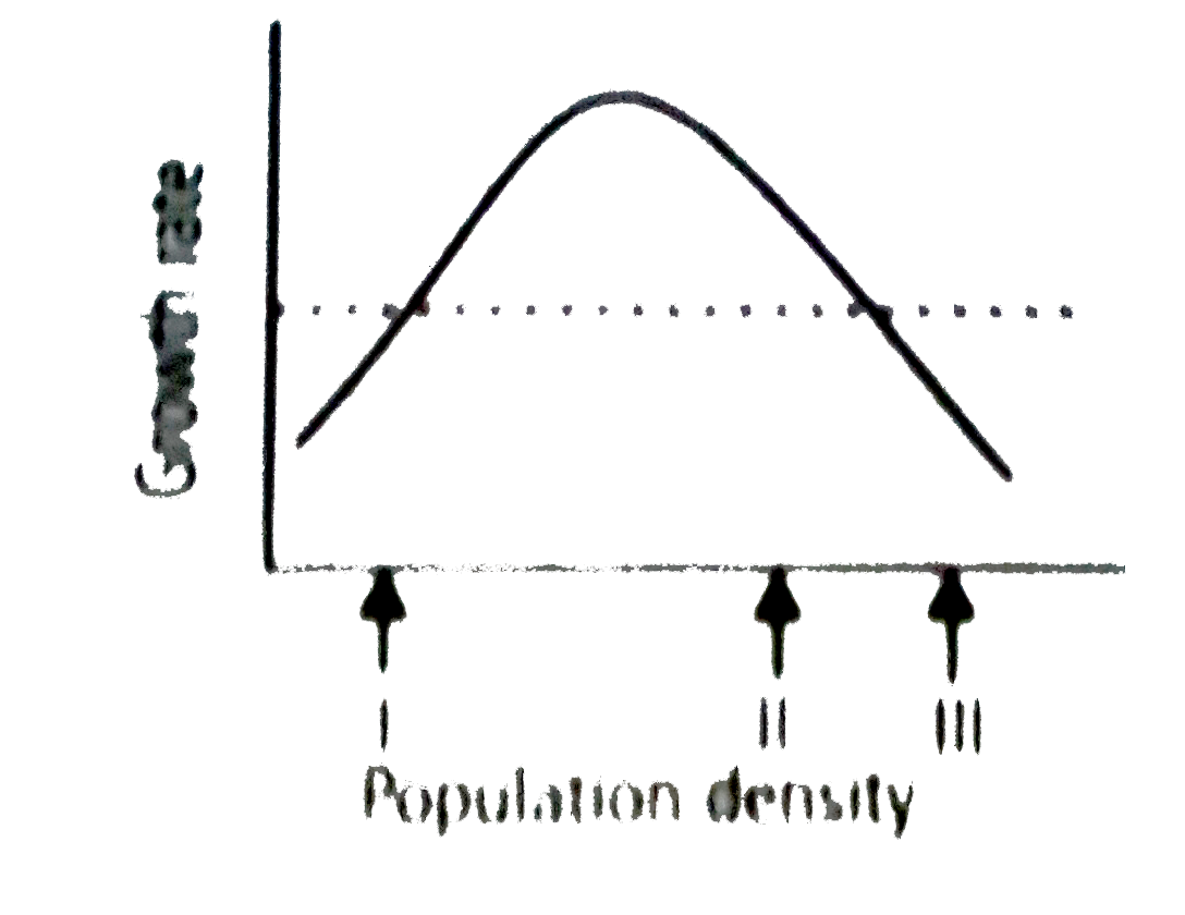
Choose from the following graphs the appropriate populations growth patterns that would be obtained if the population is at the densities (I, II, III) shown in the graph above. [Note : THe y-axis in A to D is relative density that cannot be compared to the absolute density in the figure]
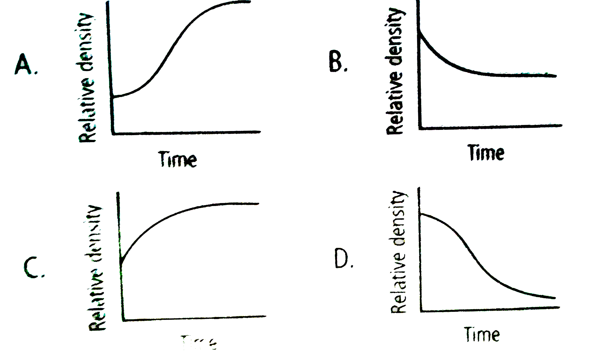 AI−A,II−B,III−CBI−D,II−C,III−BCI−B,II−C,III−DDI−C,II−A,III−B
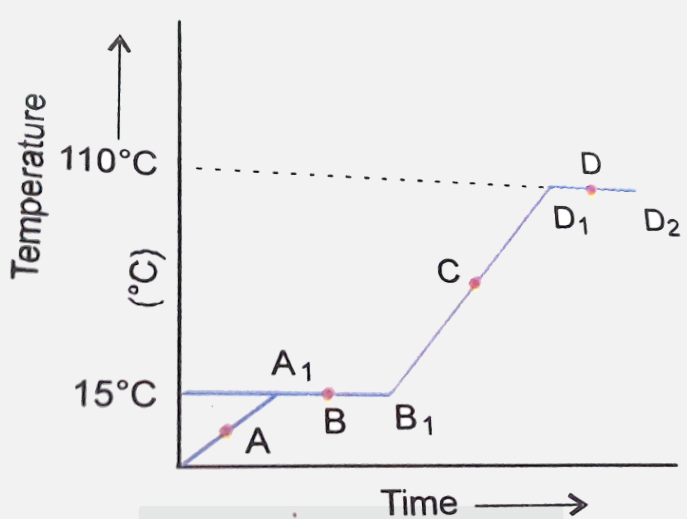
The temperature-time graph below shows the heating curve for pure wax. From the graph answer the following :
(a) What is the physical state of the substance at the points A, B, C and D ?
(b) What is the melting point of the substance ?
(c ) What is its boiling point ?
(d) Which portions of the graph indicates that change of state is taking place.
(e ) Name the terms used for heat absorbed during change of states involved in above processes.
View SolutionLichens are organisms, which are very sensitive to air pollution. The graph shows how the distance from a coal-fired power station affects the number of different types of growing lichen.
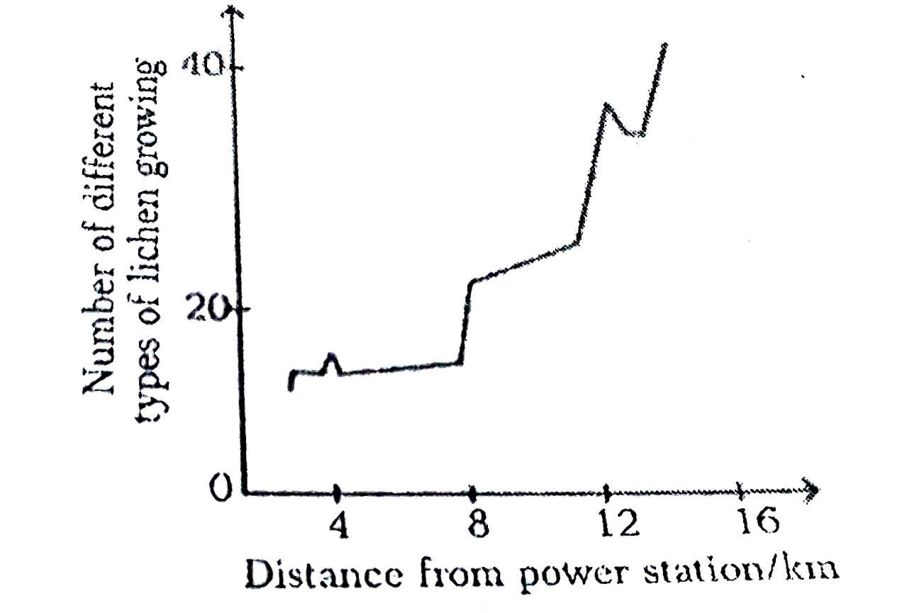
What conclusion can be drawn from this information?
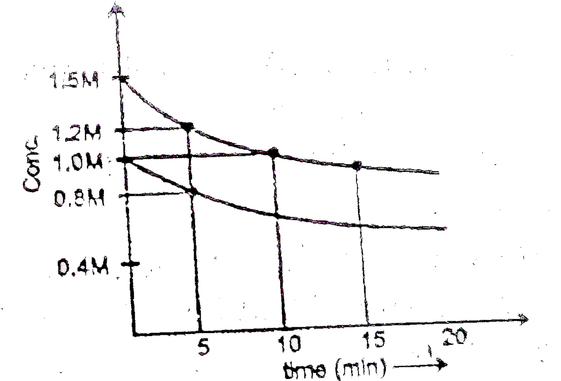
View SolutionThe rate law expresses the relationship of the rate of a reaction to the rate constant and the concentration of the reactants raised to some powers for the general reaction.
aA+bB→cC+dD
Rate law takes the form
r=k[A]x[B]y
where x and y are number that must be determined experimentely k is the rate constant and [A] and [B] are concentration of A & B respectively.
The varitation of concentration of 'A' with time in two experiments starting with two different initial concentration of 'A' is given by the following graph.The reaction is represented by A(aq)→B(aq) what is rate of reaction (M/min) when conc. of A in aqueous solution was 1.8 M:
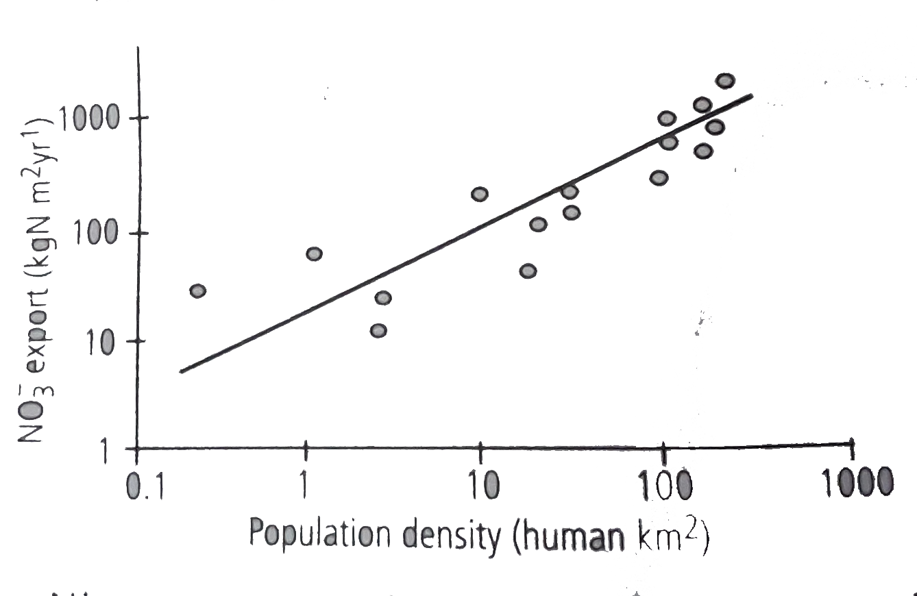
View SolutionThe given graph shows how much nitrate (NO−3) is exported from the continent towards the ocean by 16 major rivers in the world rivers in the world compared to the density of human populations living along those drainage basins (i.e., along these rivers). What interpretation can be drawn from this graph ?
View SolutionThe bar graph given below shows the production (in000 tonnes) of rice of a country for the year 2007 to 2011 .
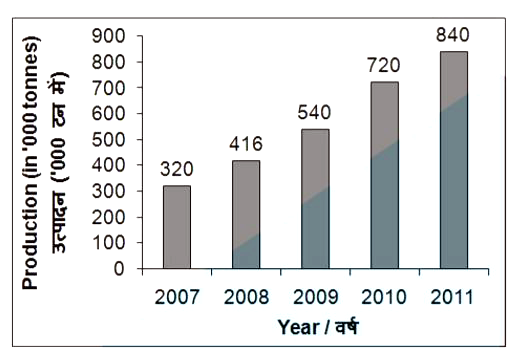
What is the average production of rice per year from 2009 to 2011 ?
View Solution