Thomas was hired for a new job in 1977, with a starting salary of $40,000 . Beginning in 1978, Thomas received an annual rise, increasing his salary by $2,300 each year.
Which of the following graphs could represent Thomas' s salary, S, in dollars, as a function of the number of years,y, after 1977?


The correct Answer is:B
To determine which graph could represent Thomas's salary as a function of the number of years after 1977, we can follow these steps:
Step 1: Identify the starting salary and annual increase
- Thomas's starting salary in 1977 is $40,000.
- From 1978 onwards, he receives an annual increase of $2,300.
Step 2: Define the function for salary
- Let S be the salary after y years.
- The function can be expressed as:
S=40000+2300y
where y is the number of years after 1977.
Step 3: Analyze the function
- The function S=40000+2300y is a linear function because it can be written in the form S=mx+b, where m (the slope) is the annual increase ($2,300) and b (the y-intercept) is the starting salary ($40,000).
Step 4: Determine the characteristics of the graph
- Since the function is linear, the graph will be a straight line.
- The slope is positive, indicating that the salary increases over time.
Step 5: Evaluate the options
- We can rule out any graphs that are not linear.
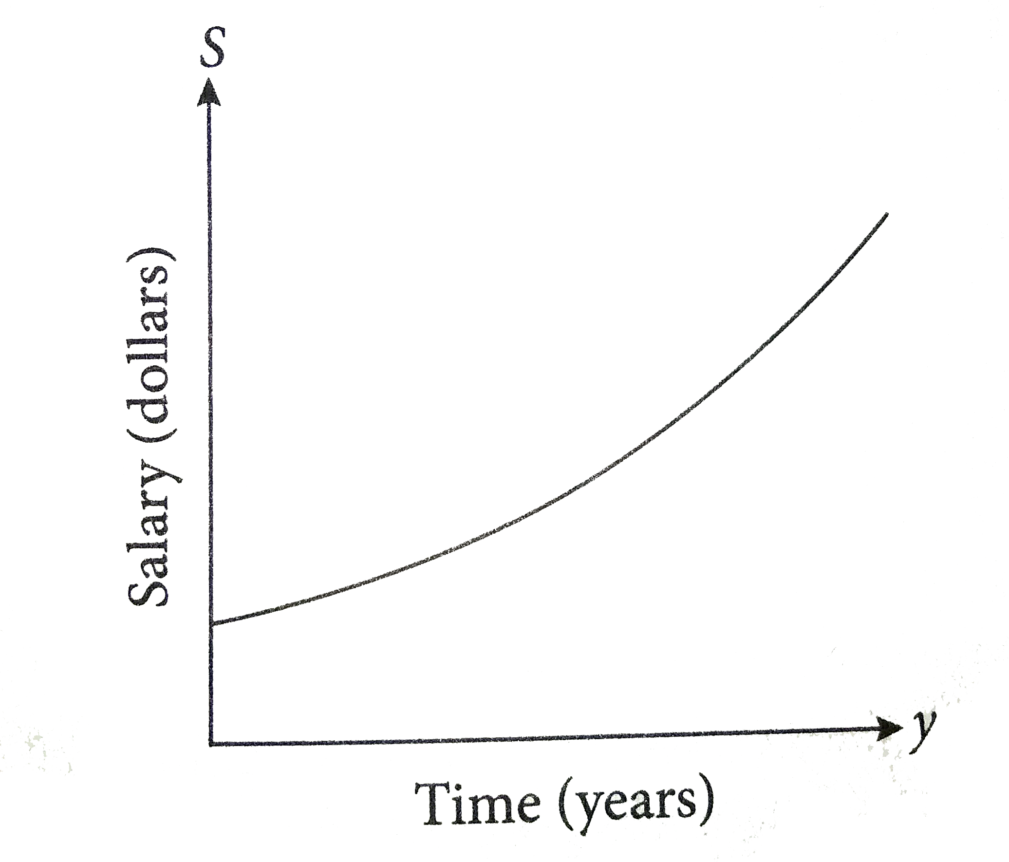
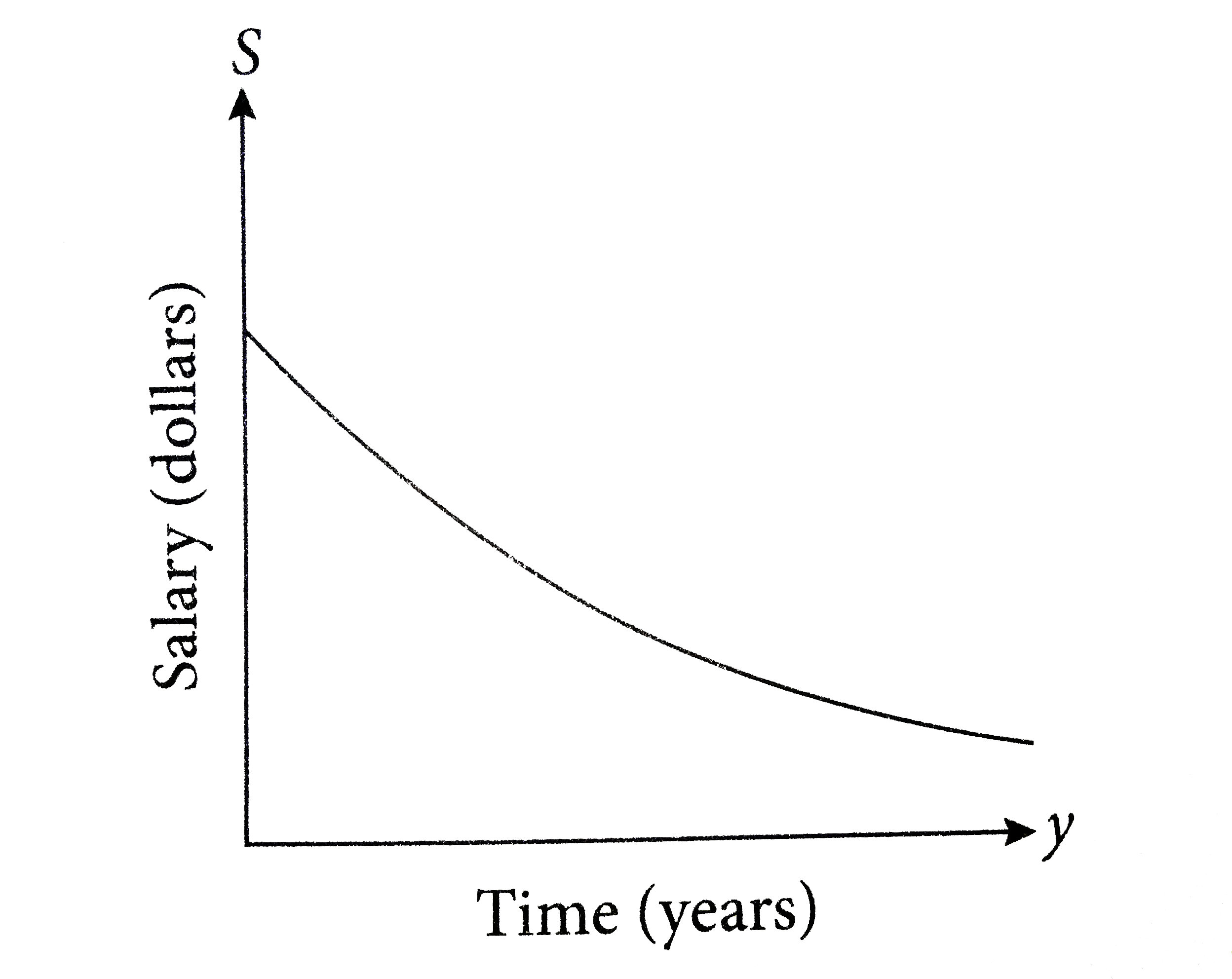
- Option A and Option C likely represent exponential functions, which do not fit our linear model.
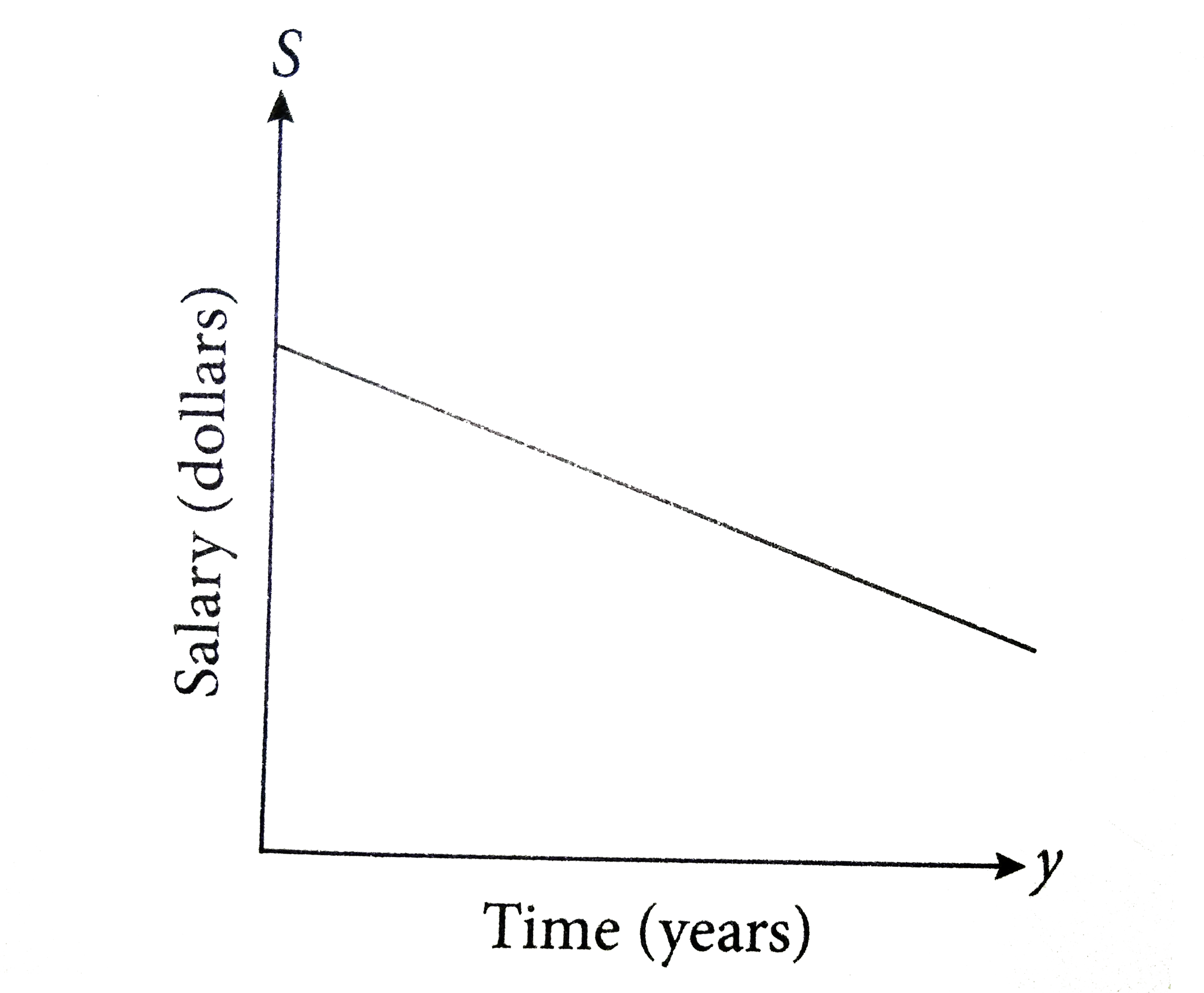
- Option D likely represents a decreasing function, which is not applicable since Thomas's salary is increasing.
Step 6: Identify the correct graph
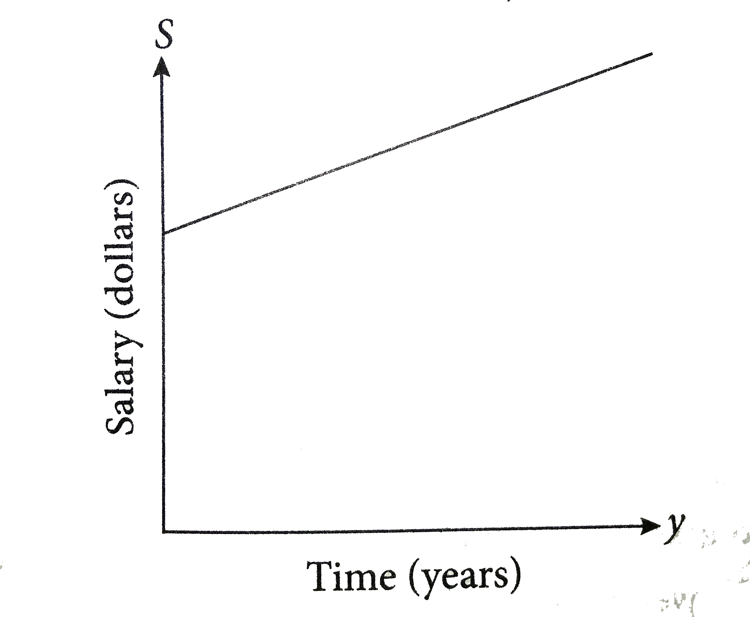
- The only graph that shows a linear increase starting from $40,000 and increasing by $2,300 each year is Option B.
Conclusion
- Therefore, the graph that represents Thomas's salary as a function of the number of years after 1977 is Option B.
---
- Thomas's starting salary in 1977 is $40,000.
- From 1978 onwards, he receives an annual increase of $2,300.
- Let S be the salary after y years.
- The function can be expressed as:
S=40000+2300y
where y is the number of years after 1977.
- The function S=40000+2300y is a linear function because it can be written in the form S=mx+b, where m (the slope) is the annual increase ($2,300) and b (the y-intercept) is the starting salary ($40,000).
- Since the function is linear, the graph will be a straight line.
- The slope is positive, indicating that the salary increases over time.
- We can rule out any graphs that are not linear.
- Option A and Option C likely represent exponential functions, which do not fit our linear model.
- Option D likely represents a decreasing function, which is not applicable since Thomas's salary is increasing.
- The only graph that shows a linear increase starting from $40,000 and increasing by $2,300 each year is Option B.
- Therefore, the graph that represents Thomas's salary as a function of the number of years after 1977 is Option B.
Topper's Solved these Questions
Similar Questions
IF the function g is defined by g(x)=3x+5, what is the value of g(-5)?
View SolutionA certain homeowner uses a gas edger to clean up his lawn every time he mows. If the edger uses 160 milliliters of fuel each time, what is the maximum number of times the homeowner can edge his lawn with 8 litres of fuel?( 1 liter = 1,000 milliliters)
View SolutionThe population ,P, of town Y since 1995 can be estimated by the equation P=1.0635x+3,250, where x is the number of years since 1995 and 0≤x≤20. In the context of this equation, what does the number 1.0635 most likely represent?
View SolutionA man starts his job with a certain monthly salary and earns a fixed increment every year. If his salary was Rs. 1500 after 4 year of service and Rs. 1800 after 10 years of service, what was his starting salary and what is the annual increment?
View Solutionइस वर्ष रमन के वेतन में 5% की बढ़ोतरी हुई । यदि उसका वर्तमान वेतन रू1,806 है, तो पिछले वर्ष उसका वेतन कितना था ?
View Solutionएक व्यक्ति कुछ मासिक वेतन पर नौकरी शुरू करता है और प्रत्येक वर्ष उसके वेतन में एक नियत वृद्धि होती है । यदि नौकरी के 4 वर्ष बाद उसका वेतन रु.2,200 हो और 15 वर्ष बाद उसका वेतन रु. 2,750 हो, तो प्रारम्भ में उसका वेतन कितना था और वार्षिक वृद्धि क्या थी , ज्ञात कीजिए ?
View Solutionकोई व्यक्ति किसी मासिक वेतन पर नौकरी पर लग जाता है। उसे नियत वार्षिक वृद्धि भी मिलती है। यदि तीन वर्ष नौकरी करने के बाद उसका मासिक वेतन 1000 रु और आठ वर्ष नौकरी करने पर वेतन 1300 रु होता है तो उस व्यक्ति का प्रारंभिक मासिक वेतन और वार्षिक वृद्धि ज्ञात करे।
View SolutionMilk starts a job at which his starting salary is $25500 per year. He expects that his salary will increase by a constnat dollar amount annually. In 12 years, his salary will be doulb ehis starting salary. Assuming salary increases take place only at the eand of a full year, how many years must Malik wait until his salary is at least $40,000 annually ?
View SolutionTwo worker were hired to begin work at the same time. Worker A's contract called for a starting salary of $20,000 with an increase of $800 after each year of employment. Worker B's contract called for a starting salary of $15,200 with an increase of $2,000 after each year of employment. If x represents the number of full years employment (that is, the number of yearly increases each worker has received), which of the number of years until B's yearly salary equals A's yearly salary?
View SolutionThomas was hired for a new job in 1977, with a starting salary of $40,000 . Beginning in 1978, Thomas received an annual rise, increasing his salary by $2,300 each year.
IF thomas retired at the end of 1999, what was his salary in his final year?
View SolutionThomas was hired for a new job in 1977, with a starting salary of $40,000 . Beginning in 1978, Thomas received an annual rise, increasing his salary by $2,300 each year.
Which of the following must be true, given that Thomas's salary after y years was between $54,000 and $60,000?
View Solutionएक पायलट ऑफिसर के वेतन में समान वार्षिक वेतन वृद्धि होती है | प्रथम वर्ष उसका वेतन ₹ 24, 000 है | पांचवे वर्ष उसका वेतन ₹ 40, 000 हो गया | बीच के वर्ष में उसका वेतन ज्ञात कीजिए |
View Solutionपुनीत शर्मा एक निश्चित मासिक वेतन पर नौकरी | आरंभ करता है तथा उसके वेतन में एक वार्षिक निश्चित वृद्धि होती है। यदि 4 वर्ष नौकरी करने के बाद उसका कुल वेतन Rs15000 तथा 10 वर्ष नौकरी करने के बाद उसका कुल वेतन Rs18000 हो तो इस स्थिति का बीजगणितीय तथा आलेखीय निरूपण कीजिए।
View Solutionएक व्यक्ति के वेतन में जिस दर से वार्षिक वृद्धि होती है वह A.P. में है। यदि वह अपने 11वें वर्ष में ₹4500 मासिक, 27वें वर्ष में ₹ 6900 मासिक प्राप्त करता हो, तो उसका आरंभिक वेतन और वार्षिक तरक्की ज्ञात कीजिए। साथ ही, 30 वर्ष के पश्चात् मासिक वेतन ज्ञात कीजिए।
View SolutionA man starts his job with a certain monthly salary and earns a fixed increment every year. If his salary was Rs. 1500 after 4 year of service and Rs. 1800 after 10 years of service, what was his starting salary and what is the annual increment?
View Solution
