Which of the following graphs best depicts the changes in one cycle of PCR ?
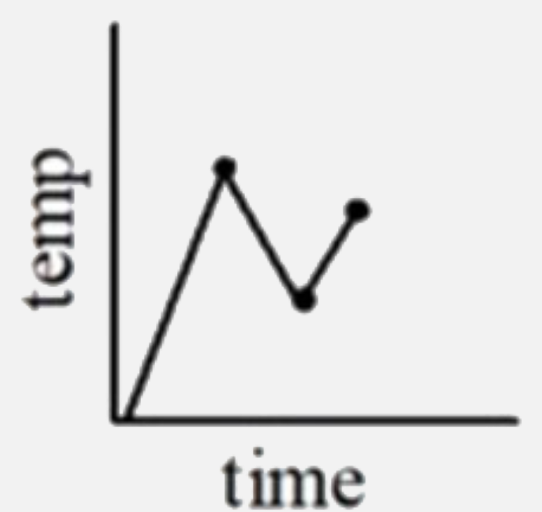
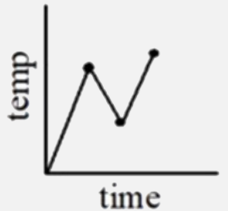
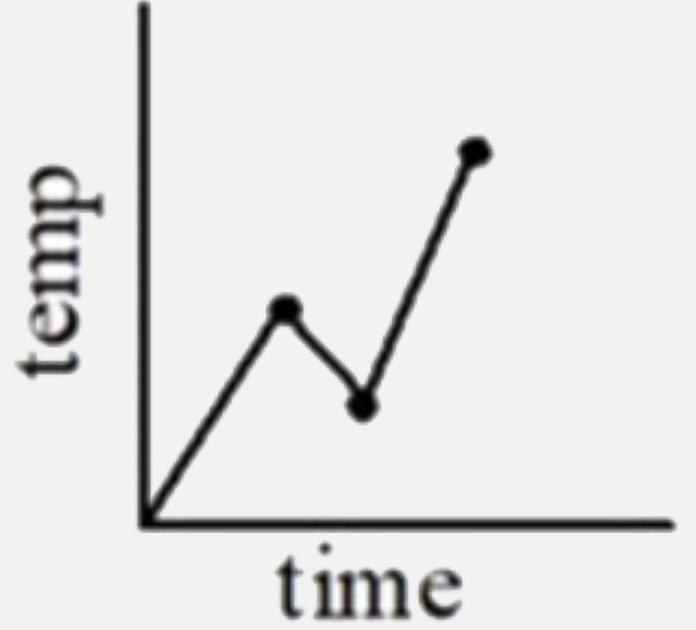
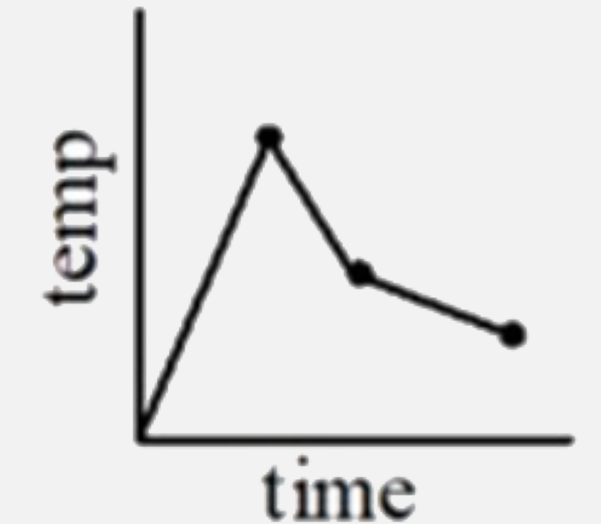
The correct Answer is:A
To determine which graph best depicts the changes in one cycle of PCR (Polymerase Chain Reaction), we need to understand the three main steps of the PCR process: denaturation, annealing, and extension. Here's a step-by-step breakdown of the process:
Step 1: Understand the PCR Process
- Denaturation: The double-stranded DNA is heated to around 94°C, causing it to separate into two single strands.
- Annealing: The temperature is lowered to around 54°C to allow primers to bind to the single-stranded DNA.
- Extension: The temperature is then raised to about 72°C, where DNA polymerase synthesizes new DNA strands by adding nucleotides to the primers.
Step 2: Analyze the Graphs
- Look for a graph that shows:
- An initial increase in temperature for denaturation.
- A decrease in temperature for annealing.
- A slight increase in temperature for extension.
Step 3: Identify the Correct Graph
- The correct graph should reflect:
- A peak at the denaturation temperature (94°C).
- A drop to the annealing temperature (54°C).
- A rise to the extension temperature (72°C) without a significant spike.
Conclusion
Based on the description provided in the video transcript, the correct graph that depicts the changes in one cycle of PCR is Graph A. This graph accurately represents the temperature changes during the PCR cycle.
- Denaturation: The double-stranded DNA is heated to around 94°C, causing it to separate into two single strands.
- Annealing: The temperature is lowered to around 54°C to allow primers to bind to the single-stranded DNA.
- Extension: The temperature is then raised to about 72°C, where DNA polymerase synthesizes new DNA strands by adding nucleotides to the primers.
- Look for a graph that shows:
- An initial increase in temperature for denaturation.
- A decrease in temperature for annealing.
- A slight increase in temperature for extension.
- The correct graph should reflect:
- A peak at the denaturation temperature (94°C).
- A drop to the annealing temperature (54°C).
- A rise to the extension temperature (72°C) without a significant spike.
Based on the description provided in the video transcript, the correct graph that depicts the changes in one cycle of PCR is Graph A. This graph accurately represents the temperature changes during the PCR cycle.
Topper's Solved these Questions
Similar Questions
Knowledge Check
Which of the following graphs best represents the variation of acceleration 'a' with displacement x?
A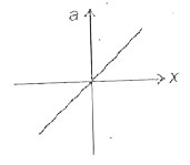 B
B C
C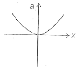 D
D
Which one of the following four graphs best depict the variation with x of the moment of inertia I of a uniform triangular lamina about an axis parallel to its base at a distance x from it
 A
A B
B C
C D
D
Which of the following graphs best represents the motion of a raindrop?
A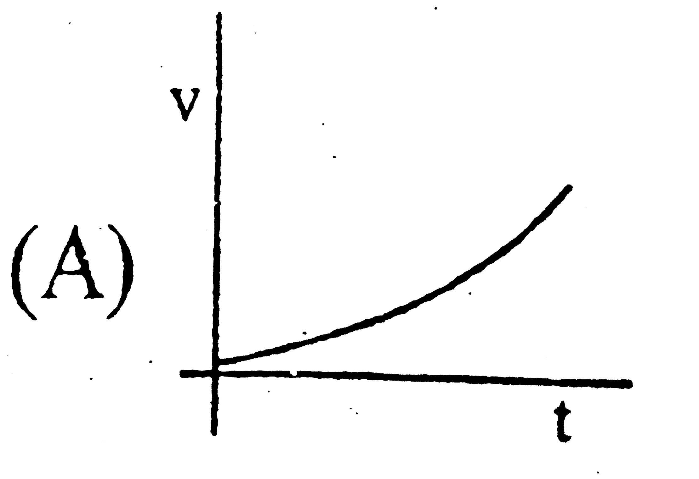 B
B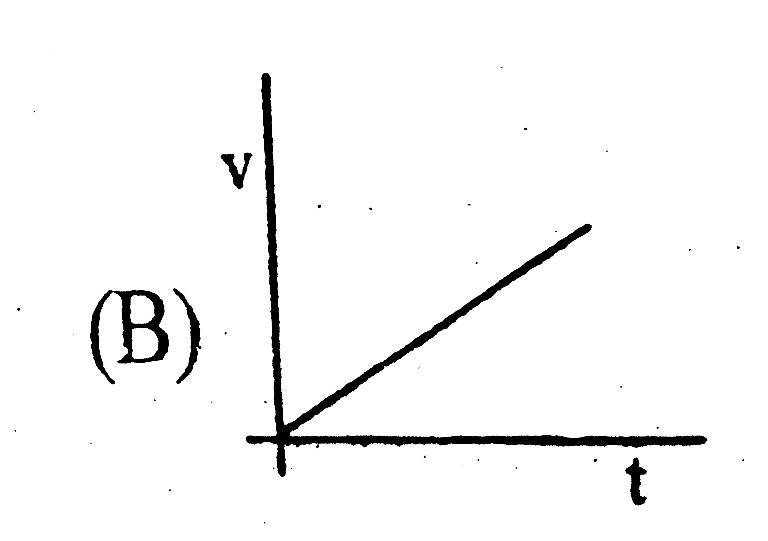 C
C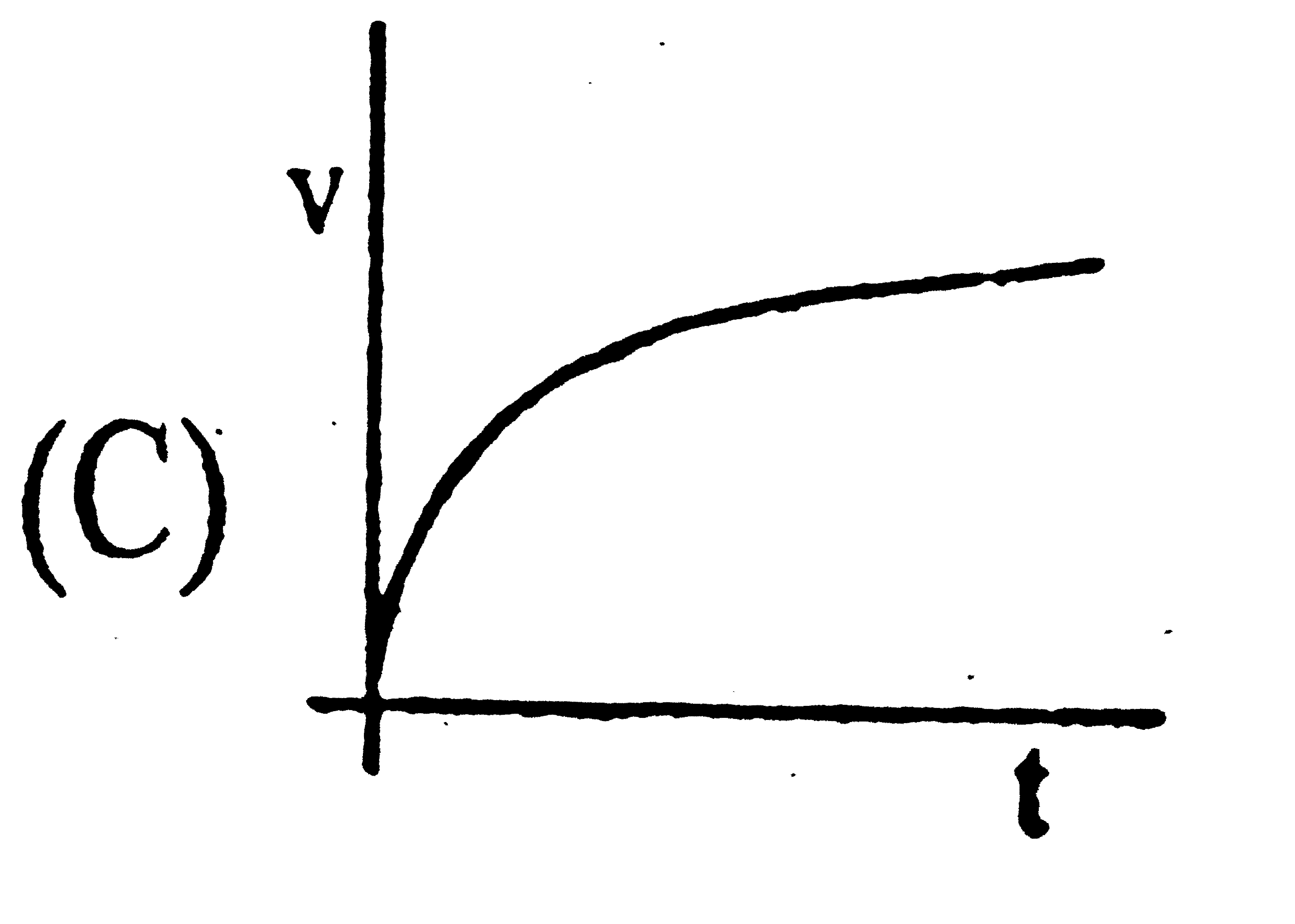 D
D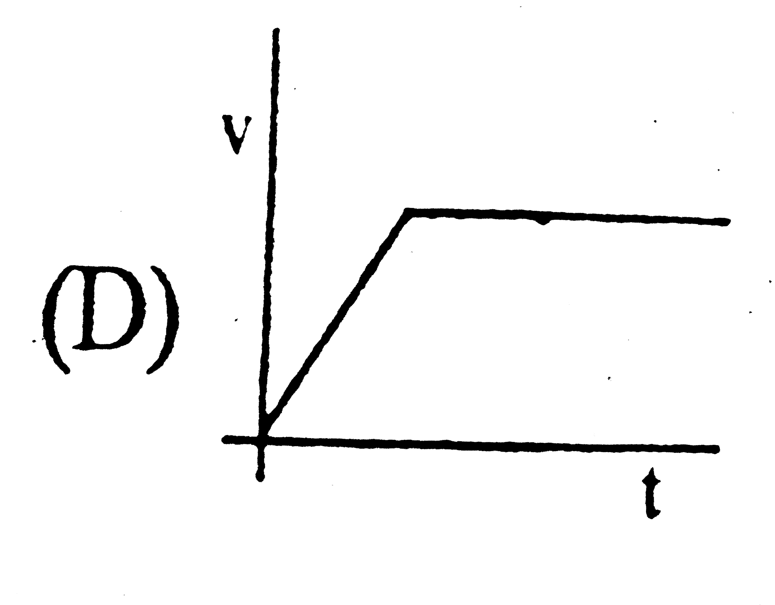
Which one of the following diagram best depicts the relationship among Elephants, Wolves and Animals?
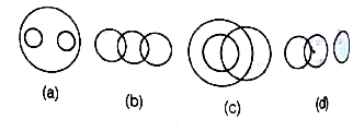
View SolutionWhich one of the following diagrams best depicts the relationship among pen, pencils, stationery?
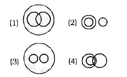
View SolutionWhich one of the following diagrams best depicts the relationship among.
Black eyed people, Brown haired people, Indian
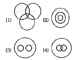
View SolutionWhich one of the following diagrams best depicts the rela tionship among pen, pencils, stationery ?
View SolutionWhich one of the following diagrams best depicts the relationship among College Graduates, Professional Athletes and Great Scientists?
View Solution
