The following graph shows the demand and production of cotton by 5 companies A, B, C, D and E. Study the graph and answer question
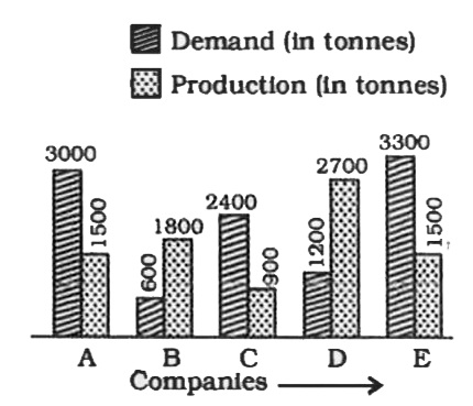
What is the difference in tones) between average demand and average production of the five companies taken together?
a) 320
420
2100
1050
The correct Answer is:B
Step by step video & image solution for The following graph shows the demand and production of cotton by 5 companies A, B, C, D and E. Study the graph and answer question What is the difference in tones) between average demand and average production of the five companies taken together? by Maths experts to help you in doubts & scoring excellent marks in Class 14 exams.
Updated on:21/07/2023Similar Questions
The following graph shows the demand and production of cotton by 5 companies A, B, C, D and E. Study the graph and answer question
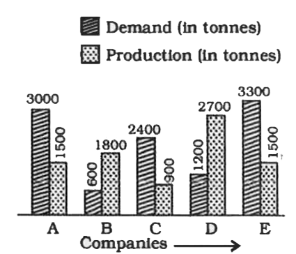
The demand for company B is what percent of the demand for comapny C?
View SolutionThe following graph shows the demand and production of cotton by 5 companies A, B, C, D and E. Study the graph and answer question
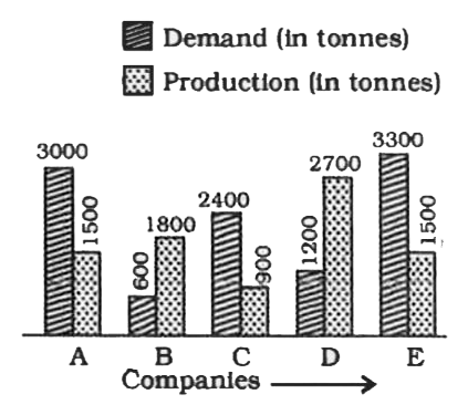
What is the ratio of companies having more demand than production to those having more production than demand?
View Solution
Knowledge Check
What is the difference between average demand and average production of the five companies taken together?
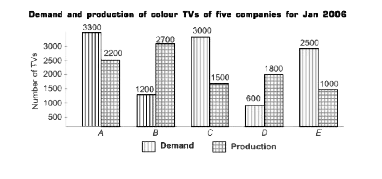 A1400B400C280D138
Study the following graph carefully and answer the questions -----
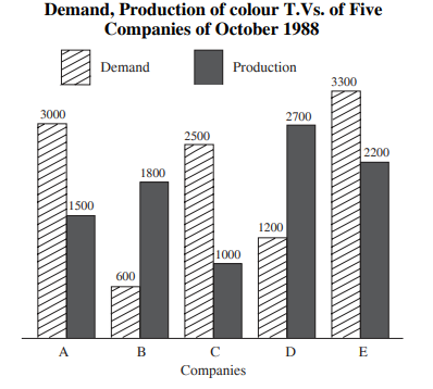
What is the difference between average demand and average production of the five companies taken together ?A1400B400C280D138The following chart represents Demand and Production for 5 companies ABCDE. On the basis of the graph answer the questions.
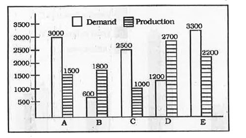
The difference between average demand and average production of the five companies taken together is :A400B280C130D620
The following graph shows the demand and production of cotton by 5 companies A, B, C, D and E. Study the graph and answer question
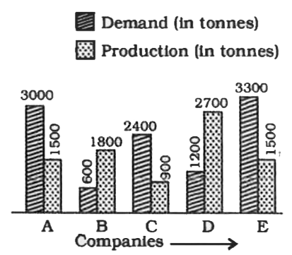
The production of company D is how many times that of the production of the company A?
View SolutionThe following graph shows the production of wheat flour (in 1000 tonnes) by three companies X, Y and Z over the years. Study the graph and answer the questions.
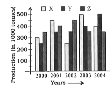
What is the percentage Increase in the production of company Y from 2002 to 2003?
View SolutionWhat is the ratio of average demand to average production of companies B and D?

View SolutionStudy the following line graph and answer the question based on it.
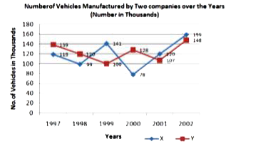
What is the difference between the total productions of the two companies from 1997 to 2000?
View SolutionThe following graph shows the production of wheat flour (in 1000 tonnes) by three companies X, Y and Z over the years. Study the graph and answer the questions.
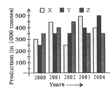
The average production for five years was maximum for which company ?
View Solution
