Use the tables below to draw linear graphs. (a) The number of days a hill side city received snow in different years. Years 2003,2004,2005and2006 and Days 8,10,5,and12 (b) Population (in thousands) of men and women in a village in different years.
To solve the problem of drawing linear graphs based on the provided data, we will follow these steps:
1. Create a Table:
- Organize the data into a table format.
- Years: 2003, 2004, 2005, 2006
- Days: 8, 10, 5, 12
| Year | Days |
|------|------|
| 2003 | 8 |
| 2004 | 10 |
| 2005 | 5 |
| 2006 | 12 |
2. Set Up the Axes:
- Draw the x-axis (horizontal) and y-axis (vertical).
- Label the x-axis as "Years" and the y-axis as "Days".
3. Scale the Axes:
- For the x-axis, mark the years: 2003, 2004, 2005, 2006. You can space them evenly (e.g., 1 cm apart).
- For the y-axis, choose a scale that accommodates the number of days. You can use increments of 2: 0, 2, 4, 6, 8, 10, 12, 14.
4. Plot the Points:
- For 2003, plot a point at (2003, 8).
- For 2004, plot a point at (2004, 10).
- For 2005, plot a point at (2005, 5).
- For 2006, plot a point at (2006, 12).
5. Connect the Points:
- Draw straight lines connecting the points in the order they were plotted to form a linear graph.
6. Final Graph:
- Ensure the graph is clearly labeled with a title, such as "Days of Snowfall in Hillside City".
Part (b): Population of Men and Women in a Village
Assuming we have similar data for the population of men and women in a village for different years, we would follow similar steps:
1. Create a Table:
- Organize the population data into a table format.
- Example data (assuming):
- Years: 2000, 2005, 2010, 2015
- Men: 20, 25, 30, 35 (in thousands)
- Women: 18, 22, 28, 33 (in thousands)
| Year | Men | Women |
|------|-----|-------|
| 2000 | 20 | 18 |
| 2005 | 25 | 22 |
| 2010 | 30 | 28 |
| 2015 | 35 | 33 |
2. Set Up the Axes:
- Draw the x-axis and y-axis.
- Label the x-axis as "Years" and the y-axis as "Population (in thousands)".
3. Scale the Axes:
- For the x-axis, mark the years: 2000, 2005, 2010, 2015.
- For the y-axis, choose a scale that accommodates the population numbers (e.g., increments of 5: 0, 5, 10, 15, 20, 25, 30, 35, 40).
4. Plot the Points:
- For men, plot points for each year based on the men’s population.
- For women, plot points for each year based on the women’s population.
5. Connect the Points:
- Draw lines connecting the points for men and another set for women.
6. Final Graph:
- Ensure the graph is clearly labeled with a title, such as "Population of Men and Women in Village".
- Organize the data into a table format.
- Years: 2003, 2004, 2005, 2006
- Days: 8, 10, 5, 12
|------|------|
| 2003 | 8 |
| 2004 | 10 |
| 2005 | 5 |
| 2006 | 12 |
- Draw the x-axis (horizontal) and y-axis (vertical).
- Label the x-axis as "Years" and the y-axis as "Days".
- For the x-axis, mark the years: 2003, 2004, 2005, 2006. You can space them evenly (e.g., 1 cm apart).
- For the y-axis, choose a scale that accommodates the number of days. You can use increments of 2: 0, 2, 4, 6, 8, 10, 12, 14.
- For 2003, plot a point at (2003, 8).
- For 2004, plot a point at (2004, 10).
- For 2005, plot a point at (2005, 5).
- For 2006, plot a point at (2006, 12).
- Draw straight lines connecting the points in the order they were plotted to form a linear graph.
- Ensure the graph is clearly labeled with a title, such as "Days of Snowfall in Hillside City".
- Organize the population data into a table format.
- Example data (assuming):
- Years: 2000, 2005, 2010, 2015
- Men: 20, 25, 30, 35 (in thousands)
- Women: 18, 22, 28, 33 (in thousands)
|------|-----|-------|
| 2000 | 20 | 18 |
| 2005 | 25 | 22 |
| 2010 | 30 | 28 |
| 2015 | 35 | 33 |
- Draw the x-axis and y-axis.
- Label the x-axis as "Years" and the y-axis as "Population (in thousands)".
- For the x-axis, mark the years: 2000, 2005, 2010, 2015.
- For the y-axis, choose a scale that accommodates the population numbers (e.g., increments of 5: 0, 5, 10, 15, 20, 25, 30, 35, 40).
- For men, plot points for each year based on the men’s population.
- For women, plot points for each year based on the women’s population.
- Draw lines connecting the points for men and another set for women.
- Ensure the graph is clearly labeled with a title, such as "Population of Men and Women in Village".
Topper's Solved these Questions
- INTRODUCTION TO GRAPHSBOOK - NCERT ENGLISHCHAPTER - INTRODUCTION TO GRAPHSEXERCISE - EXERCISE 15.3
2 Videos
- INTRODUCTION TO GRAPHSBOOK - NCERT ENGLISHCHAPTER - INTRODUCTION TO GRAPHSEXERCISE - SOLVED EXAMPLES
8 Videos
- FACTORISATIONBOOK - NCERT ENGLISHCHAPTER - FACTORISATIONEXERCISE - EXERCISE 14.1
3 Videos
- LINEAR EQUATIONS IN ONE VARIABLEBOOK - NCERT ENGLISHCHAPTER - LINEAR EQUATIONS IN ONE VARIABLEEXERCISE - EXERCISE 2.3
9 Videos
Similar Questions
The following data shows the number of patients discharged from a hospital with HIV diagnosis in different years: Years:, 2002, 2003, 2004, 2005, 2006 No. of Patients:, 150, 170, 195, 225, 230 Represent this information by a graph.
View SolutionThe following table shows the amount of rice grown by a farmer in different years: Years:, 2000, 2001, 2002, 2003, 2004, 2005, 2006 Rice grown (in quintals):, 200, 180, 240, 260, 250, 200, 270 Plot a graph to illustrate this information.
View Solution
Knowledge Check
The table below details a recent census report about the commuting habits of U.S . Workers age 16 or over for the years 2004 , 2005 , and 2006.
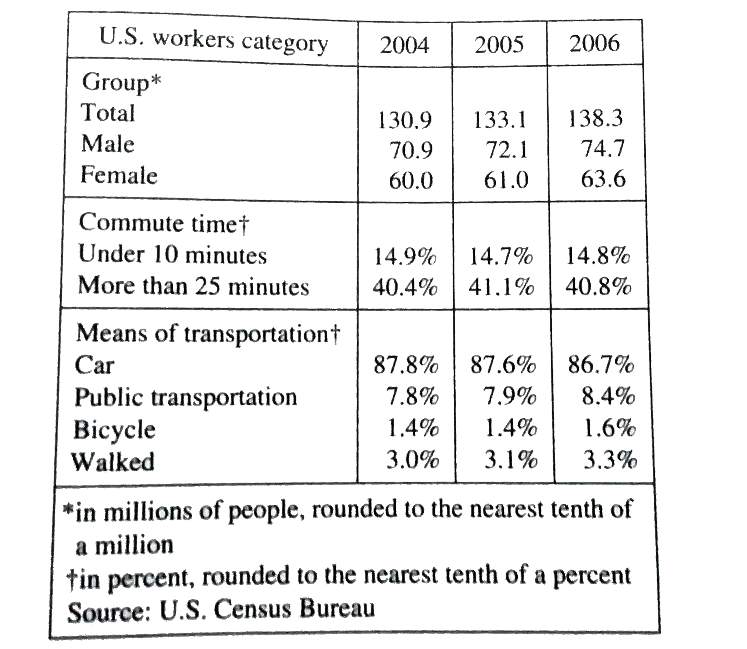
The the nearest percent , what percent of all U.S workers age 16 or over in 2004 was female ?A50%B48%C46%D44%The table below details a recent census report about the commuting habits of U.S . Workers age 16 or over for the years 2004 , 2005 , and 2006.
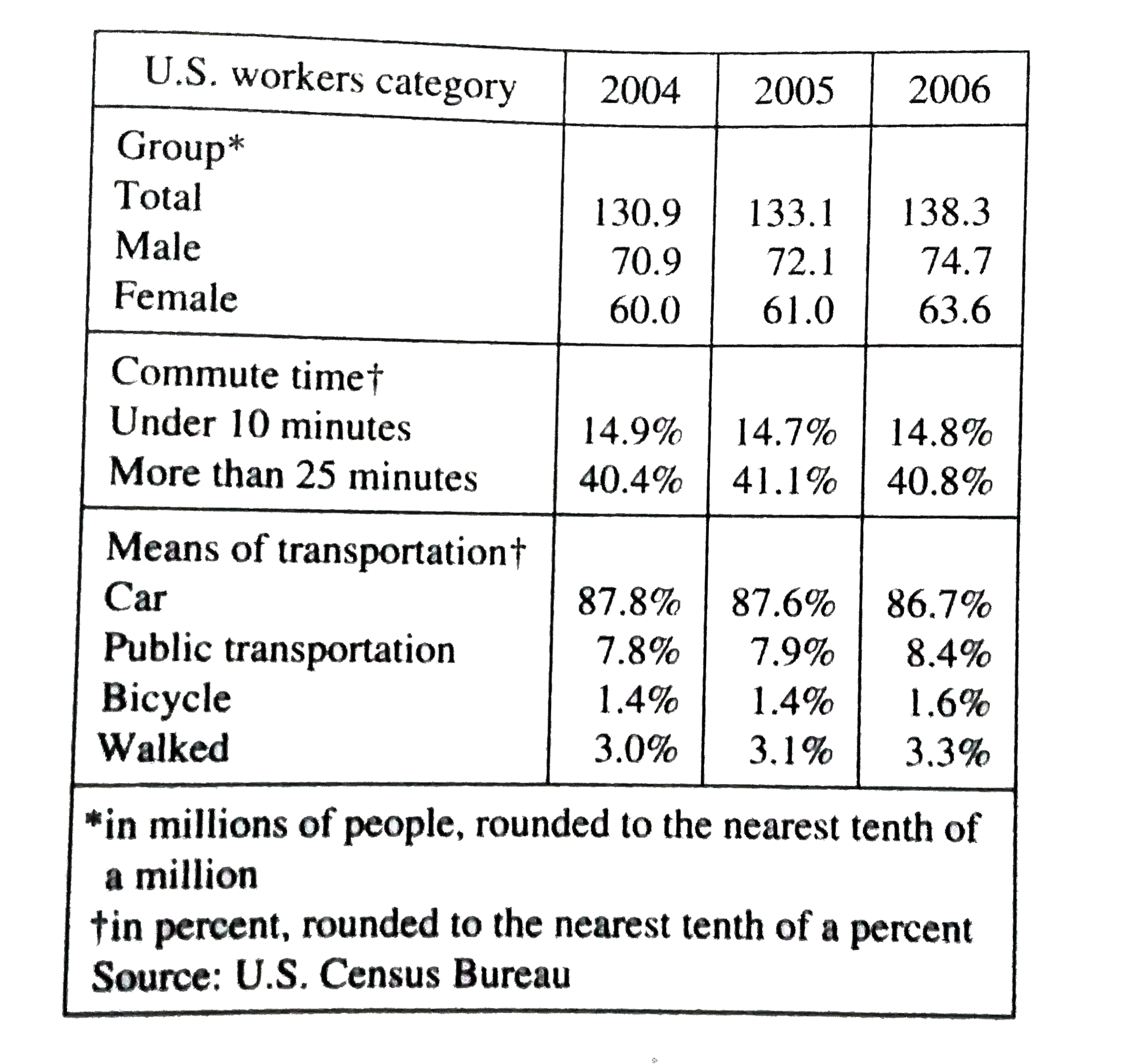
Expressed in millions of people , what was the average growth per year for female U.S workers age 16 or over from 2004 to 2006 , rounded to the nearest 0.1 million ?A0.5B0.9C1.3D1.8The table below details a recent census report about the commuting habits of U.S . Workers age 16 or over for the years 2004 , 2005 , and 2006.
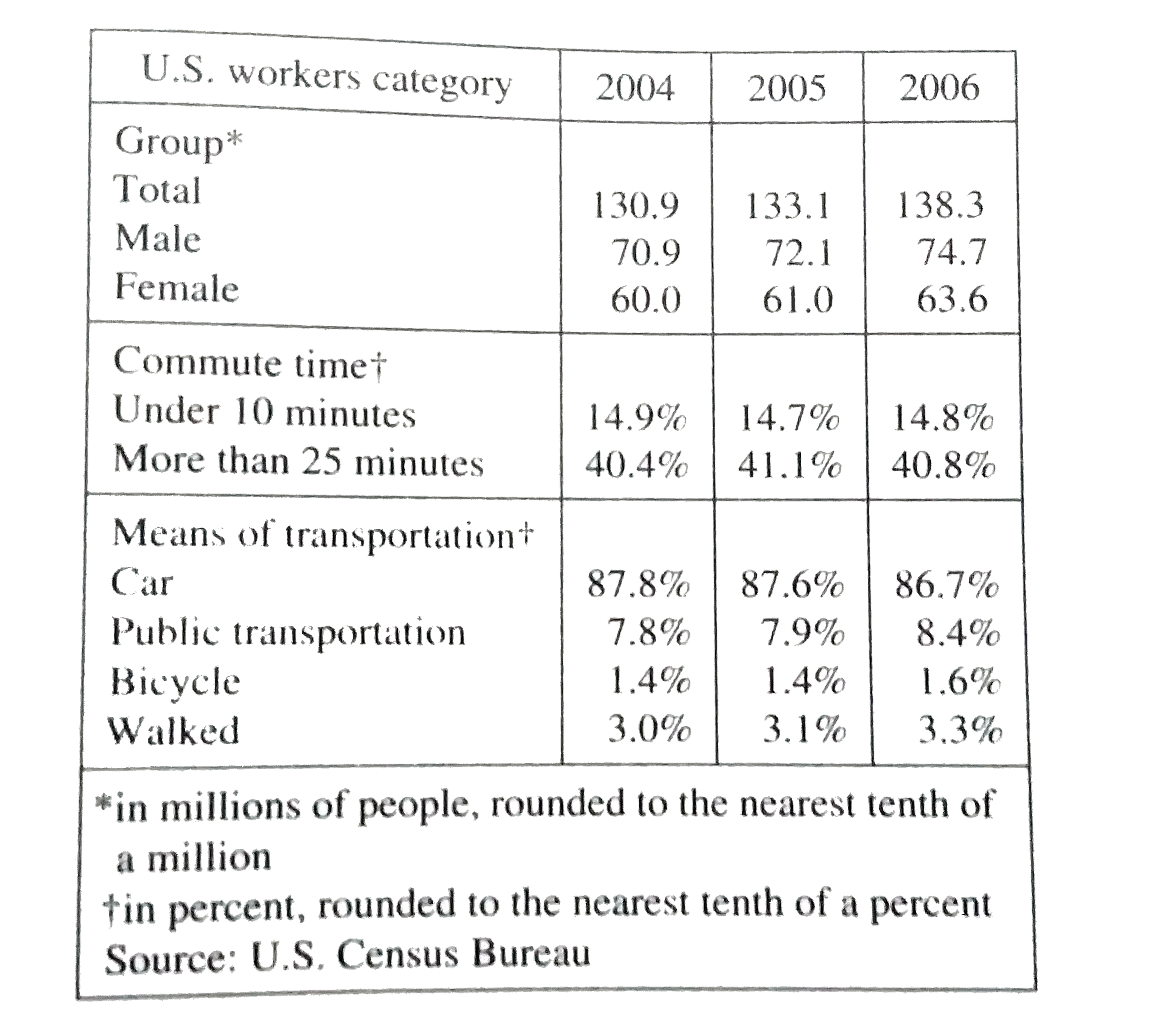
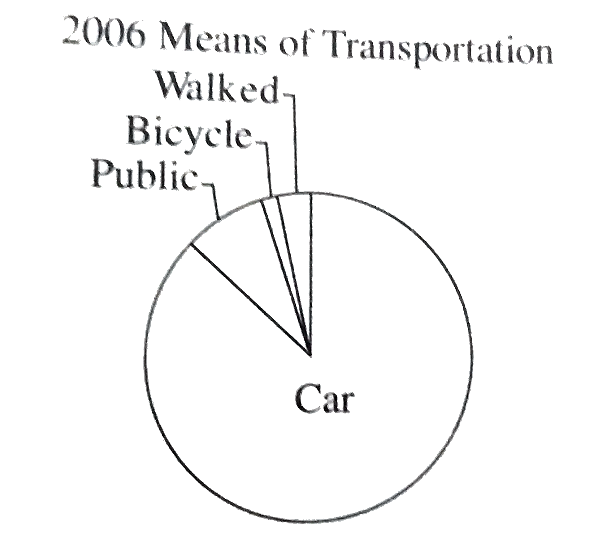
The circle graph (pie chart ) below represents the 2006 means of transportation for U.S . workers age 16 or over for the four transportation types listed . To the nearest degree , What is the measure of the central angle for the " Public " sector ?
 A8∘B12∘C20∘D30∘
Answer question numbers 3(a) - 3(d) on the basis of your understanding of the following paragraph and the related studied concepts:
Around the year 1800, only 30 elements were known. Dobereiner in 1817 and Newlands in 1866 tried to arrange the then known elements and framed laws which were rejected by the scientists. Even after the ejection of the proposed laws, many scientists continued to search for a pattern that correlated the properties of elements with their atomic masses.
The main credit for classifying elements goes to Mendeleev for his most important contribution to the early development of a Periodic table of elements wherein he arranged the elements on the basis of their fundamental property, the atomic mass and also on the similarity of chemical properties. The formula of their hydrides and oxides were treated as basic criteria for the classification of the elements.
However, Mendeleev's classification also had some limitations as it could not assign the position to isotopes. He also left some gaps in the periodic table.
3(a) state Mendeleev's Periodic Law.
3(b) Why did Mendeleev leave some gaps in the Periodic table?
3(c) if the letter 'R' was used to represent any of the elements in the group , then the hydride and oxide of carbon would respectively be represented as
(i) RH4, RO
(ii) RH4, RO2
(iii) RH2, RO2
(iv) RH2, RO
3(d) isotopes are
(i) atoms of an element with similar chemical properties but different atomic masses.
(ii) atoms of different elements with similar chemical properties but different atomic masses.
(iii) atoms of an element with different chemical properties but same atomic masses.
(iv) atoms of different elements with different chemical properties but same atomic masses.
View SolutionFor each of 3 years , the table below gives the number of different routes a runner ran , the number of runs she ran , and the total number of miles she ran .
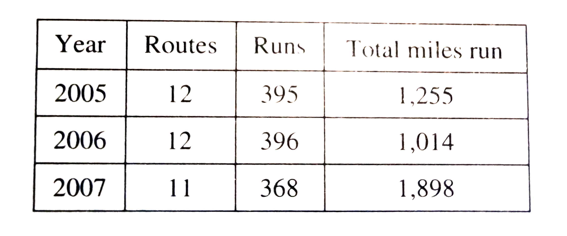
To the nearest tenth of a mile , what is the average number of miles the runner ran per run in 2005 ?
View SolutionIN GORILLA society, power belongs to silverback males. These splendid creatures have numerous status markers besides their back hair: they are bigger than the rest of their band, strike space filling postures, produce deeper sounds, thump their chests lustily and, in general, exude an air of physical fitness. Things are not that different in the corporate world. The typical chief executive is more than six feet tall, has a deep voice, a good posture, a touch of grey in his thick, lustrous hair and, for his age, a fit body. Bosses spread themselves out behind their large desks. They stand tall when talking to subordinates. Their conversation is laden with prestige pauses and declarative statements. The big difference between gorillas and humans is, of course, that human society changes rapidly. The past few decades have seen a striking change in thedistribution of power-between men and women, the West and the emerging world and geeks and non geeks. Women run some of America's largest firms, such as General Motors (Mary Barra) and IBM (Virginia Rometty). More than half of the world's biggest 2,500 public companies have their headquarters outside the West. Geeks barely out of short trousers run some of the world's most dynamic businesses. Peter Thiel, one of Silicon Valley's leading investors, has introduced a blanket rule: never invest in a CEO who wears a suit. Yet it is remarkable, in this supposed age of diversity, how many bosses still conform to the stereotype. First, they are tall: in research for his 2005 book, "Blink", Malcolm Glad well found that 30% of CEOs of Fortune 500 companies are 6 feet 2 inches or taller, compared with 3.9% of the American population. People who "sound right" also have a marked advantage in the race for the top. Quantified Communications, a Texas-based company, asked people to evaluate speeches delivered by 120 executives. They found that voice quality accounted for 23% of listeners' evaluations and the content of the speech only accounted for 11%. Academics from the business schools of the University of California, San Diego and Duke University listened to 792 male CEOs giving presentations to investors and found that those with the deepest voices earned $187,000 a year more than the average. Physical fitness seems to matter too: a study published this month, by Peter Limbach of the Karlsruhe Institute of Technology and Florian Sonnenburg of the University of Cologne, found that companies in America's S&P 1500 index whose CEOs had finished a marathon were worth 5% more on average than those whose bosses had not. Good posture makes people act like leaders as well as look like them: Amy Cuddy of Harvard Business School notes that the very act of standing tall, with your feet planted solidly and somewhat apart, your chest out and your shoulders back, boosts the supply of testosterone to the blood and lowers the supply of cortisol, a steroid associated with stress. (Unfortunately, this also increases the chance that you will make a risky bet.) Besides relying on all these supposedly positive indicators of fitness to lead, those who choose bosses also rely on some negative stereotypes. Overweight people women especially-are judged incapable of controlling themselves, let alone others. Those who "uptalk" - habitually ending their statements on a high note as if asking a question-rule themselves out on the grounds that they sound tentative and juvenile.
For each word given below choose the correct meaning (as used in the passage) from the options provided:
stereotype
View SolutionIN GORILLA society, power belongs to silverback males. These splendid creatures have numerous status markers besides their back hair: they are bigger than the rest of their band, strike space filling postures, produce deeper sounds, thump their chests lustily and, in general, exude an air of physical fitness. Things are not that different in the corporate world. The typical chief executive is more than six feet tall, has a deep voice, a good posture, a touch of grey in his thick, lustrous hair and, for his age, a fit body. Bosses spread themselves out behind their large desks. They stand tall when talking to subordinates. Their conversation is laden with prestige pauses and declarative statements. The big difference between gorillas and humans is, of course, that human society changes rapidly. The past few decades have seen a striking change in thedistribution of power-between men and women, the West and the emerging world and geeks and non geeks. Women run some of America's largest firms, such as General Motors (Mary Barra) and IBM (Virginia Rometty). More than half of the world's biggest 2,500 public companies have their headquarters outside the West. Geeks barely out of short trousers run some of the world's most dynamic businesses. Peter Thiel, one of Silicon Valley's leading investors, has introduced a blanket rule: never invest in a CEO who wears a suit. Yet it is remarkable, in this supposed age of diversity, how many bosses still conform to the stereotype. First, they are tall: in research for his 2005 book, "Blink", Malcolm Glad well found that 30% of CEOs of Fortune 500 companies are 6 feet 2 inches or taller, compared with 3.9% of the American population. People who "sound right" also have a marked advantage in the race for the top. Quantified Communications, a Texas-based company, asked people to evaluate speeches delivered by 120 executives. They found that voice quality accounted for 23% of listeners' evaluations and the content of the speech only accounted for 11%. Academics from the business schools of the University of California, San Diego and Duke University listened to 792 male CEOs giving presentations to investors and found that those with the deepest voices earned $187,000 a year more than the average. Physical fitness seems to matter too: a study published this month, by Peter Limbach of the Karlsruhe Institute of Technology and Florian Sonnenburg of the University of Cologne, found that companies in America's S&P 1500 index whose CEOs had finished a marathon were worth 5% more on average than those whose bosses had not. Good posture makes people act like leaders as well as look like them: Amy Cuddy of Harvard Business School notes that the very act of standing tall, with your feet planted solidly and somewhat apart, your chest out and your shoulders back, boosts the supply of testosterone to the blood and lowers the supply of cortisol, a steroid associated with stress. (Unfortunately, this also increases the chance that you will make a risky bet.) Besides relying on all these supposedly positive indicators of fitness to lead, those who choose bosses also rely on some negative stereotypes. Overweight people women especially-are judged incapable of controlling themselves, let alone others. Those who "uptalk" - habitually ending their statements on a high note as if asking a question-rule themselves out on the grounds that they sound tentative and juvenile.
Which of the following statement is FALSE in the context of the passage?
View SolutionIN GORILLA society, power belongs to silverback males. These splendid creatures have numerous status markers besides their back hair: they are bigger than the rest of their band, strike space filling postures, produce deeper sounds, thump their chests lustily and, in general, exude an air of physical fitness. Things are not that different in the corporate world. The typical chief executive is more than six feet tall, has a deep voice, a good posture, a touch of grey in his thick, lustrous hair and, for his age, a fit body. Bosses spread themselves out behind their large desks. They stand tall when talking to subordinates. Their conversation is laden with prestige pauses and declarative statements. The big difference between gorillas and humans is, of course, that human society changes rapidly. The past few decades have seen a striking change in thedistribution of power-between men and women, the West and the emerging world and geeks and non geeks. Women run some of America's largest firms, such as General Motors (Mary Barra) and IBM (Virginia Rometty). More than half of the world's biggest 2,500 public companies have their headquarters outside the West. Geeks barely out of short trousers run some of the world's most dynamic businesses. Peter Thiel, one of Silicon Valley's leading investors, has introduced a blanket rule: never invest in a CEO who wears a suit. Yet it is remarkable, in this supposed age of diversity, how many bosses still conform to the stereotype. First, they are tall: in research for his 2005 book, "Blink", Malcolm Glad well found that 30% of CEOs of Fortune 500 companies are 6 feet 2 inches or taller, compared with 3.9% of the American population. People who "sound right" also have a marked advantage in the race for the top. Quantified Communications, a Texas-based company, asked people to evaluate speeches delivered by 120 executives. They found that voice quality accounted for 23% of listeners' evaluations and the content of the speech only accounted for 11%. Academics from the business schools of the University of California, San Diego and Duke University listened to 792 male CEOs giving presentations to investors and found that those with the deepest voices earned $187,000 a year more than the average. Physical fitness seems to matter too: a study published this month, by Peter Limbach of the Karlsruhe Institute of Technology and Florian Sonnenburg of the University of Cologne, found that companies in America's S&P 1500 index whose CEOs had finished a marathon were worth 5% more on average than those whose bosses had not. Good posture makes people act like leaders as well as look like them: Amy Cuddy of Harvard Business School notes that the very act of standing tall, with your feet planted solidly and somewhat apart, your chest out and your shoulders back, boosts the supply of testosterone to the blood and lowers the supply of cortisol, a steroid associated with stress. (Unfortunately, this also increases the chance that you will make a risky bet.) Besides relying on all these supposedly positive indicators of fitness to lead, those who choose bosses also rely on some negative stereotypes. Overweight people women especially-are judged incapable of controlling themselves, let alone others. Those who "uptalk" - habitually ending their statements on a high note as if asking a question-rule themselves out on the grounds that they sound tentative and juvenile.
Which of the following statement is TRUE according to the passage?
(1) Gorillas have numerous status markers besides their back hair.
(2) Bosses stand tall when talking to subordinates.
(3) The big difference between gorillas and humans is, of course, that human society changes rapidly.
(4) Good posture makes people act like leaders as well as look like them.
View Solution
