A histogram
is a pictorial representation of the grouped data in which class intervals
and frequency are respectively taken along
(a) vertical
axis and horizontal axis
(b) vertical
axis only
(c) horizontal axis only
(d) horizontal axis and vertical axis.
To solve the question about the representation of class intervals and frequency in a histogram, let's follow these steps:
1. Understanding Histogram: A histogram is a type of bar graph that represents the distribution of numerical data. It is used to visualize the frequency of different ranges of values (class intervals).
2. Identifying Axes: In a histogram:
- The horizontal axis (x-axis) represents the class intervals. These are the ranges of data that are grouped together.
- The vertical axis (y-axis) represents the frequency. This indicates how many data points fall within each class interval.
3. Matching Options: Now, let's analyze the options given in the question:
- (a) vertical axis and horizontal axis
- (b) vertical axis only
- (c) horizontal axis only
- (d) horizontal axis and vertical axis
4. Correct Answer: Based on our understanding:
- Class intervals are on the horizontal axis.
- Frequency is on the vertical axis.
- Therefore, the correct option that describes this relationship is (d) horizontal axis and vertical axis.
5. Conclusion: In a histogram, class intervals are plotted on the horizontal axis, and frequencies are plotted on the vertical axis.
Final Answer:
The correct option is (d) horizontal axis and vertical axis.
---
- The horizontal axis (x-axis) represents the class intervals. These are the ranges of data that are grouped together.
- The vertical axis (y-axis) represents the frequency. This indicates how many data points fall within each class interval.
- (a) vertical axis and horizontal axis
- (b) vertical axis only
- (c) horizontal axis only
- (d) horizontal axis and vertical axis
- Class intervals are on the horizontal axis.
- Frequency is on the vertical axis.
- Therefore, the correct option that describes this relationship is (d) horizontal axis and vertical axis.
The correct option is (d) horizontal axis and vertical axis.
Topper's Solved these Questions
Similar Questions
In a histogram the class intervals or the groups are taken along (a)Y-axis (b) X-axis (c)both of X-axis and Y-axis (d) in between X and Y axis
View SolutionFind the equation of the ellipse whose centre is the origin, major axis 92 and eccentricity 1√3 where the major axis is the horizontal axis.
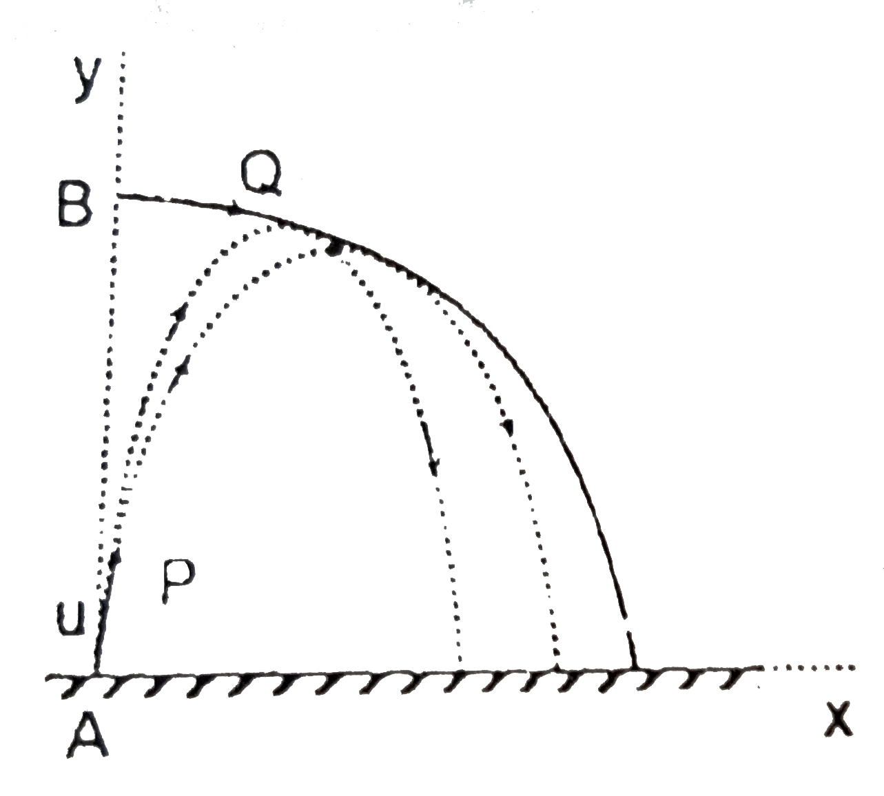
View SolutionA particle P is to be projected from a fixed point A on the ground with a fixed speed u. Another particle Q is also to be projected from a point B which is directly above the point A. The trajectory of the particle Q touches all possible trajectories (for different angle of projection) of the particle P in the vertical x−y plane. Find the equation of trajectory of the particle Q. (Take the point A as origin, horizontal axis x− axis and vertical axis y−axis Consider the figure.)

View SolutionFind the equation to the ellipse with axes as the axes of coordinates.
major axis 92 and eccentricity 1√3, where the major axis is the horizontal axis,
View SolutionA dip circle is at right angles to the magnetic meridian. What will be the apparent dip ?
View SolutionA uniform of mass m and length L is tied to a vertical shaft. It rotates in horizontal plane about the vertical axis at angular velocity ω. How much horizontal force does the shaft exert on the rod?

View SolutionWhich two orbitals are located along the axis, and not between the axis?
View SolutionName any two letters of the English alphabet which have:
a. only horizontal line of symmetry
b. only vertical line of symmetry
c. both horizontal and vertical lines of symmetry.
View SolutionPressure gradient in the horizontal direction in a static fluid is represented by (z-direction is vertically upwards, and x-axis is along horizontal, d is density of fluid):
View SolutionThe vertical component of a vector is equal to its horizontal component. What is the angle made by the vector with x-axis ?
View Solution
