The graph given below shows the variations in the population of producers, primary consumers and secondary consumers as well as the amount of dissolved mineral salts in a pond
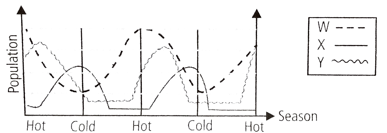
Which one of the following correctly matches each graph?
Producer populationPrimary consumer populationSecondary consumer populationXYW
Producer populationPrimary consumer populationSecondary consumer populationWXY
Producer populationPrimary consumer populationSecondary consumer populationWYX
Producer populationPrimary consumer populationSecondary consumer populationXWY
The correct Answer is:C
Step by step video, text & image solution for The graph given below shows the variations in the population of producers, primary consumers and secondary consumers as well as the amount of dissolved mineral salts in a pond Which one of the following correctly matches each graph? by Biology experts to help you in doubts & scoring excellent marks in Class 12 exams.
Updated on:21/07/2023Topper's Solved these Questions
- ECOSYSTEMBOOK - NCERT FINGERTPS ENGLISHCHAPTER - ECOSYSTEMEXERCISE - Ecosystem
140 Videos
- BIOTECHNOLOGY AND ITS APPLICATIONBOOK - NCERT FINGERTPS ENGLISHCHAPTER - BIOTECHNOLOGY AND ITS APPLICATIONEXERCISE - Biotechnology And Its Application
137 Videos
- ENVIRONMENTAL ISSUESBOOK - NCERT FINGERTPS ENGLISHCHAPTER - ENVIRONMENTAL ISSUESEXERCISE - Environmental Issues
142 Videos
Similar Questions
Which of the following acts as a primary as well a secondary consumer in the forest eco-system?
View SolutionThe equation of a tangent to the parabola y2=8xisy=x+2 . The point on this line from which the other tangent to the parabola is perpendicular to the given tangent is (1) (−1,1) (2) (0,2) (3) (2,4) (4) (−2,0)
View Solution
Knowledge Check
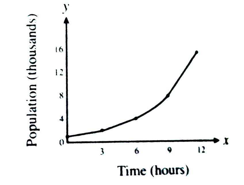
The graph above shows the size of a certain population after time t. Which of the following equations correctly shows y as a function of t ?Ay=t3By=1.000−2t3Cy=3t2Dy=1,000t-2,000Given below are some differences between primary air pollutants and secondary air pollutants.
Which one of the following is an incorrect difference ?A Primary air pollutantsSecondary sir pollutantsThese persist in the form in which they are added to the environment.These are formed by interaction among the primary pollutants.B Primary air pollutantsSecondary sir pollutantsThese are more toxic than the secondary pollutants.These are less toxic than the primary pollutantsC Primary air pollutantsSecondary sir pollutantsExamples include DDT,CO2Examples include Ozone, PANDNone of these
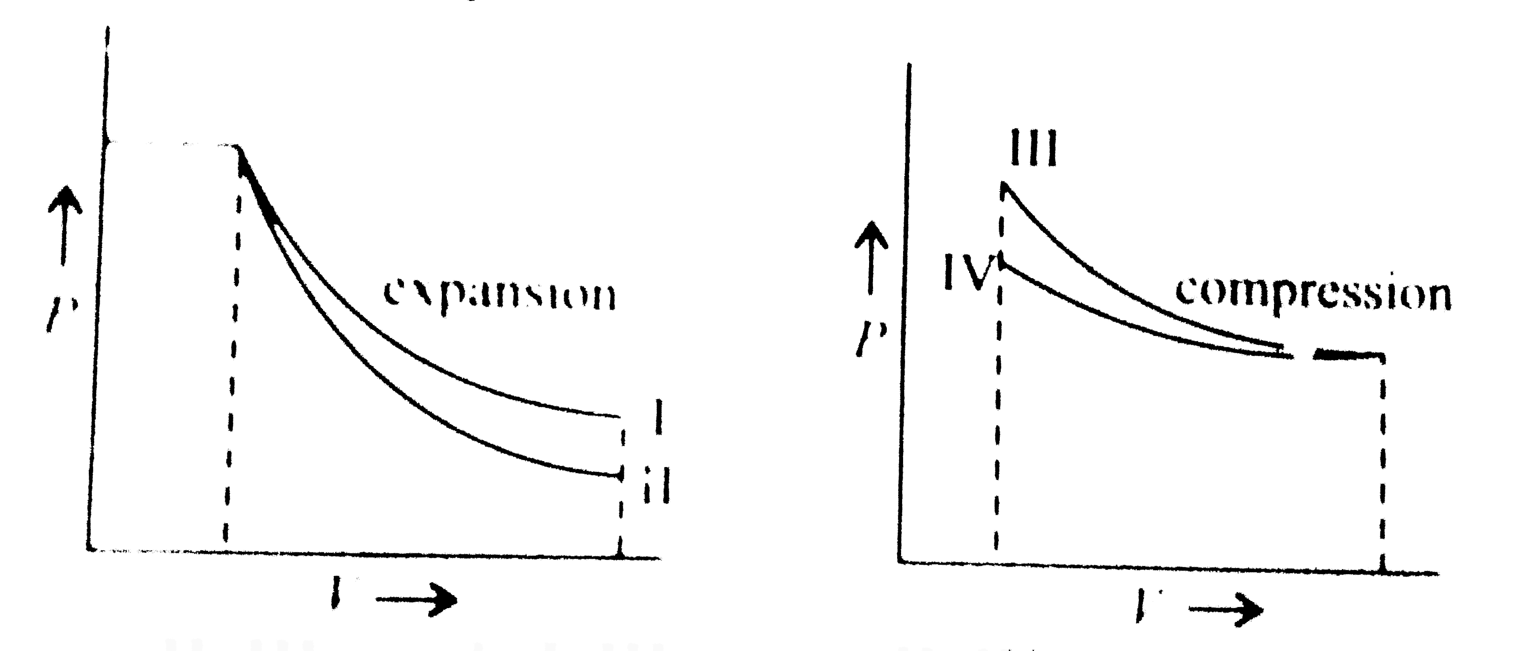
Which of the following graphs given below show (s) adiabatic process?
View SolutionThe graph given show the position of two cars A and B as a function of time. The cars move along the x axis on parallel but separate tracks, so that they can pass each other's position without colliding.
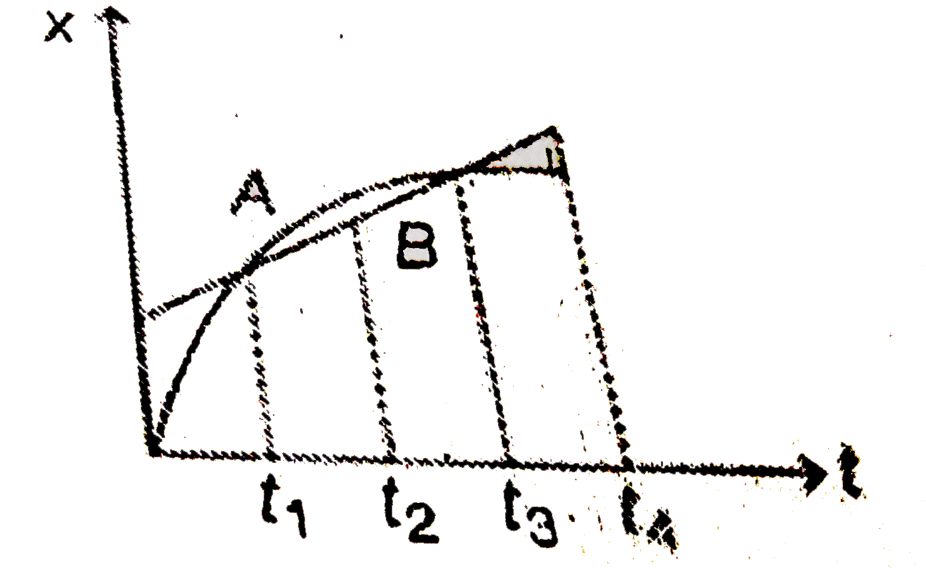
Which one of the following best describes the motion of car A as shown on the graphs?
View SolutionBetween 1985 and 2003, data were collected every three years on the amount of plastic produced annually in the United States, in billions of pounds. The graph below shows the data and a line of best fit. The equation of the line of best fit is y = 3.39x + 46.89, where x is the number of years since 1985 and y is the amount of plastic produced annually, in billions of pounds.
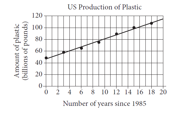
Which of the following is closest to the percent increase in the billions of pounds of plastic produced in the United States from 2000 to 2003?
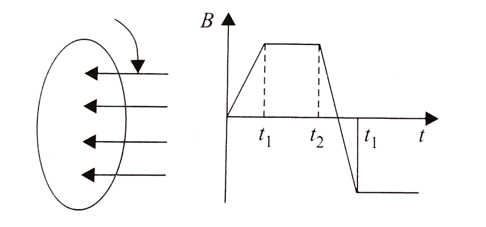
View SolutionA wire loop is placed in a region of time varying magnetic field which is oriented orthogonally to the plane of the loop as shown in Fig. The graph shows the magnetic field variation as the function of time. Assume the positive emf is the one which drives a current in the clockwise direction and seen by the observer in the direction of B. Which of the following graphs best represents the induced emf as a function of time?
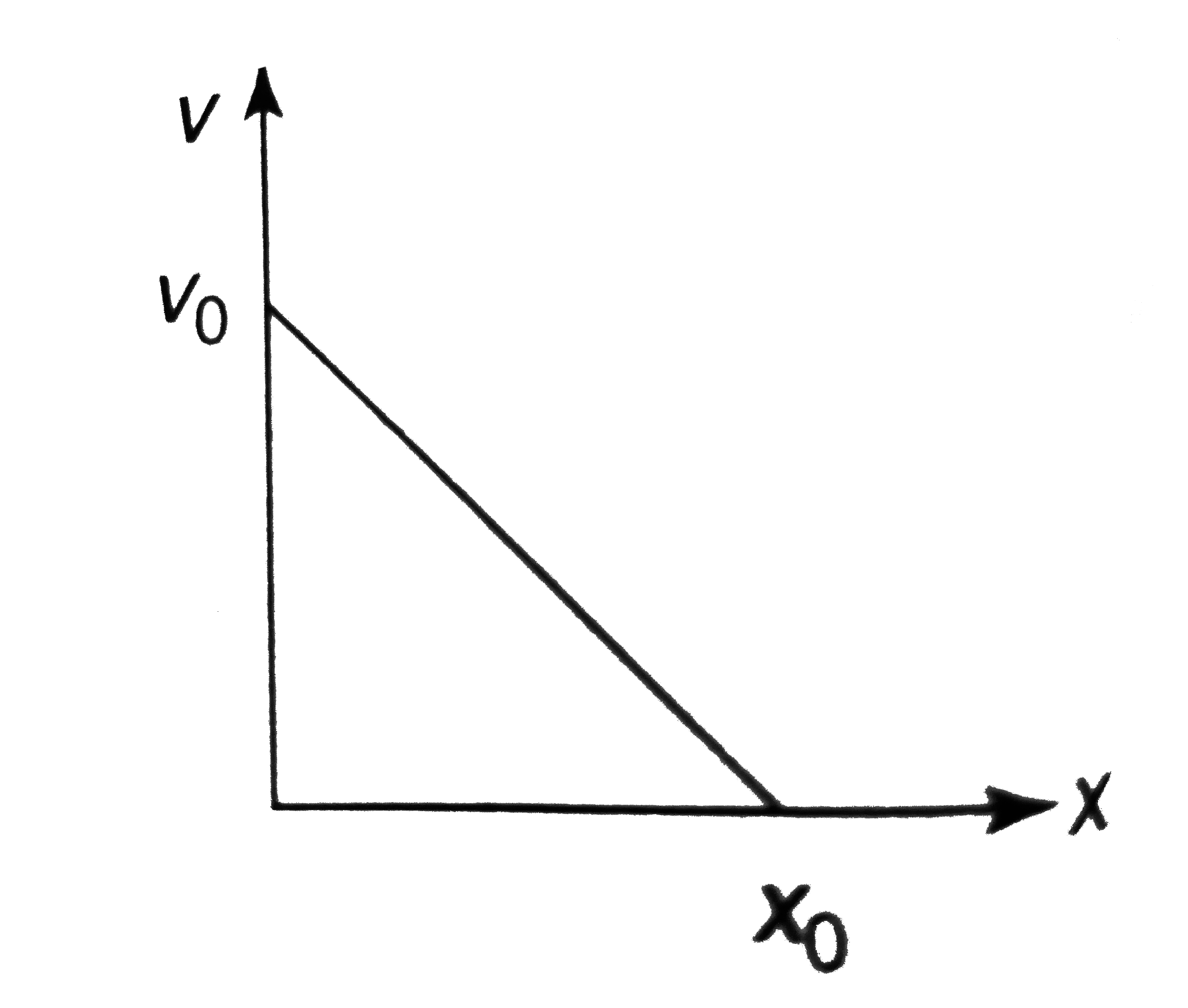
View SolutionThe given graph shows the variation of velocity with displacement. Which one of the graphs given below correctly represents the variation of acceleration with displacement ?
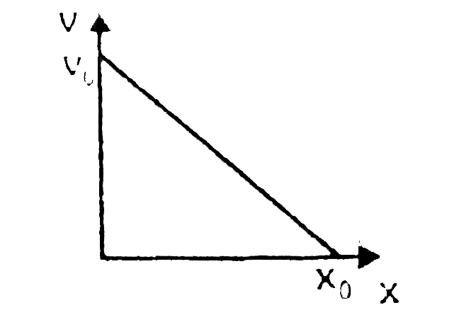
View SolutionThe given graph shows the variation of velocity with displacement. Which one of the graph given below correctly represents the variation of acceleration with displacement :-
View Solution
