The given Bar graph presents the numbers of students from Science and Arts streams from a school in different years.
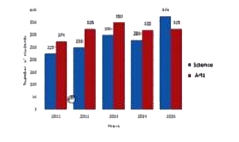
In which year the number of Arts stu- dents is 30% more than that of Science?
2013
2014
2012
2011
Step by step video & image solution for The given Bar graph presents the numbers of students from Science and Arts streams from a school in different years. In which year the number of Arts stu- dents is 30% more than that of Science? by Maths experts to help you in doubts & scoring excellent marks in Class 14 exams.
Updated on:21/07/2023Topper's Solved these Questions
Similar Questions
The given bar graph presents the number of students from Science and Arts streams from a school in different years.
दिया गया दंड आरेख अलग-अलग वर्षों में एक विद्यालय में विज्ञान एवं कला संकाय के छात्रों की संख्या को दर्शाता है |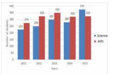 What is the ratio of the total number of Science students in 2011 and 2015 to that of Arts in 2012 and 2015?
2011 तथा 2015 में विज्ञान के छात्रों की कुल संख्या का 2012 तथा 2015 में कला के छात्रों की कुल संख्या के साथ अनुपात ज्ञात करें |
View SolutionDirections: Read the given information carefully and answer the following questions. Three streams Arts, Science, and Commerce are offered in 3 colleges A, B, and C.
There are 1750 students in college A. The number of Commerce students in college A is 400 more than that of in Science in college A. the ratio of the number of students in college A in Arts and Science is 23 : 2) (2) There are 3250 students in Arts in all colleges. The number of students in Science in all colleges is 37.5% less than that of in Commerce in all colleges. (3) The number of Arts students in college C is 10% more than that of in college B. the ratio of the number of students in Science in college B to that of in college C is 3 : 4) (4) The number of students in Commerce in college B is 30% less than that in college A. total number of students in college B is 280 less than that of in college C.
The total number of students in college B is what percent more/less than that of in Science in all colleges?
View Solution
Knowledge Check
The given Bar graph presents the numbers of students from Science and Arts streams from a school in different years.

In which year the number of Arts students is 30% more than that of Science?A2013B2014C2012D2011The given Bar graph present the number of students from Science and Arts streams from a school in different years
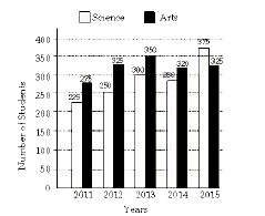
In which year the number of arts students is 30% more than that of science?A2013B2014C2012D2011The given Bar graph presents the numbers of students from Science and Arts streams from a school in different years.
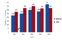
The average of number of Science stu- dents in 2011, 2013 and 2015 is what percentage more than the number of Arts students in 2011?A1119%B9311%C9111%D819%
The given Bar graph present the number of students from Science and Arts streams from a school in different years

The total number of Arts students in 2011, 2013 and 2015 is what percentage less than that of science in the given five years
View SolutionThe given Bar graph presents the number of students of two schools for six years
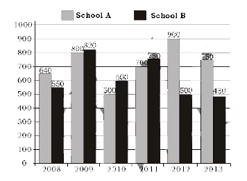
What is the average of the number of students from school A during the six year period?
View SolutionThe given Bar Graph presents the number of students of two schools for six years.
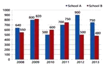
What is the average of the number of students from school A during the six year period?
View SolutionThe given bar graph presents the number of students two schools for six years.
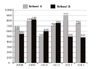
In which year, the absolute difference between the number of students in two schools is the highest?
View SolutionThe given bar graph presents the number of students enrolled for a vocational course in institutes A and B during a period of five years.
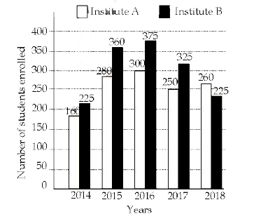
percentage the number of students enrolled in B more than the number of students enrolled in A during 2017?
View Solution
