The line graph shows the production of steel of a certain country. Study the diagram and answer the following questions.
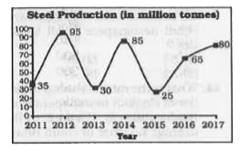
What was the difference (in million tonnes) in the steel production between the years 2011 and 2015?
10
5
15
20
The correct Answer is:A
Step by step video, text & image solution for The line graph shows the production of steel of a certain country. Study the diagram and answer the following questions. What was the difference (in million tonnes) in the steel production between the years 2011 and 2015? by Maths experts to help you in doubts & scoring excellent marks in Class 14 exams.
Topper's Solved these Questions
- BOOK - KIRAN PUBLICATIONCHAPTER - STATISTICS AND DATA INTERPRETATIONEXERCISE - TYPE-VII363videos
STATISTICS AND DATA INTERPRETATION
- BOOK - KIRAN PUBLICATIONCHAPTER - STATISTICS AND DATA INTERPRETATIONEXERCISE - TYPE-VIII8videos
STATISTICS AND DATA INTERPRETATION
- BOOK - KIRAN PUBLICATIONCHAPTER - STATISTICS AND DATA INTERPRETATIONEXERCISE - TYPE-V38videos
STATISTICS AND DATA INTERPRETATION
- BOOK - KIRAN PUBLICATIONCHAPTER - SIMPLIFICATIONEXERCISE - TEST YOURSELF25videos
SIMPLIFICATION
- BOOK - KIRAN PUBLICATIONCHAPTER - TIME AND DISTANCEEXERCISE - Type -XI74videos
TIME AND DISTANCE
Similar Questions
The line graph shows the Sales per employee of a certain company. Study the diagram and answer the following questions.
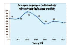
What was the difference in the Sales per employee (in Rs lakhs) between the years 2011 and 2015?View SolutionThe line graph show the number of students admitted in the given year to a certain university. Study the diagram and answer the following questions.
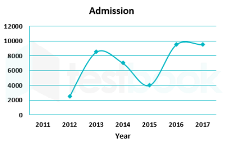
What was the difference in admissions between the years 2016 and 2012 ?View Solution
Knowledge Check
- Question 1 - Select One
The line graph shows the production of steel of a certain country. Study the diagram and answer the following questions.
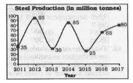
If 1 tonne of steel costs Rs. 30,000, what was the cost (in Rs billion) of the steel production in the year 2017?A240B3000C2400D300 - Question 2 - Select One
The line graph shows the production of steel of a certain country. Study the diagram and answer the following questions.

In which year was the steel production lesser than that of the previous year?A2013B2014C2012D2016 - Question 3 - Select One
The line graph shows the number of vacancies for sales officers in a certain company. Study the diagram and answer the following questions.
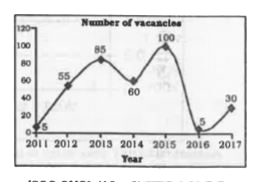
What was the difference in the number of vacancies between the years 2015 and 2012?A55B40C50D45
The line graph shows the number of vacancies for sales officers in a certain company. Study the diagram and answer the following questions.

What was the difference in the number of vacancies between the years 2015 and 2012?View SolutionThe line graph shows the production of steel of a certain country. Study the diagram and answer the following questions.
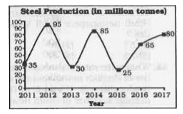
The steel production in 2012 was greater than that in 2015 by _____.View SolutionThe line graph shows the number of deaths due to rail accidents in a certain state. Study the diagram and answer the following questions.
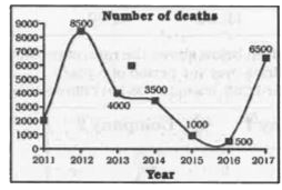
What was the difference between the number of deaths between the years 2012 and 2015?View SolutionThe line graph shows the number of deaths due to road accidents in a certain state. Study the diagram and answer the following questions.
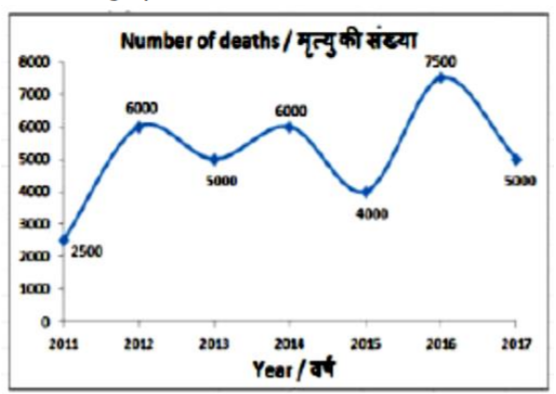
What was the difference in the number of deaths between the years 2011 and 2013?View SolutionThe line graph shows the number of vacancies for executives in a certain company. Study the diagram and answer the following questions.
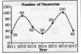
What was the difference in the number of vacancies between the years 2016 and 2014?View Solution

