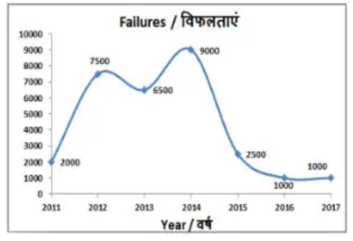
The line graph shows the number of students of a certain university who failed in the given year in their final exams. Study the diagram and answer the following questions
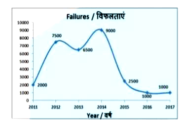
Failures in 2014 were greater than that in 2012 by ________.
0.25
0.1667
0.2
0.15
0.2
Similar Questions
The line graph shows the number of students of a certain university who passed in the given year in their final exams. Study the diagram and answer the following questions.
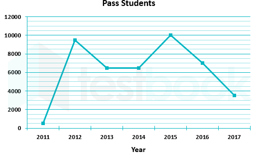
Number of students who passed in 2016 were greater than that in 2017 by ________.
View SolutionThe line graph shows the number of students of a certain university who failed in the given year in their final exams. Study the diagram and answer the following questions
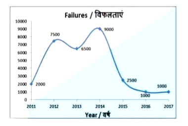
In which year were failures greater than that of the previous year?
View SolutionThe line graph shows the number of students of a certain university who failed in the given year in their final exams. Study the diagram and answer the following questions
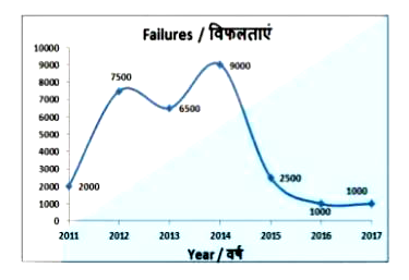
What is the average number of failures in the last three years?
View SolutionThe line graph shows the number of students of a certain university who failed in the given year in their final exams. Study the diagram and answer the following questions
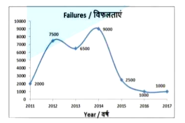
What was the difference in failures between the years 2011 and 2013?
View SolutionThe line graph shows the number of students of a certain university who passed in the given year in their final exams. Study the diagram and answer the following questions.
In which year were number of students who passed were more than those who passed in the previous year?
View SolutionThe line graph shows the number of students of a certain university who passed in the given year in their final exams. Study the diagram and answer the following questions.

If students who pass are given a certificate, what is the number of certificates awarded in the last three years?
View SolutionThe line graph shows the number of students of a certain university who passed in the given year in their final exams. Study the diagram and answer the following questions.

What was the difference in the number of students who passed between the years 2013 and 2016?
View SolutionThe line graph show s the number of student admitted in the given year to a certain university. Study the diagram and answer the following questions.
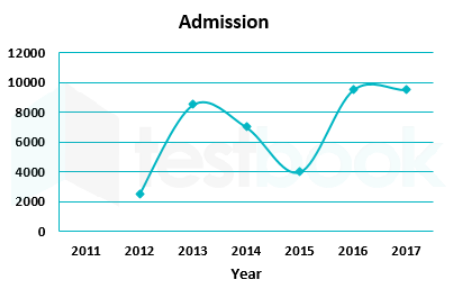
Admissions in 2016 were greater than that in 2015 by __________ .
View SolutionThe line graph shows the exprots by a certain company. Study the diagram and answer the following questions.
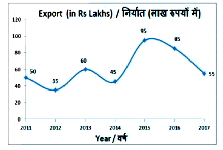
The exports in 2014 were lesser than that in 2011 by ________.
View SolutionThe line graph shows the number of students admitted in the given year to a certain university. Study the diagram and answer the following questions.
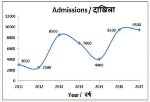
In which year were admissions greater that that of the previous years ?
View Solution
