The line graph shows the number of candidates who applied for admission to a certain college. Study the diagram and answer the following questions.

What was the difference in applications between the years 2017 and 2012 ?
3500
2000
2500
3000
The correct Answer is:D
Step by step video, text & image solution for The line graph shows the number of candidates who applied for admission to a certain college. Study the diagram and answer the following questions. What was the difference in applications between the years 2017 and 2012 ? by Maths experts to help you in doubts & scoring excellent marks in Class 14 exams.
Similar Questions
The line graph show the number of students admitted in the given year to a certain university. Study the diagram and answer the following questions.
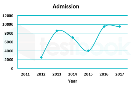
What was the difference in admissions between the years 2016 and 2012 ?View SolutionThe line graph shows the number of vacancies for executives in a certain company. Study the diagram and answer the following questions.
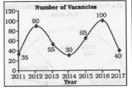
What was the difference in the number of vacancies between the years 2016 and 2014?View Solution
Knowledge Check
- Question 1 - Select One
The line graph shows the number of candidates who applied for admission to a certain college. Study the diagram and answer the following questions.
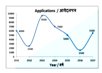
In which year were applications greater than that of the previous year?
A2012B2014C2015D2013 - Question 2 - Select One
The line graph shows the number of vacancies for sales officers in a certain company. Study the diagram and answer the following questions.
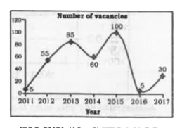
What was the difference in the number of vacancies between the years 2015 and 2012?A55B40C50D45 - Question 3 - Select One
The line graph shows the number of vacancies for sales officers in a certain company. Study the diagram and answer the following questions.

What was the difference in the number of vacancies between the years 2015 and 2012?A55B40C50D45
The line graph shows the number of vacancies for executives in a certain company. Study the diagram and answer the following questions.

What was the difference in the number of vacancies between the years 2016 and 2014?View SolutionThe line graph shows the number of vacancies for executives in a certain company. Study the diagram and answer the following questions.

What was the difference in the number of vacancies between the years 2016 and 2014?View SolutionThe line graph shows the number of candidates who applied for admission to a certain college. Study the diagram and answer the following questions.
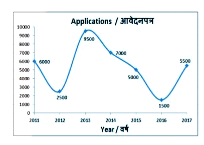
Applications in 2014 were greater than that in 2015 by _______View SolutionThe line graph shows the number of candidates who applied for admission to a certain college. Study the diagram and answer the following questions.
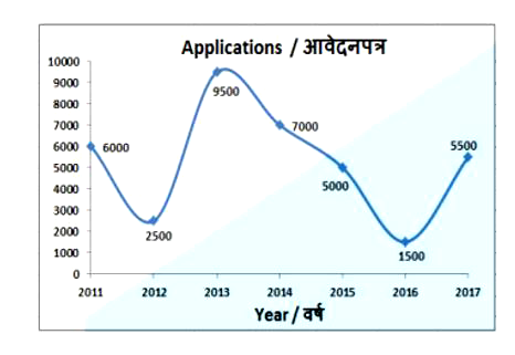
If each applicant has to submit Rs 500 as application fees how much did the college collect (in Rs lakhs) as application fees in the last three years?View SolutionThe line graph shows the number of deaths due to road accidents in a certain state. Study the diagram and answer the following questions.
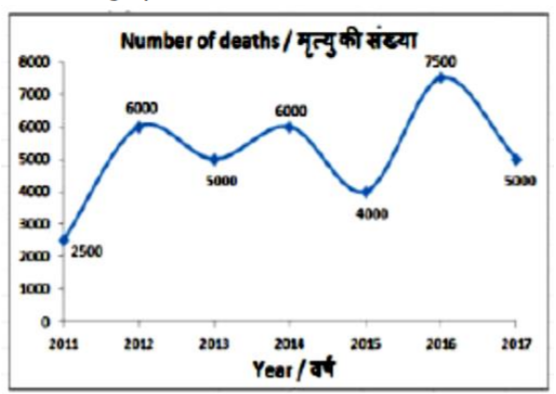
What was the difference in the number of deaths between the years 2011 and 2013?View Solution
