The given bar graph shows the number of students of two schools over a period of six years.
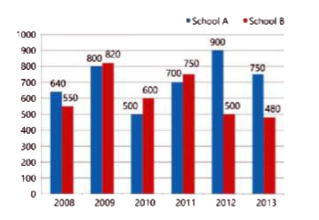
In the bar graph, in which year is the absolme difference of the students from schools A to B taken together, the maximum?
2013
2010
2011
2012
The correct Answer is:D
Step by step video & image solution for The given bar graph shows the number of students of two schools over a period of six years. In the bar graph, in which year is the absolme difference of the students from schools A to B taken together, the maximum? by Maths experts to help you in doubts & scoring excellent marks in Class 14 exams.
Similar Questions
The given bar graph shows the number of students of two schools over a period of six years.
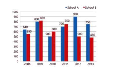
In the bar graph, what is the ratio of the average of total students from school B to the average of total students from school A?View SolutionThe given bar graph shows the number of students of two schools over a period of six years.
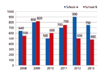
In the bar grnph, what is the ratio of ihe students taken for years the 2008, 20 12, 20 13 together from school A to ihe students taken for the years 2009, 20 lO, 20 11 together from school B?View Solution
Knowledge Check
- Question 1 - Select One
The given bar graph shows the number of students of two schools over a period of six years.
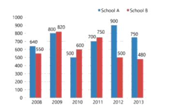
In the bar graph, what is the ratio of the average of the total students from school A to the average of the total students from school B ?A429:799B370:429C429:370D799:429 - Question 2 - Select One
In which year, the absolute difference of the students in two schools is the lowest ?
A2008B2011C2009D2012 - Question 3 - Select One
The given bar graph shows the number of students of two shools over a period of six years.
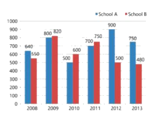
In the bar graph , what is the ratio of the students taken for the years 2009 , 2011, 2013 together from school A to the students taken for the years 2008 , 2012, 2013 togther from school B ?A25:17B17:25C18:25D25:18
The given bar graph presents the number of students two schools for six years.
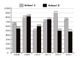
In which year, the absolute difference between the number of students in two schools is the highest?View SolutionThe given bar graph shows the biscuit exports of India over a period of five years. Study the graph and answer the questions that follows
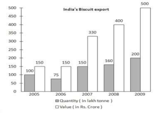
In which two year was the value per tonne equal?View SolutionIn which year the sum of the students in two school is the highest?
View SolutionWhat is the average number of students from school B during the six year period
View SolutionThe given Bar graph presents the number of students of two schools for six years
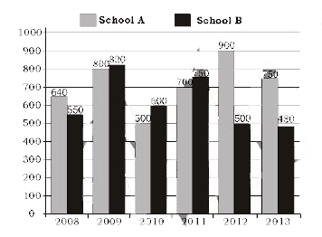
What is the average of the number of students from school A during the six year period?View Solution

