Read the passage carefully and answer the question given below :
The decision to bestow the 2016 Good Design Award, Japan's most prestigious design honour, upon the AuthaGraph World Map came as a surprise to many. Given that previous winners have been innovations like personal mobility chairs and robotic arms, people wondered what had impressed the judges about the design of a map. It turns out that this strange-looking map is the most proportionate depiction of our planet.
The world map, as we know it, uses the Mercator Projection, a mapping technique developed in 1569 by cartographer Gerardus Mercator. Through excellent for navigation, the method significantly distorts the size and proportion of land masses and bodies of water. So while North America and Africa appears to be about the same size, in reality, the former could fit inside Africa with room to spare for India, Argentina, Tunisia, and much more. Similarly, though Brazil is more than five times larger than Alaska, it is latter, that appears bigger. The reason for the discrepancies has to do with the challenge of transposing the 3-dimensional spherical surface of Earth onto a 2-dimensional flat map, a task that is surprisingly hard to do accurately.
Over the year, there have been numerous attempt to solve the issue. The Galls-Peters projection tried by vertically compressing the regions near the poles, while the Mollweide projection bent continents around the corners to portray them more accurately. Though the Boggs eumorphic projection showed the correct shape and land mass size by slicing the globe into sections, the map was not practical for ocean navigation.
The AuthaGraph World Map, which beat out 1,000 entries in various categories, appear to have solved the issue using geometry. Created by architect and designer Hajime Narukawa, it divides the globe into ninety-six equal triangles and projects them onto a tetrahedron shape. This simple technique preserves the proportions of the land and water when going from a 3-dimensional sphere to a 2-dimensional map.
The result is an accurate map that is unlike any other. Instead of lining up straight across, the continents curve upwards, as though smiling at finally being represented accurately. It also appears as though Africa and the Americas have swapped places. As for those tidy longitude and latitude grids ? They have been reduced to a mishmash of curvy and twisty lines!
Feitlinger
Question : What is the highlighting feature of the AuthaGraph World Map ?
It seems to have solved the issue using geometry only
It stood first among a thousand entries in various categories only
It divides the globe into ninety-six equal triangles and projects them onto a tetrahedron shape only
All of the above
The correct Answer is:D
Similar Questions
Knowledge Check
Read the passage carefully and answer the question given below :
The decision to bestow the 2016 Good Design Award, Japan's most prestigious design honour, upon the AuthaGraph World Map came as a surprise to many. Given that previous winners have been innovations like personal mobility chairs and robotic arms, people wondered what had impressed the judges about the design of a map. It turns out that this strange-looking map is the most proportionate depiction of our planet.
The world map, as we know it, uses the Mercator Projection, a mapping technique developed in 1569 by cartographer Gerardus Mercator. Through excellent for navigation, the method significantly distorts the size and proportion of land masses and bodies of water. So while North America and Africa appears to be about the same size, in reality, the former could fit inside Africa with room to spare for India, Argentina, Tunisia, and much more. Similarly, though Brazil is more than five times larger than Alaska, it is latter, that appears bigger. The reason for the discrepancies has to do with the challenge of transposing the 3-dimensional spherical surface of Earth onto a 2-dimensional flat map, a task that is surprisingly hard to do accurately.
Over the year, there have been numerous attempt to solve the issue. The Galls-Peters projection tried by vertically compressing the regions near the poles, while the Mollweide projection bent continents around the corners to portray them more accurately. Though the Boggs eumorphic projection showed the correct shape and land mass size by slicing the globe into sections, the map was not practical for ocean navigation.
The AuthaGraph World Map, which beat out 1,000 entries in various categories, appear to have solved the issue using geometry. Created by architect and designer Hajime Narukawa, it divides the globe into ninety-six equal triangles and projects them onto a tetrahedron shape. This simple technique preserves the proportions of the land and water when going from a 3-dimensional sphere to a 2-dimensional map.
The result is an accurate map that is unlike any other. Instead of lining up straight across, the continents curve upwards, as though smiling at finally being represented accurately. It also appears as though Africa and the Americas have swapped places. As for those tidy longitude and latitude grids ? They have been reduced to a mishmash of curvy and twisty lines!
Feitlinger
Question : The AuthaGraph World Map has been designed by :AGalls-PetersBBoggsCGerardus MercatorDHajimeRead the passage carefully and answer the question given below :
The decision to bestow the 2016 Good Design Award, Japan's most prestigious design honour, upon the AuthaGraph World Map came as a surprise to many. Given that previous winners have been innovations like personal mobility chairs and robotic arms, people wondered what had impressed the judges about the design of a map. It turns out that this strange-looking map is the most proportionate depiction of our planet.
The world map, as we know it, uses the Mercator Projection, a mapping technique developed in 1569 by cartographer Gerardus Mercator. Through excellent for navigation, the method significantly distorts the size and proportion of land masses and bodies of water. So while North America and Africa appears to be about the same size, in reality, the former could fit inside Africa with room to spare for India, Argentina, Tunisia, and much more. Similarly, though Brazil is more than five times larger than Alaska, it is latter, that appears bigger. The reason for the discrepancies has to do with the challenge of transposing the 3-dimensional spherical surface of Earth onto a 2-dimensional flat map, a task that is surprisingly hard to do accurately.
Over the year, there have been numerous attempt to solve the issue. The Galls-Peters projection tried by vertically compressing the regions near the poles, while the Mollweide projection bent continents around the corners to portray them more accurately. Though the Boggs eumorphic projection showed the correct shape and land mass size by slicing the globe into sections, the map was not practical for ocean navigation.
The AuthaGraph World Map, which beat out 1,000 entries in various categories, appear to have solved the issue using geometry. Created by architect and designer Hajime Narukawa, it divides the globe into ninety-six equal triangles and projects them onto a tetrahedron shape. This simple technique preserves the proportions of the land and water when going from a 3-dimensional sphere to a 2-dimensional map.
The result is an accurate map that is unlike any other. Instead of lining up straight across, the continents curve upwards, as though smiling at finally being represented accurately. It also appears as though Africa and the Americas have swapped places. As for those tidy longitude and latitude grids ? They have been reduced to a mishmash of curvy and twisty lines!
Feitlinger
Question : The Good Design Award is the brainchild of which country ?AArgentinaBBrazilCTunisiaDJapanRead the passage carefully and answer the question given below :
The decision to bestow the 2016 Good Design Award, Japan's most prestigious design honour, upon the AuthaGraph World Map came as a surprise to many. Given that previous winners have been innovations like personal mobility chairs and robotic arms, people wondered what had impressed the judges about the design of a map. It turns out that this strange-looking map is the most proportionate depiction of our planet.
The world map, as we know it, uses the Mercator Projection, a mapping technique developed in 1569 by cartographer Gerardus Mercator. Through excellent for navigation, the method significantly distorts the size and proportion of land masses and bodies of water. So while North America and Africa appears to be about the same size, in reality, the former could fit inside Africa with room to spare for India, Argentina, Tunisia, and much more. Similarly, though Brazil is more than five times larger than Alaska, it is latter, that appears bigger. The reason for the discrepancies has to do with the challenge of transposing the 3-dimensional spherical surface of Earth onto a 2-dimensional flat map, a task that is surprisingly hard to do accurately.
Over the year, there have been numerous attempt to solve the issue. The Galls-Peters projection tried by vertically compressing the regions near the poles, while the Mollweide projection bent continents around the corners to portray them more accurately. Though the Boggs eumorphic projection showed the correct shape and land mass size by slicing the globe into sections, the map was not practical for ocean navigation.
The AuthaGraph World Map, which beat out 1,000 entries in various categories, appear to have solved the issue using geometry. Created by architect and designer Hajime Narukawa, it divides the globe into ninety-six equal triangles and projects them onto a tetrahedron shape. This simple technique preserves the proportions of the land and water when going from a 3-dimensional sphere to a 2-dimensional map.
The result is an accurate map that is unlike any other. Instead of lining up straight across, the continents curve upwards, as though smiling at finally being represented accurately. It also appears as though Africa and the Americas have swapped places. As for those tidy longitude and latitude grids ? They have been reduced to a mishmash of curvy and twisty lines!
Feitlinger
Question : The underlines word 'cartographer' in the Paragraph 2 of the passage means a person who .....AStudies and makes mapsBdesigns globeClooks into the geographical boundaries of the earthDsketches route maps
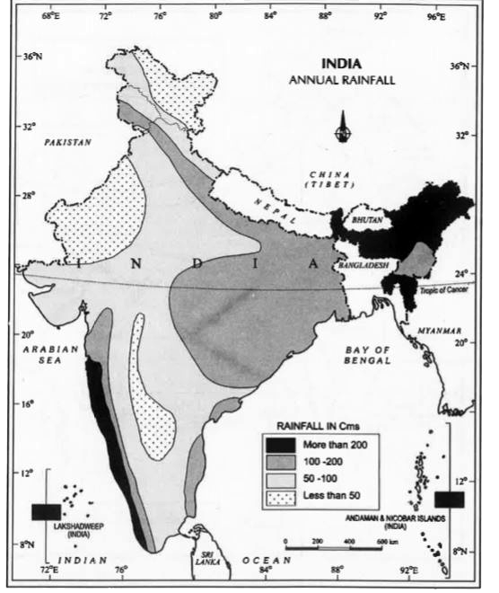
Study the map given below aand answer the questions that follow :

What is variability of rainfall ?
View SolutionRead the passage given below and answer the questions that follow :
'I could come and go as I pleased. He was the most trusting person I had ever met.
What does the speaker mean by 'most trusting person'?
View SolutionRead the passage carefully and answer the question given below :
The decision to bestow the 2016 Good Design Award, Japan's most prestigious design honour, upon the AuthaGraph World Map came as a surprise to many. Given that previous winners have been innovations like personal mobility chairs and robotic arms, people wondered what had impressed the judges about the design of a map. It turns out that this strange-looking map is the most proportionate depiction of our planet.
The world map, as we know it, uses the Mercator Projection, a mapping technique developed in 1569 by cartographer Gerardus Mercator. Through excellent for navigation, the method significantly distorts the size and proportion of land masses and bodies of water. So while North America and Africa appears to be about the same size, in reality, the former could fit inside Africa with room to spare for India, Argentina, Tunisia, and much more. Similarly, though Brazil is more than five times larger than Alaska, it is latter, that appears bigger. The reason for the discrepancies has to do with the challenge of transposing the 3-dimensional spherical surface of Earth onto a 2-dimensional flat map, a task that is surprisingly hard to do accurately.
Over the year, there have been numerous attempt to solve the issue. The Galls-Peters projection tried by vertically compressing the regions near the poles, while the Mollweide projection bent continents around the corners to portray them more accurately. Though the Boggs eumorphic projection showed the correct shape and land mass size by slicing the globe into sections, the map was not practical for ocean navigation.
The AuthaGraph World Map, which beat out 1,000 entries in various categories, appear to have solved the issue using geometry. Created by architect and designer Hajime Narukawa, it divides the globe into ninety-six equal triangles and projects them onto a tetrahedron shape. This simple technique preserves the proportions of the land and water when going from a 3-dimensional sphere to a 2-dimensional map.
The result is an accurate map that is unlike any other. Instead of lining up straight across, the continents curve upwards, as though smiling at finally being represented accurately. It also appears as though Africa and the Americas have swapped places. As for those tidy longitude and latitude grids ? They have been reduced to a mishmash of curvy and twisty lines!
Feitlinger
Question : According to the passage, which of the following projection is not practical for sailing in the waters ?
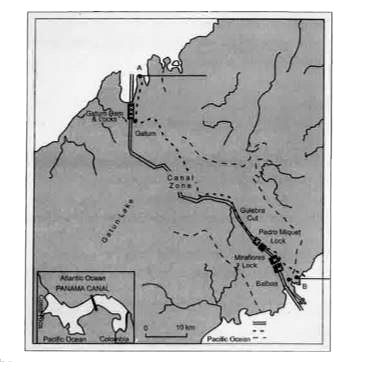
View SolutionRead the following road map carefully

View SolutionRead the passage carefully and choose the best answer to the given question out of the four alternatives.
In ancient times, Man had an apprehension of
View Solution

