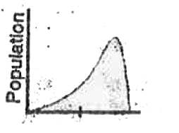
The given graph shows the range of variation among population members for a trait determined by multiple genes. If this population is subjected to disruptive selection for several generations, which of the following distributions is most likely to result?
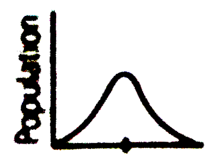
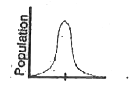
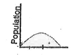
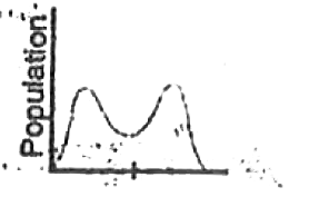
The correct Answer is:C
Step by step video & image solution for The given graph shows the range of variation among population members for a trait determined by multiple genes. If this population is subjected to disruptive selection for several generations, which of the following distributions is most likely to result? by Biology experts to help you in doubts & scoring excellent marks in Class 12 exams.
Updated on:21/07/2023Topper's Solved these Questions
- EVOLUTIONBOOK - AAKASH SERIESCHAPTER - EVOLUTIONEXERCISE - EXERCISE - I (BRIEF ACCOUNT OF EVOLUTION)
19 Videos
- EVOLUTIONBOOK - AAKASH SERIESCHAPTER - EVOLUTIONEXERCISE - EXERCISE - I (EVOLUTION OF MAN)
27 Videos
- EVOLUTIONBOOK - AAKASH SERIESCHAPTER - EVOLUTIONEXERCISE - EXERCISE - I (HARDY WEINBERG)
3 Videos
- DIGESTION AND ABSORPTIONBOOK - AAKASH SERIESCHAPTER - DIGESTION AND ABSORPTIONEXERCISE - Exercise - III (Previous AIPMT/NEET Questions)
24 Videos
- EXCRETORY PRODUCTS AND THEIR ELIMINATIONBOOK - AAKASH SERIESCHAPTER - EXCRETORY PRODUCTS AND THEIR ELIMINATIONEXERCISE - EXERCISE - III (PREVIOUS AIPMT/NEET QUESTIONS)
20 Videos
Similar Questions
According to Hardy-Weinberg principle, allele and genotype frequencies in a population will remain constant from generation to generation in the absence of other evolutionary influences. It makes several assumptions which were given below.
i. Random Mating
ii. Sexual Reproduction
iii. Non-overlapping Generations
iv. Occurrence of Natural Selection
v. Small size of population.
Identify two assumptions which do not meet for a population to reach Hardy-Weinberg Equilibrium?
View Solution2500 single men and 2500 single women were asked about whether they owned any dogs or cats. The table below displays a summery of the results.
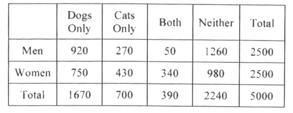
Of the people who said they had neigher dogs nor cats, 200 were selected at random, and they were asked if they had any pets at all. 43 people said they did have pets,and the remaining 157 said that they did not. Based on both the initial data given in the table, together with the new data stated in this paragraph, which of the following is most likely to be accurate?
View Solution
Knowledge Check
The graph shows the percenatge of population owining TV sets in various countries .
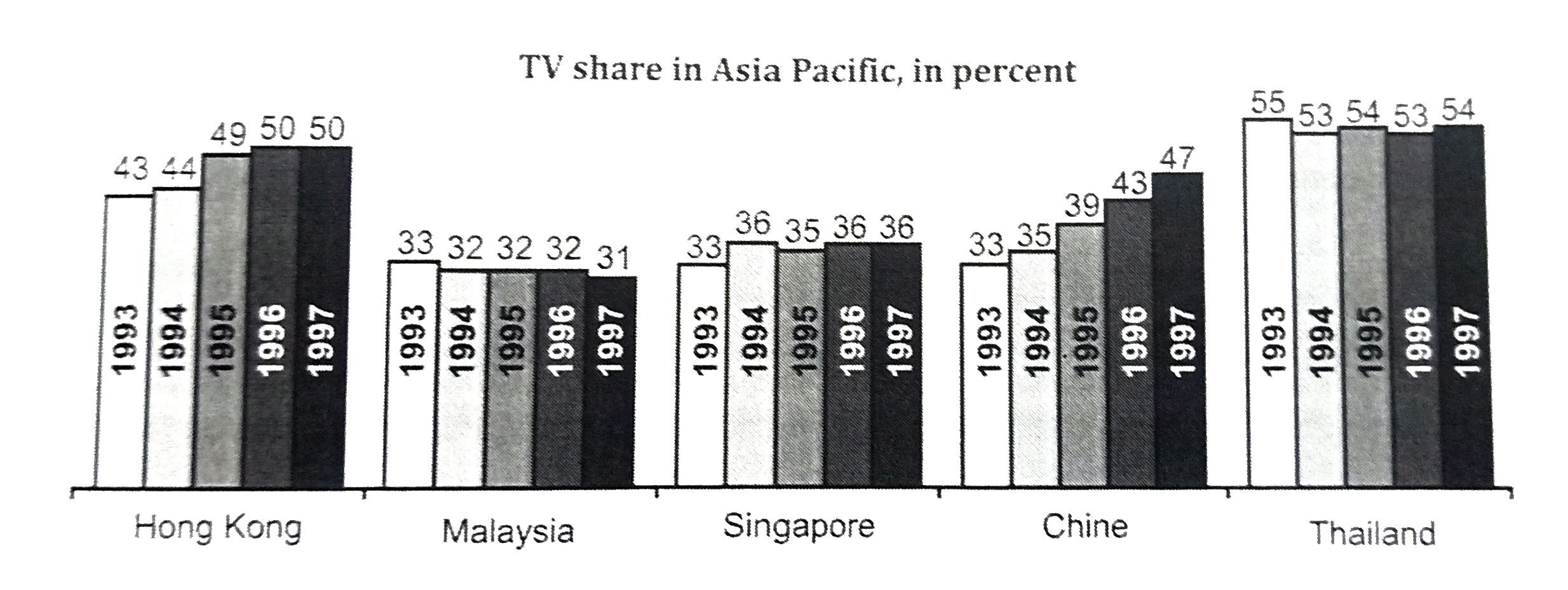
Assuming that the population of all the countries is the same and remains constant for the given years, which fo the following opitons in INCORRECT ?ANumber of TV sets in Hong Kong has increased by approximately 16.3% form 1993 to 1997.BNumber of TV sets in Singapore and China is the same for 1993CNumber of TV sets increasen by 12.5% for Singapore from 1993 to 1997.DNumber of TV sets for China increased by approximately 42.4% from 1993to 1997.The graph given below shows the variations in the population of producers, primary consumers and secondary consumers as well as the amount of dissolved mineral salts in a pond
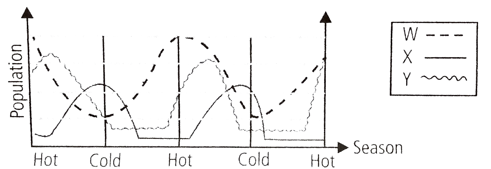
Which one of the following correctly matches each graph?AProducer populationPrimary consumer populationSecondary consumer populationXYWBProducer populationPrimary consumer populationSecondary consumer populationWXYCProducer populationPrimary consumer populationSecondary consumer populationWYXDProducer populationPrimary consumer populationSecondary consumer populationXWY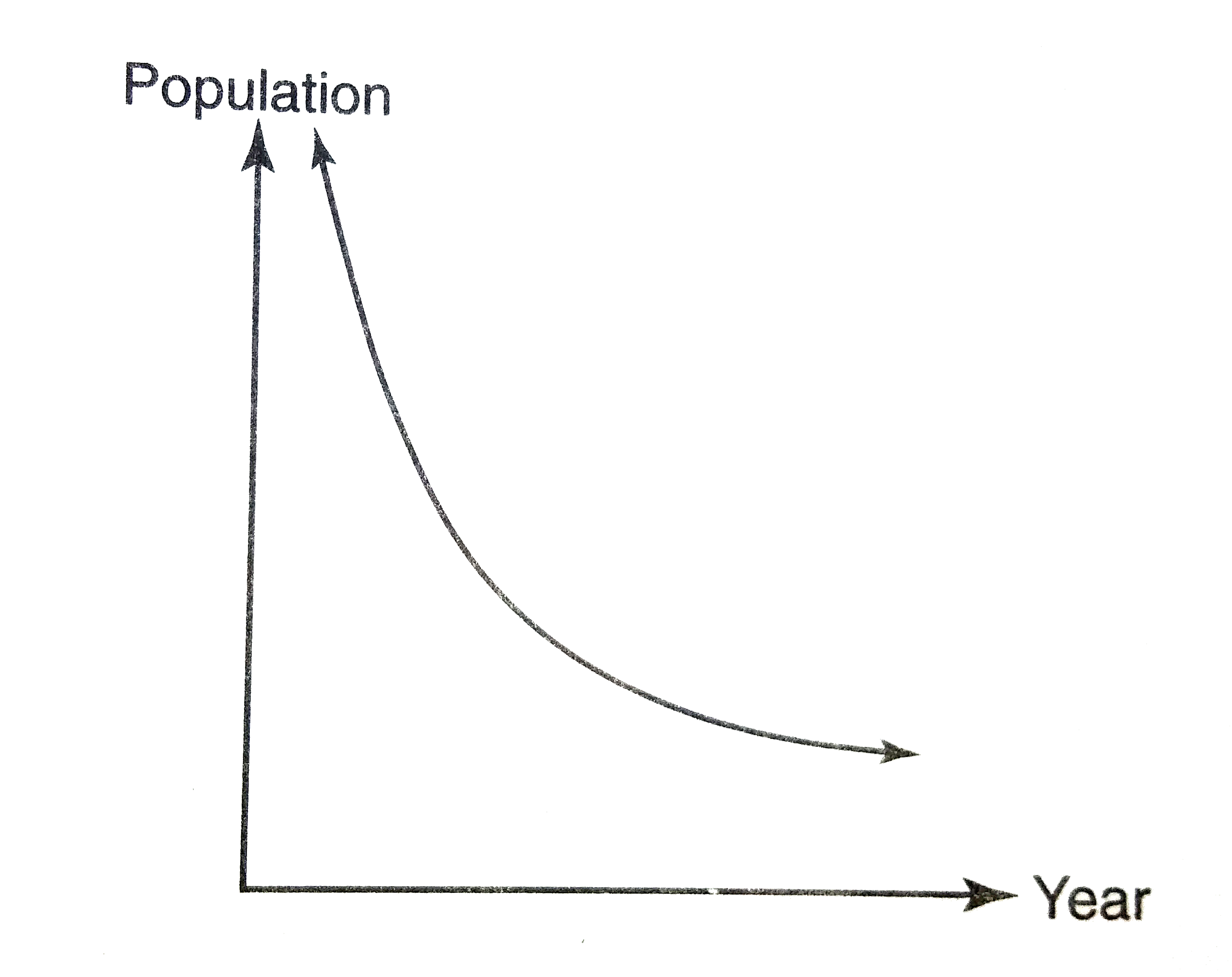
The graph above shows how the size of a country's population has changed over time. Which of the following are the most likely underlying reasons for the type of graph shown?AA moderate increase in annual birthrates and a liberal immigration policy.BA large increase in annual birhtrates and increased life expectancy rates.CA liberal immigration policy and a opportunities.DThe spread of a highly contagius fatal disease and a history of political strife and unrest.
We are not witnessing the abandonment of the suburbs, or a movement of millions of people back to the city all at once. The 2010 census certainly did not turn up evidence of a middle-class stampede to the nation’s cities. The news was mixed: Some of the larger cities on the East Coast tended to gain population, albeit in small increments. Those in the Midwest, including Chicago, tended to lose substantial numbers. The cities that showed gains in overall population during the entire decade tended to be in the South and Southwest. But when it comes to measuring demographic inversion, raw census numbers are an ineffective blunt instrument. A closer look at the results shows that the most powerful demographic events of the past decade were the movement of African Americans out of central cities (180,000 of them in Chicago alone) and the settlement of immigrant groups in suburbs, often ones many miles distant from downtown.
Central-city areas that gained affluent residents in the first part of the decade maintained that population in the recession years from 2007 to 2009. They also, according to a 2011 study by Brookings, uffered considerably less from increased unemployment than the suburbs did. Not many young professionals moved to new downtown condos in the recession years because few such residences were being built. But there is no reason to believe that the demographic trends prevailing prior to the construction bust will not resume once that bust is over. It is important to remember that demographic inversion is not a proxy for population growth, it can occur in cities that are growing, those whose numbers are flat, and even in those undergoing a modest decline in size.
America’s major cities face enormous fiscal problems, many of them the result of public pension obligations they incurred in the more prosperous years of the past two decades. Some, Chicago rominent among them, simply are not producing enough revenue to support the level of public services to which most of the citizens have grown to feel entitled. How the cities are going to solve thisproblem, I do not know. What I do know is that if fiscal crisis were going to drive affluent professionals out of central cities, it would have done so by now. There is no evidence that it has. The truth is that we are living at a moment in which the massive outward migration of the affluent that characterized the second half of the twentieth century is coming to an end. And we need to adjust our perceptions of cities, suburbs, and urban mobility as a result.
Much of our perspe ctive on the process of metropolitan settlement dates, whether we realize it or not, from a paper written in 1925 by the University of Chicago sociologist Ernest W. Burgess. It was Burgess who defined four urban/suburban zones of settlement: a central business district, an area of manufacturing just beyond it, then a residential area inhabited by the industrial and immigrant working class, and finally an outer enclave of single-family dwellings. Burgess was right about the urban America of 1925, he was right about the urban America of 1974. Virtually every city in the country had a downtown, where the commercial life of the metropolis was conducted, it had a factory district just beyond, it had districts of working-class residences just beyond that, and it had residential suburbs for the wealthy and the upper middle class at the far end of the continuum. As a family moved up the economic ladder, it also moved outward from crowded working-class districts to more spacious apartments and, eventually, to a suburban home. The suburbs of Burgess’s time bore little resemblance to those at the end of the twentieth century, but the theory still essentially worked. People moved ahead in life by moving farther out.
But in the past decade, in quite a few places, this model has ceased to describe reality. There are still downtown commercial districts, but there are no factory districts lying next to them. There are scarcely any factories at all. These close-in parts of the city, whose few residents Burgess described as dwelling in “submerged regions of poverty, degradation and disease,” are increasingly the preserve of the affluent who work in the commercial core. And just as crucially newcomers to America are not settling on the inside and accumulating the resources to move out, they are living in the suburbs from day one.
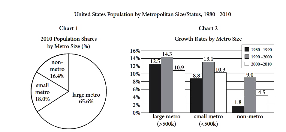
According to the passage, members of which group moved away from central-city areas in large numbers in the early 2000s?
View SolutionWe are not witnessing the abandonment of the suburbs, or a movement of millions of people back to the city all at once. The 2010 census certainly did not turn up evidence of a middle-class stampede to the nation’s cities. The news was mixed: Some of the larger cities on the East Coast tended to gain population, albeit in small increments. Those in the Midwest, including Chicago, tended to lose substantial numbers. The cities that showed gains in overall population during the entire decade tended to be in the South and Southwest. But when it comes to measuring demographic inversion, raw census numbers are an ineffective blunt instrument. A closer look at the results shows that the most powerful demographic events of the past decade were the movement of African Americans out of central cities (180,000 of them in Chicago alone) and the settlement of immigrant groups in suburbs, often ones many miles distant from downtown.
Central-city areas that gained affluent residents in the first part of the decade maintained that population in the recession years from 2007 to 2009. They also, according to a 2011 study by Brookings, uffered considerably less from increased unemployment than the suburbs did. Not many young professionals moved to new downtown condos in the recession years because few such residences were being built. But there is no reason to believe that the demographic trends prevailing prior to the construction bust will not resume once that bust is over. It is important to remember that demographic inversion is not a proxy for population growth, it can occur in cities that are growing, those whose numbers are flat, and even in those undergoing a modest decline in size.
America’s major cities face enormous fiscal problems, many of them the result of public pension obligations they incurred in the more prosperous years of the past two decades. Some, Chicago rominent among them, simply are not producing enough revenue to support the level of public services to which most of the citizens have grown to feel entitled. How the cities are going to solve thisproblem, I do not know. What I do know is that if fiscal crisis were going to drive affluent professionals out of central cities, it would have done so by now. There is no evidence that it has. The truth is that we are living at a moment in which the massive outward migration of the affluent that characterized the second half of the twentieth century is coming to an end. And we need to adjust our perceptions of cities, suburbs, and urban mobility as a result.
Much of our perspe ctive on the process of metropolitan settlement dates, whether we realize it or not, from a paper written in 1925 by the University of Chicago sociologist Ernest W. Burgess. It was Burgess who defined four urban/suburban zones of settlement: a central business district, an area of manufacturing just beyond it, then a residential area inhabited by the industrial and immigrant working class, and finally an outer enclave of single-family dwellings. Burgess was right about the urban America of 1925, he was right about the urban America of 1974. Virtually every city in the country had a downtown, where the commercial life of the metropolis was conducted, it had a factory district just beyond, it had districts of working-class residences just beyond that, and it had residential suburbs for the wealthy and the upper middle class at the far end of the continuum. As a family moved up the economic ladder, it also moved outward from crowded working-class districts to more spacious apartments and, eventually, to a suburban home. The suburbs of Burgess’s time bore little resemblance to those at the end of the twentieth century, but the theory still essentially worked. People moved ahead in life by moving farther out.
But in the past decade, in quite a few places, this model has ceased to describe reality. There are still downtown commercial districts, but there are no factory districts lying next to them. There are scarcely any factories at all. These close-in parts of the city, whose few residents Burgess described as dwelling in “submerged regions of poverty, degradation and disease,” are increasingly the preserve of the affluent who work in the commercial core. And just as crucially newcomers to America are not settling on the inside and accumulating the resources to move out, they are living in the suburbs from day one.
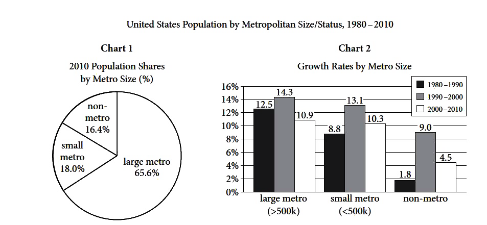
Chart 2 suggests which of the following about population change in the 1990s?
View SolutionWe are not witnessing the abandonment of the suburbs, or a movement of millions of people back to the city all at once. The 2010 census certainly did not turn up evidence of a middle-class stampede to the nation’s cities. The news was mixed: Some of the larger cities on the East Coast tended to gain population, albeit in small increments. Those in the Midwest, including Chicago, tended to lose substantial numbers. The cities that showed gains in overall population during the entire decade tended to be in the South and Southwest. But when it comes to measuring demographic inversion, raw census numbers are an ineffective blunt instrument. A closer look at the results shows that the most powerful demographic events of the past decade were the movement of African Americans out of central cities (180,000 of them in Chicago alone) and the settlement of immigrant groups in suburbs, often ones many miles distant from downtown.
Central-city areas that gained affluent residents in the first part of the decade maintained that population in the recession years from 2007 to 2009. They also, according to a 2011 study by Brookings, uffered considerably less from increased unemployment than the suburbs did. Not many young professionals moved to new downtown condos in the recession years because few such residences were being built. But there is no reason to believe that the demographic trends prevailing prior to the construction bust will not resume once that bust is over. It is important to remember that demographic inversion is not a proxy for population growth, it can occur in cities that are growing, those whose numbers are flat, and even in those undergoing a modest decline in size.
America’s major cities face enormous fiscal problems, many of them the result of public pension obligations they incurred in the more prosperous years of the past two decades. Some, Chicago rominent among them, simply are not producing enough revenue to support the level of public services to which most of the citizens have grown to feel entitled. How the cities are going to solve thisproblem, I do not know. What I do know is that if fiscal crisis were going to drive affluent professionals out of central cities, it would have done so by now. There is no evidence that it has. The truth is that we are living at a moment in which the massive outward migration of the affluent that characterized the second half of the twentieth century is coming to an end. And we need to adjust our perceptions of cities, suburbs, and urban mobility as a result.
Much of our perspe ctive on the process of metropolitan settlement dates, whether we realize it or not, from a paper written in 1925 by the University of Chicago sociologist Ernest W. Burgess. It was Burgess who defined four urban/suburban zones of settlement: a central business district, an area of manufacturing just beyond it, then a residential area inhabited by the industrial and immigrant working class, and finally an outer enclave of single-family dwellings. Burgess was right about the urban America of 1925, he was right about the urban America of 1974. Virtually every city in the country had a downtown, where the commercial life of the metropolis was conducted, it had a factory district just beyond, it had districts of working-class residences just beyond that, and it had residential suburbs for the wealthy and the upper middle class at the far end of the continuum. As a family moved up the economic ladder, it also moved outward from crowded working-class districts to more spacious apartments and, eventually, to a suburban home. The suburbs of Burgess’s time bore little resemblance to those at the end of the twentieth century, but the theory still essentially worked. People moved ahead in life by moving farther out.
But in the past decade, in quite a few places, this model has ceased to describe reality. There are still downtown commercial districts, but there are no factory districts lying next to them. There are scarcely any factories at all. These close-in parts of the city, whose few residents Burgess described as dwelling in “submerged regions of poverty, degradation and disease,” are increasingly the preserve of the affluent who work in the commercial core. And just as crucially newcomers to America are not settling on the inside and accumulating the resources to move out, they are living in the suburbs from day one.
In line 34, “flat” is closest in meaning to
View SolutionWe are not witnessing the abandonment of the suburbs, or a movement of millions of people back to the city all at once. The 2010 census certainly did not turn up evidence of a middle-class stampede to the nation’s cities. The news was mixed: Some of the larger cities on the East Coast tended to gain population, albeit in small increments. Those in the Midwest, including Chicago, tended to lose substantial numbers. The cities that showed gains in overall population during the entire decade tended to be in the South and Southwest. But when it comes to measuring demographic inversion, raw census numbers are an ineffective blunt instrument. A closer look at the results shows that the most powerful demographic events of the past decade were the movement of African Americans out of central cities (180,000 of them in Chicago alone) and the settlement of immigrant groups in suburbs, often ones many miles distant from downtown.
Central-city areas that gained affluent residents in the first part of the decade maintained that population in the recession years from 2007 to 2009. They also, according to a 2011 study by Brookings, uffered considerably less from increased unemployment than the suburbs did. Not many young professionals moved to new downtown condos in the recession years because few such residences were being built. But there is no reason to believe that the demographic trends prevailing prior to the construction bust will not resume once that bust is over. It is important to remember that demographic inversion is not a proxy for population growth, it can occur in cities that are growing, those whose numbers are flat, and even in those undergoing a modest decline in size.
America’s major cities face enormous fiscal problems, many of them the result of public pension obligations they incurred in the more prosperous years of the past two decades. Some, Chicago rominent among them, simply are not producing enough revenue to support the level of public services to which most of the citizens have grown to feel entitled. How the cities are going to solve thisproblem, I do not know. What I do know is that if fiscal crisis were going to drive affluent professionals out of central cities, it would have done so by now. There is no evidence that it has. The truth is that we are living at a moment in which the massive outward migration of the affluent that characterized the second half of the twentieth century is coming to an end. And we need to adjust our perceptions of cities, suburbs, and urban mobility as a result.
Much of our perspe ctive on the process of metropolitan settlement dates, whether we realize it or not, from a paper written in 1925 by the University of Chicago sociologist Ernest W. Burgess. It was Burgess who defined four urban/suburban zones of settlement: a central business district, an area of manufacturing just beyond it, then a residential area inhabited by the industrial and immigrant working class, and finally an outer enclave of single-family dwellings. Burgess was right about the urban America of 1925, he was right about the urban America of 1974. Virtually every city in the country had a downtown, where the commercial life of the metropolis was conducted, it had a factory district just beyond, it had districts of working-class residences just beyond that, and it had residential suburbs for the wealthy and the upper middle class at the far end of the continuum. As a family moved up the economic ladder, it also moved outward from crowded working-class districts to more spacious apartments and, eventually, to a suburban home. The suburbs of Burgess’s time bore little resemblance to those at the end of the twentieth century, but the theory still essentially worked. People moved ahead in life by moving farther out.
But in the past decade, in quite a few places, this model has ceased to describe reality. There are still downtown commercial districts, but there are no factory districts lying next to them. There are scarcely any factories at all. These close-in parts of the city, whose few residents Burgess described as dwelling in “submerged regions of poverty, degradation and disease,” are increasingly the preserve of the affluent who work in the commercial core. And just as crucially newcomers to America are not settling on the inside and accumulating the resources to move out, they are living in the suburbs from day one.

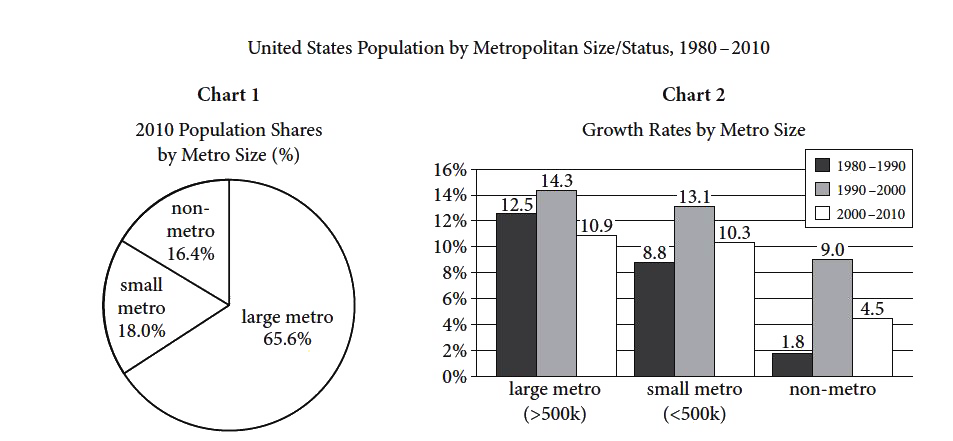
The author of the passage would most likely consider the information in chart 1 to be
View SolutionWe are not witnessing the abandonment of the suburbs, or a movement of millions of people back to the city all at once. The 2010 census certainly did not turn up evidence of a middle-class stampede to the nation’s cities. The news was mixed: Some of the larger cities on the East Coast tended to gain population, albeit in small increments. Those in the Midwest, including Chicago, tended to lose substantial numbers. The cities that showed gains in overall population during the entire decade tended to be in the South and Southwest. But when it comes to measuring demographic inversion, raw census numbers are an ineffective blunt instrument. A closer look at the results shows that the most powerful demographic events of the past decade were the movement of African Americans out of central cities (180,000 of them in Chicago alone) and the settlement of immigrant groups in suburbs, often ones many miles distant from downtown.
Central-city areas that gained affluent residents in the first part of the decade maintained that population in the recession years from 2007 to 2009. They also, according to a 2011 study by Brookings, uffered considerably less from increased unemployment than the suburbs did. Not many young professionals moved to new downtown condos in the recession years because few such residences were being built. But there is no reason to believe that the demographic trends prevailing prior to the construction bust will not resume once that bust is over. It is important to remember that demographic inversion is not a proxy for population growth, it can occur in cities that are growing, those whose numbers are flat, and even in those undergoing a modest decline in size.
America’s major cities face enormous fiscal problems, many of them the result of public pension obligations they incurred in the more prosperous years of the past two decades. Some, Chicago rominent among them, simply are not producing enough revenue to support the level of public services to which most of the citizens have grown to feel entitled. How the cities are going to solve thisproblem, I do not know. What I do know is that if fiscal crisis were going to drive affluent professionals out of central cities, it would have done so by now. There is no evidence that it has. The truth is that we are living at a moment in which the massive outward migration of the affluent that characterized the second half of the twentieth century is coming to an end. And we need to adjust our perceptions of cities, suburbs, and urban mobility as a result.
Much of our perspe ctive on the process of metropolitan settlement dates, whether we realize it or not, from a paper written in 1925 by the University of Chicago sociologist Ernest W. Burgess. It was Burgess who defined four urban/suburban zones of settlement: a central business district, an area of manufacturing just beyond it, then a residential area inhabited by the industrial and immigrant working class, and finally an outer enclave of single-family dwellings. Burgess was right about the urban America of 1925, he was right about the urban America of 1974. Virtually every city in the country had a downtown, where the commercial life of the metropolis was conducted, it had a factory district just beyond, it had districts of working-class residences just beyond that, and it had residential suburbs for the wealthy and the upper middle class at the far end of the continuum. As a family moved up the economic ladder, it also moved outward from crowded working-class districts to more spacious apartments and, eventually, to a suburban home. The suburbs of Burgess’s time bore little resemblance to those at the end of the twentieth century, but the theory still essentially worked. People moved ahead in life by moving farther out.
But in the past decade, in quite a few places, this model has ceased to describe reality. There are still downtown commercial districts, but there are no factory districts lying next to them. There are scarcely any factories at all. These close-in parts of the city, whose few residents Burgess described as dwelling in “submerged regions of poverty, degradation and disease,” are increasingly the preserve of the affluent who work in the commercial core. And just as crucially newcomers to America are not settling on the inside and accumulating the resources to move out, they are living in the suburbs from day one.

Which choice provides the best evidence for the answer to the previous question?
View Solution
