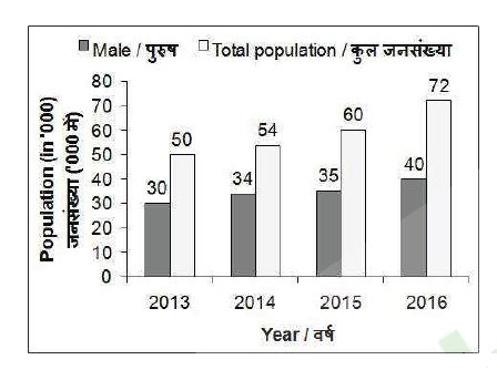
The bar graph given below represents the total population and male population (in 000) of a city, during the period of 2013 to 2016 .

In 2016 male population is how much percent more than the female population?
25
20
23
28
The correct Answer is:A
Step by step video, text & image solution for The bar graph given below represents the total population and male population (in 000) of a city, during the period of 2013 to 2016 . In 2016 male population is how much percent more than the female population? by Maths experts to help you in doubts & scoring excellent marks in Class 14 exams.
Similar Questions
Knowledge Check
- Question 1 - Select One
The bar graph given below represents the total population and male population (in '000) of a city, during to period of 2013 to 2016.

In 2014 female population is what percent of total population?A62.96B37.03C20D31.13 - Question 2 - Select One
The bar graph given below represents the total population and male population (in '000) of a city, during to period of 2013 to 2016.

Female population in 2015 is what percent of female population in 2014?A25B80C150D125 - Question 3 - Select One
The bar graph given below represents the total propulation and male population (in 000) of a city, during the period of 2013 to 2016.

What is the ratio of male and female population respectively in 2015?A12:7B5:7C7:5D5:3
Average female to male ratio in world population is
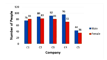
View SolutionThe Bar graph given below presents the number of males and females working in five different companies.

The total number of males working in these five companies is how much percent (approximately) more than the total number of females working in these five companies ?View SolutionPopulation density of a population in a given hanitat during a given period fluctuates due to change in
View SolutionThe table given below shows number of literate people and total population in a village from the year 2011 to 2016.

What is the percentage increase (approximately) in the total population in the year 2012 in comparison to year 2011?View SolutionThe table given below shows number of literate people and total population in a village from the year 2011 to 2016.

What is the percentage of people who are literate in 2012?View Solution


