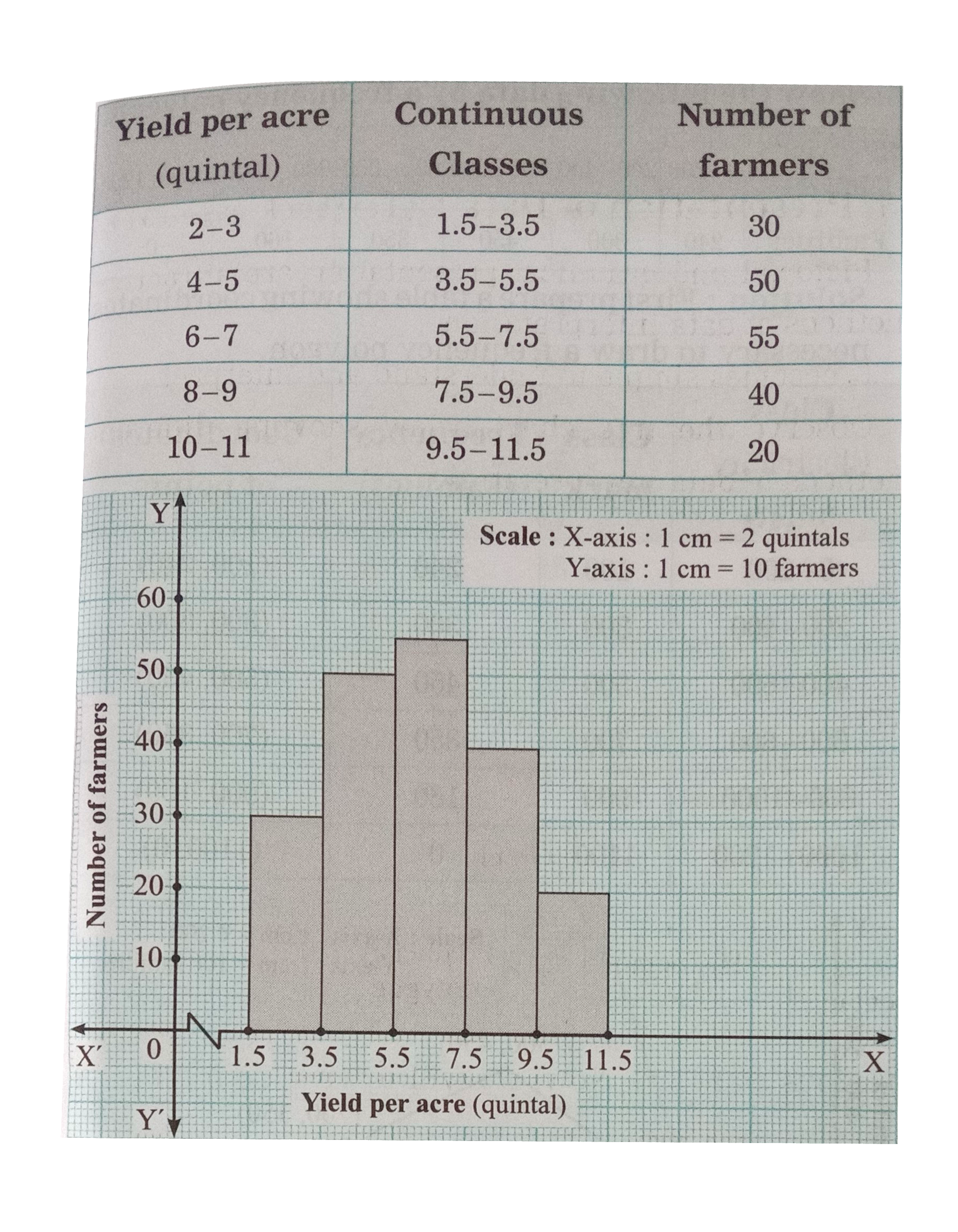
The table below show the yield of jowar per acre. Show the data by histogram .

Here, the classes are not continuous.We make the classes continuous.
Topper's Solved these Questions
- BOOK - NAVNEET PUBLICATION - MAHARASHTRA BOARDCHAPTER - STATISTICSEXERCISE - PRACTICE SET 6.53videos
STATISTICS
- BOOK - NAVNEET PUBLICATION - MAHARASHTRA BOARDCHAPTER - STATISTICSEXERCISE - PRACTICE SET 6.66videos
STATISTICS
- BOOK - NAVNEET PUBLICATION - MAHARASHTRA BOARDCHAPTER - STATISTICSEXERCISE - PRACTICE SET 6.34videos
STATISTICS
- BOOK - NAVNEET PUBLICATION - MAHARASHTRA BOARDCHAPTER - SIMILARITYEXERCISE - SUBJECTIVE TYPE20videos
SIMILARITY
- BOOK - NAVNEET PUBLICATION - MAHARASHTRA BOARDCHAPTER - THEOREMS EXERCISE - CIRCLE15videos
THEOREMS
Similar Questions
Knowledge Check
- Question 1 - Select One
A survey asked a group of 1000 people what type of bread they like best. The table below shows their preferences.
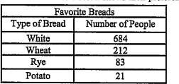
Which one of the following graphs best represents the data in this table?A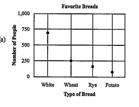 B
B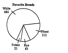 C
C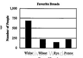 DNONE OF THESE
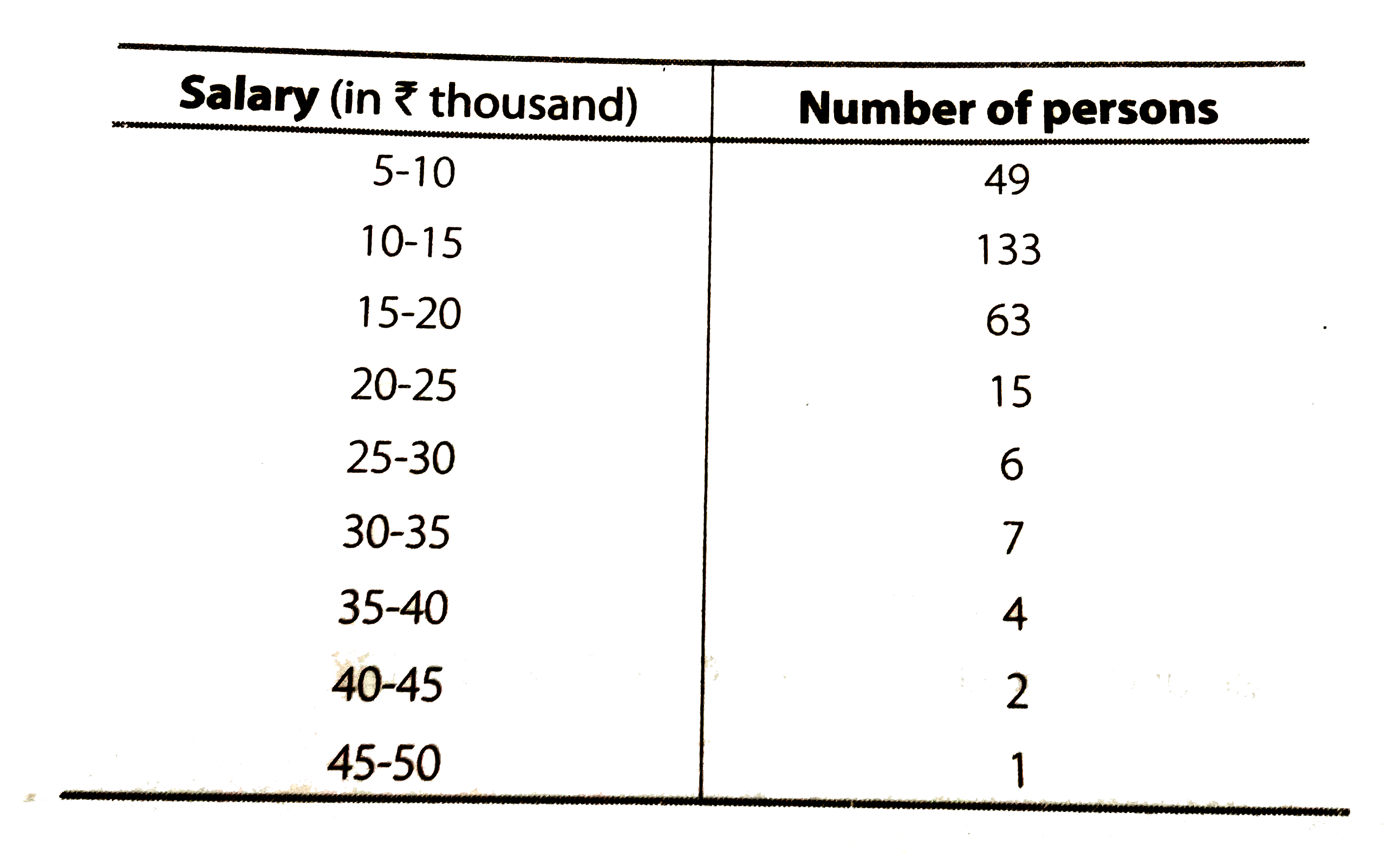
The table below shows the saleries of 280 persons.
 View Solution
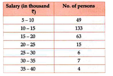
The table below shows the salaries of 280 persons:
View SolutionThe table below show the salaries of 280 persons:
Calculate the median salary of the data.
 View Solution
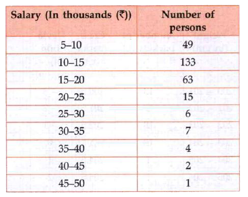
The table below shows the salaries of 280 persons.
Calculate the median and mode of the data.
 View Solution
The table below shows Salary of 280 persons. Calculate the median salary of the data.
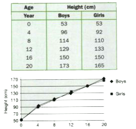
View SolutionThe table below shows the data on likely heights of boys and girls as they grow in age. Draw graphs of height and age for both boys and girls on the same graph paper. What conclusions can be drawn from these graphs?
 View Solution
The following table shows the investment made by some families. Shows the information by a histogram.
 View Solution


