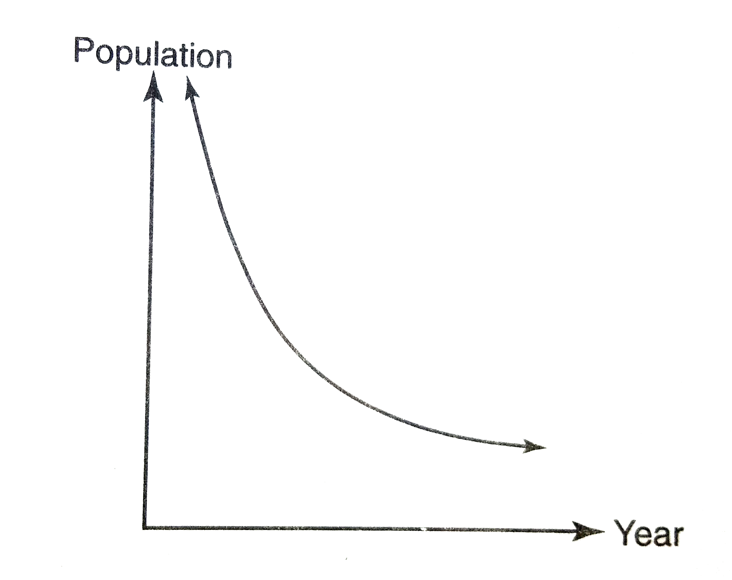
The graph above shows how the size of a country's population has changed over time. Which of the following are the most likely underlying reasons for the type of graph shown?
A moderate increase in annual birthrates and a liberal immigration policy.
A large increase in annual birhtrates and increased life expectancy rates.
A liberal immigration policy and a opportunities.
The spread of a highly contagius fatal disease and a history of political strife and unrest.
The correct Answer is:D
Step by step video, text & image solution for The graph above shows how the size of a country's population has changed over time. Which of the following are the most likely underlying reasons for the type of graph shown? by Maths experts to help you in doubts & scoring excellent marks in Class 12 exams.
Updated on:21/07/2023Topper's Solved these Questions
Similar Questions
Knowledge Check
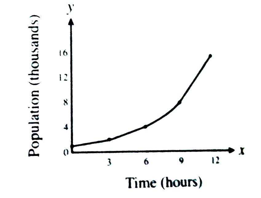
The graph above shows the size of a certain population after time t. Which of the following equations correctly shows y as a function of t ?Ay=t3By=1.000−2t3Cy=3t2Dy=1,000t-2,000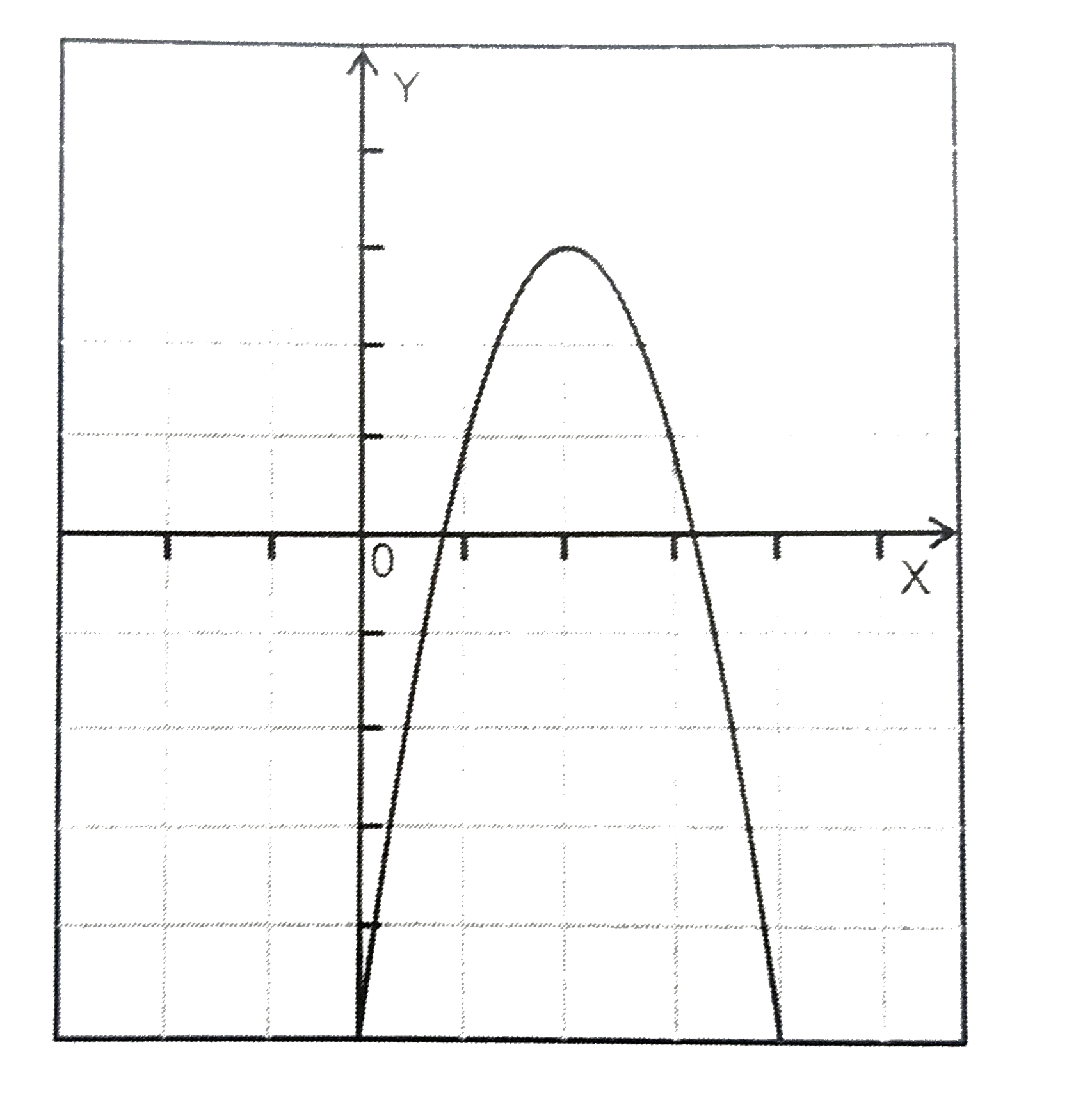
Which of the following can be the correct expression for the graph of the quadratic shown above ?Ay=x2−6x+8By=−x2+6x−8Cy=x2+6x−8Dy=−x2+6x+8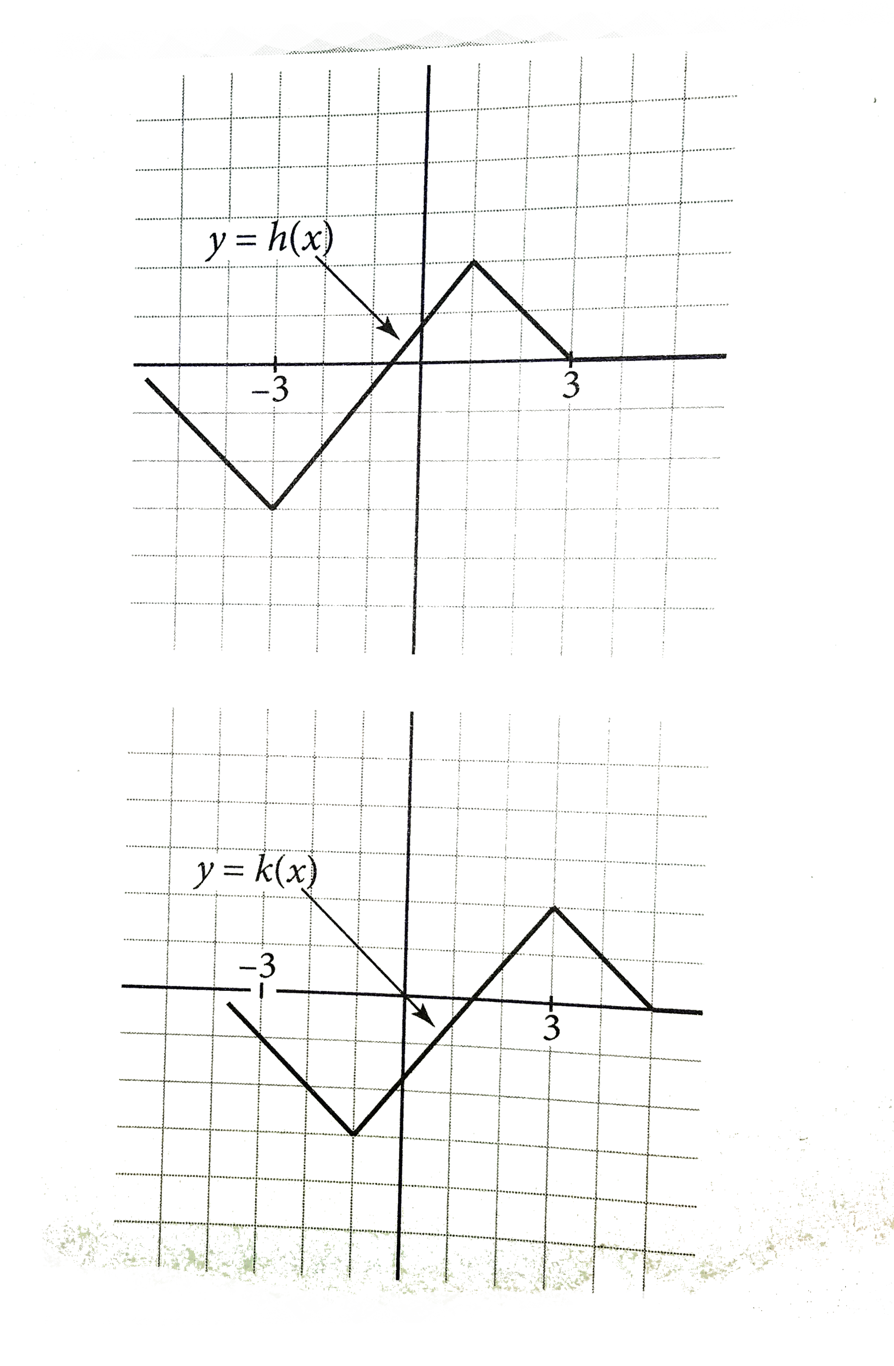
The graphs above show the complete functions h and k. which one of the following expresses k(x) in terms of h(x)?Ak(x)=h(x)+2Bk(x)=h(x)−2Ck(x)=h(x+2)Dk(x)=h(x−2)
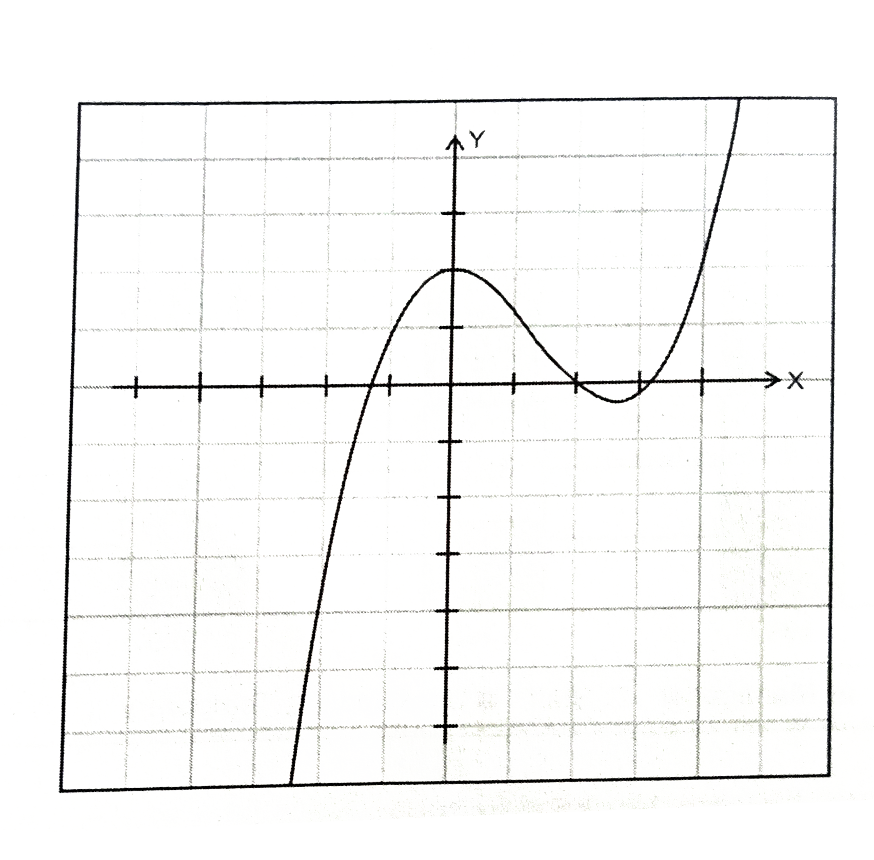
Which of the following could be the equation of the graph shown above ?
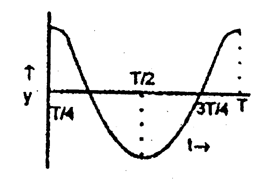
View SolutionThe graph in the figure shows how the displacement of a particle describing S.H.M. varies with time. Which one of the following statements is not true ?
View SolutionWhich of the following graphs show most significant deviation from ideal gas behaviour ?
View Solution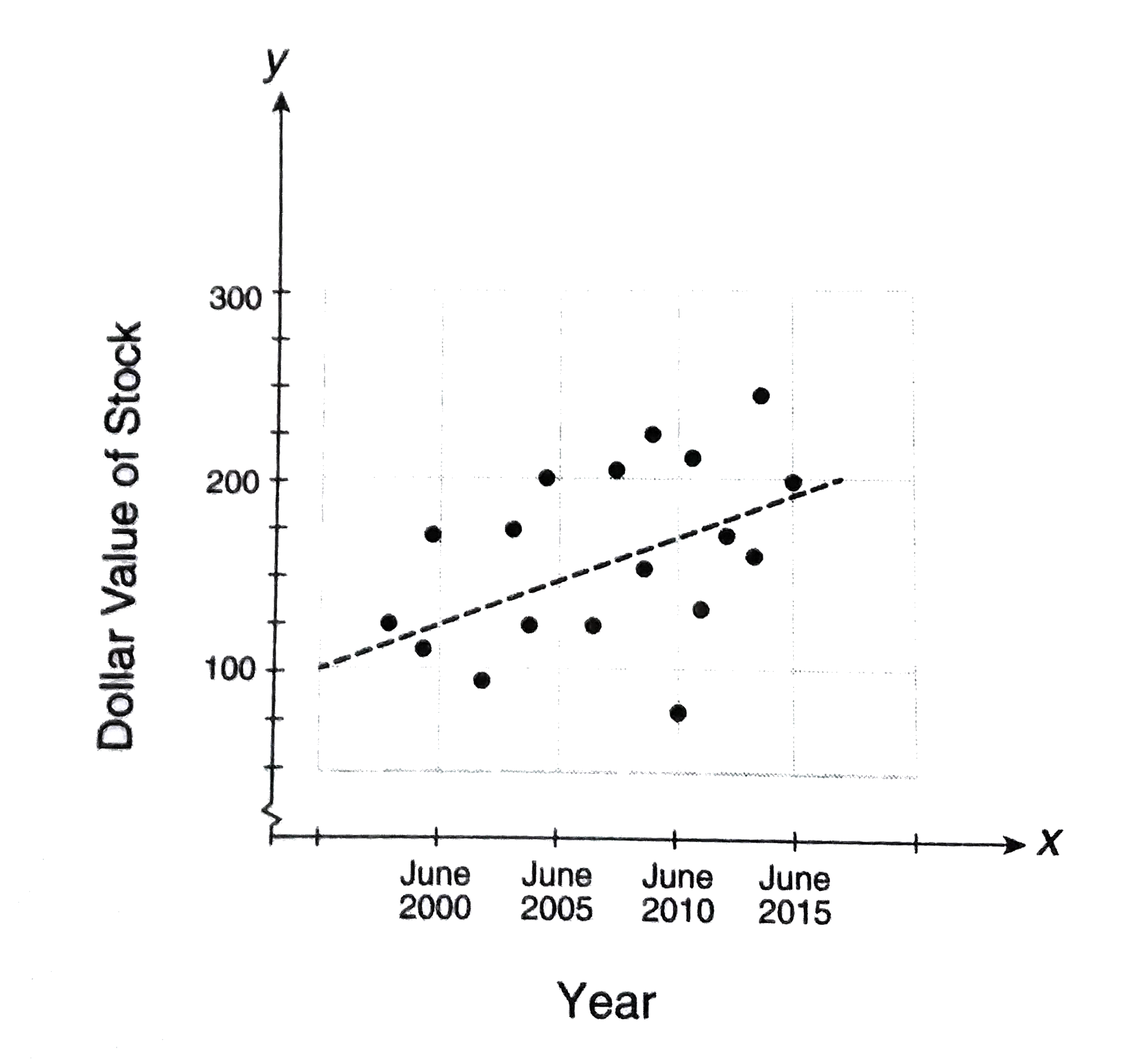
The graph above shows how the value of a stock has increased over time. The line of best fit is shown.
a. The value of the stock increased from June 2000 to Jone 2005 by approcimately what percent?
View Solution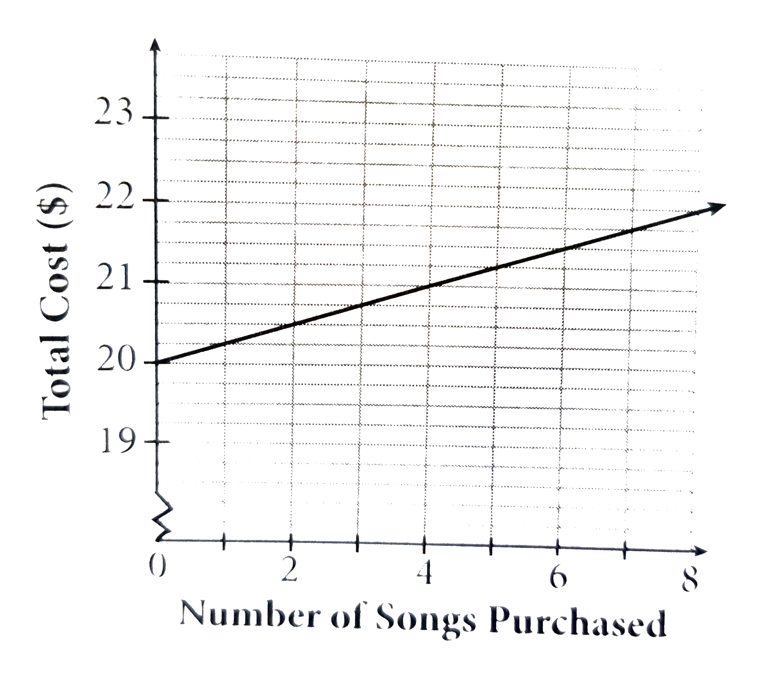
The graph above shows the cost of joining and buying music from a music subsciption service. What does the y-intercept of the line most likely represent ?
View Solution

