Given below are the seats won by different political parties in the polling outcome of a state assembly elections: (i) Draw a bar graph to represent the polling result
To draw a bar graph representing the seats won by different political parties in the state assembly elections, follow these steps:
1. Collect the Data:
The seats won by different political parties are as follows:
- Party A: 75 seats
- Party B: 55 seats
- Party C: 37 seats
- Party D: 29 seats
- Party E: 10 seats
- Party F: 37 seats
2. Set Up the Axes:
- Draw a horizontal line (x-axis) and a vertical line (y-axis) to create a graph.
- Label the x-axis with the names of the political parties (A, B, C, D, E, F).
- Label the y-axis with the number of seats won, using appropriate intervals (e.g., 0, 10, 20, 30, 40, 50, 60, 70, 80).
3. Determine the Scale:
- Choose a scale for the y-axis that can accommodate the maximum number of seats won (75 in this case). An interval of 10 is suitable.
4. Draw the Bars:
- For Party A (75 seats), draw a bar that reaches up to the 75 mark on the y-axis.
- For Party B (55 seats), draw a bar that reaches up to the 55 mark.
- For Party C (37 seats), draw a bar that reaches up to the 37 mark.
- For Party D (29 seats), draw a bar that reaches up to the 29 mark.
- For Party E (10 seats), draw a bar that reaches up to the 10 mark.
- For Party F (37 seats), draw a bar that reaches up to the 37 mark.
5. Label the Bars:
- Write the name of each party below its respective bar to clearly indicate which bar corresponds to which party.
6. Final Touches:
- Ensure that the bars are of equal width and are spaced evenly.
- Add a title to the graph, such as "Seats Won by Political Parties in State Assembly Elections".
The seats won by different political parties are as follows:
- Party A: 75 seats
- Party B: 55 seats
- Party C: 37 seats
- Party D: 29 seats
- Party E: 10 seats
- Party F: 37 seats
- Draw a horizontal line (x-axis) and a vertical line (y-axis) to create a graph.
- Label the x-axis with the names of the political parties (A, B, C, D, E, F).
- Label the y-axis with the number of seats won, using appropriate intervals (e.g., 0, 10, 20, 30, 40, 50, 60, 70, 80).
- Choose a scale for the y-axis that can accommodate the maximum number of seats won (75 in this case). An interval of 10 is suitable.
- For Party A (75 seats), draw a bar that reaches up to the 75 mark on the y-axis.
- For Party B (55 seats), draw a bar that reaches up to the 55 mark.
- For Party C (37 seats), draw a bar that reaches up to the 37 mark.
- For Party D (29 seats), draw a bar that reaches up to the 29 mark.
- For Party E (10 seats), draw a bar that reaches up to the 10 mark.
- For Party F (37 seats), draw a bar that reaches up to the 37 mark.
- Write the name of each party below its respective bar to clearly indicate which bar corresponds to which party.
- Ensure that the bars are of equal width and are spaced evenly.
- Add a title to the graph, such as "Seats Won by Political Parties in State Assembly Elections".
Topper's Solved these Questions
- STATISTICSBOOK - NCERT ENGLISHCHAPTER - STATISTICSEXERCISE - EXERCISE 14.1
2 Videos
- STATISTICSBOOK - NCERT ENGLISHCHAPTER - STATISTICSEXERCISE - Exercise 14.2
9 Videos
- STATISTICSBOOK - NCERT ENGLISHCHAPTER - STATISTICSEXERCISE - Solved Examples
14 Videos
- QUADRILATERALSBOOK - NCERT ENGLISHCHAPTER - QUADRILATERALSEXERCISE - Exercise 8.2
7 Videos
- SURFACE AREAS AND VOLUMESBOOK - NCERT ENGLISHCHAPTER - SURFACE AREAS AND VOLUMESEXERCISE - Exercise 13.9
3 Videos
Similar Questions
Knowledge Check
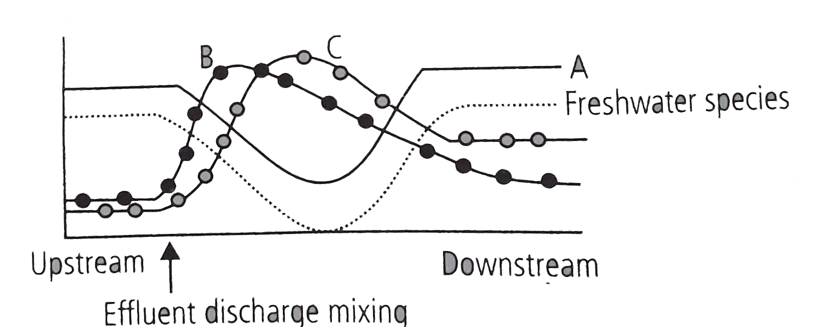
The graph given below represents changes in different ecological parameters due to effluent mixing in a stream. The three lines A, B anc C represent
 AA: oxygen concentration
B: biological O2 demand
C: pollution resistant speciesBA: pollutan
B: aerobic process
C: anaerobic processCA: oxygen concentration
B: CO2 concentration
C: termperatureDA: phosphate concentration
B: nitrate concentration
C: rate of photosynthesis.
The expenditure of a family of different heads in a month is given below

Draw a bar graph to represent the data above.
View SolutionGiven below is the data of school going students (boys and girls):

Draw the bar graph to represent the above data.
View SolutionHundred students from a certain locality use different modes of travelling to school as given below. Draw a bar graph.

View SolutionThe percentage of marks obtained, in different subjects by Ashok Sharma (in an examination) are given below. Draw a bar graph to represent it.

View SolutionFollowing table represents the lengths of six different ribbons.

f the given data has to be represented as a bar graph, then select the most appropriate scale from the given options that can be used to draw the bar graph.
1 unit = 5 cm
View SolutionFollowing table represents the lengths of six different ribbons.

f the given data has to be represented as a bar graph, then select the most appropriate scale from the given options that can be used to draw the bar graph.
1 unit = 1 cm
View SolutionFollowing table represents the lengths of six different ribbons.

f the given data has to be represented as a bar graph, then select the most appropriate scale from the given options that can be used to draw the bar graph.
1 unit = 3 cm
View Solution


