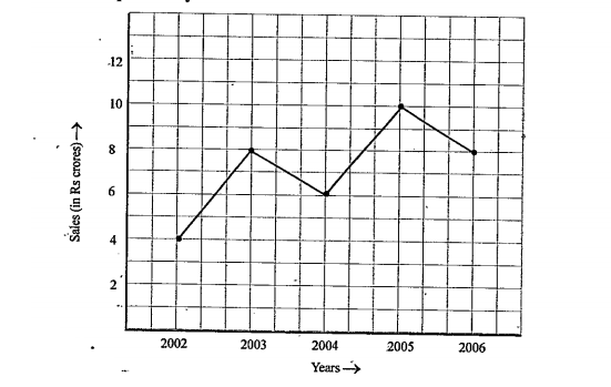
The following line graph shows the yearly sales figures for a manufacturing company.
In which year was there the greatest differene between the sales as compared to its previous year?
 Solution in Assamese
Step by step video & image solution for The following line graph shows the yearly sales figures for a manufacturing company. In which year was there the greatest differene between the sales as compared to its previous year? by Maths experts to help you in doubts & scoring excellent marks in Class 8 exams.
Updated on:21/07/2023Topper's Solved these Questions
Similar Questions
Find the common factors of the given terms.
12x,36
View SolutionSolve the following equations.
x−2=7
View SolutionHow many lines of symmetry does the above figure have ?
View SolutionWhich of the following are correct chain isomers of butane ? (i)
View SolutionDetermine the point of symmetry of a regular hexagon.
View SolutionDtermine the images of the following figure about the given line :
View SolutionMatch the following Column A to Column B
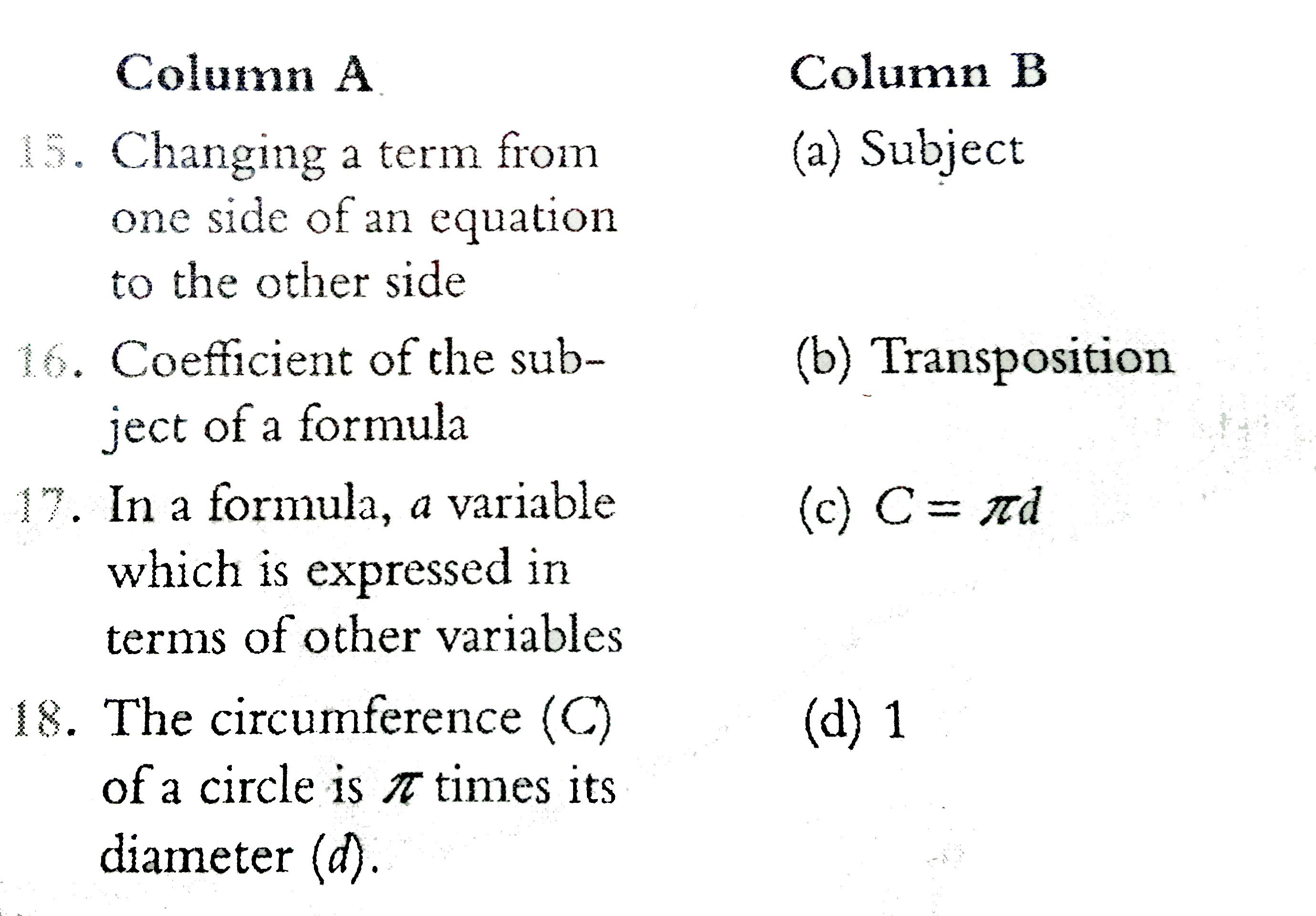
View SolutionMatch the following Column A to Column B
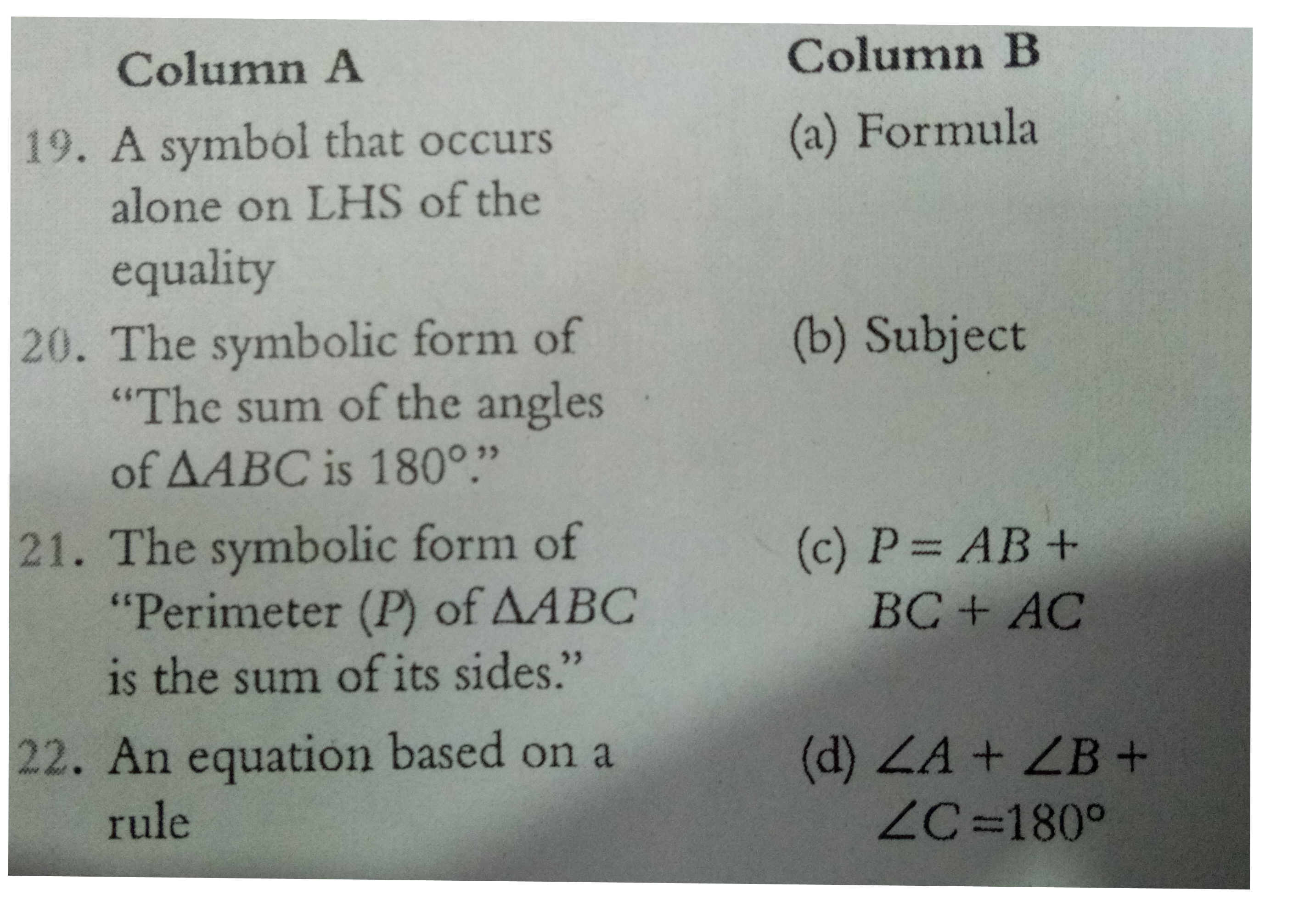
View SolutionMatch the following Column A to Column B
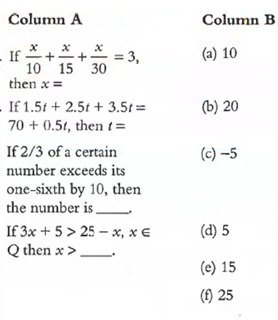
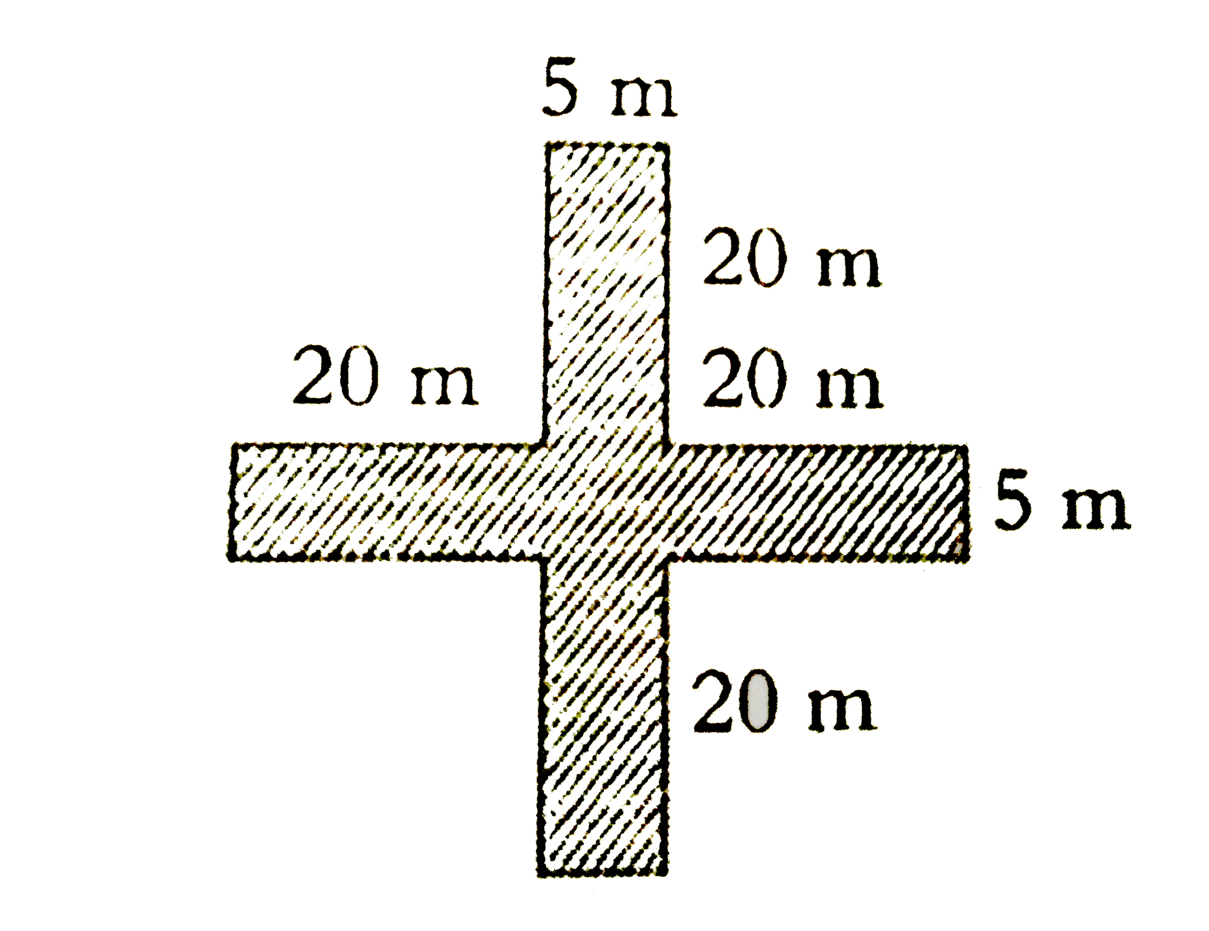
View SolutionFind the area of the figure given below.
View SolutionThe inequation represented by the graph given below is :
View SolutionThe inequation that best describes the graph given below is _________
View SolutionThe inequation that best describes the following graph is _________
View SolutionWhich inequations represent the shaded region in the given figure
View SolutionWhich of the following statement is not correc for following straight line graph :-
ltimg src="https://d10lpgp6xz60nq.cloudfront.net/physics_images/ALN_PHY_R04_E01_015_Q01.png" width="80%"gt
View SolutionThe equation of straight line shown in figure is :
ltimg src="https://d10lpgp6xz60nq.cloudfront.net/physics_images/ALN_PHY_R04_E01_020_Q01.png" width="80%"gt
View Solution
