Construct a frequency polygon for the following distribution, using a graph sheet :
Marks30−4040−5050−6060−7070−8080−90No. of students 6 15 28 34 18 8
To construct a frequency polygon for the given distribution, follow these steps:
Step 1: Identify the midpoints of the class intervals.
The class intervals provided are:
- 30-40
- 40-50
- 50-60
- 60-70
- 70-80
- 80-90
To find the midpoints, use the formula:
Midpoint=Lower limit+Upper limit2
Calculating the midpoints:
- For 30-40: 30+402=35
- For 40-50: 40+502=45
- For 50-60: 50+602=55
- For 60-70: 60+702=65
- For 70-80: 70+802=75
- For 80-90: 80+902=85
Step 2: List the midpoints and corresponding frequencies.
Now, we will pair the midpoints with the number of students:
- Midpoint 35 → Frequency 6
- Midpoint 45 → Frequency 15
- Midpoint 55 → Frequency 28
- Midpoint 65 → Frequency 34
- Midpoint 75 → Frequency 18
- Midpoint 85 → Frequency 8
Step 3: Prepare the graph.
On a graph sheet:
- Draw the x-axis (horizontal) for the midpoints.
- Draw the y-axis (vertical) for the number of students.
- Label the x-axis with midpoints: 35, 45, 55, 65, 75, 85.
- Label the y-axis with the corresponding frequencies: 0, 6, 12, 18, 24, 30, 34, 36.
Step 4: Plot the points on the graph.
Plot the following points based on the midpoints and frequencies:
- (35, 6)
- (45, 15)
- (55, 28)
- (65, 34)
- (75, 18)
- (85, 8)
Step 5: Connect the points.
Using a ruler, connect the points with straight lines. Start from the first point (35, 6) and connect to (45, 15), then to (55, 28), and so on until you reach (85, 8).
Step 6: Extend the polygon.
To complete the frequency polygon, you can extend the line to the x-axis at the beginning and end of the data range. This means you can add points at (30, 0) and (90, 0) to close the polygon.
Final Note:
Your frequency polygon is now complete! It visually represents the distribution of students' marks.
---
The class intervals provided are:
- 30-40
- 40-50
- 50-60
- 60-70
- 70-80
- 80-90
Midpoint=Lower limit+Upper limit2
- For 30-40: 30+402=35
- For 40-50: 40+502=45
- For 50-60: 50+602=55
- For 60-70: 60+702=65
- For 70-80: 70+802=75
- For 80-90: 80+902=85
Now, we will pair the midpoints with the number of students:
- Midpoint 35 → Frequency 6
- Midpoint 45 → Frequency 15
- Midpoint 55 → Frequency 28
- Midpoint 65 → Frequency 34
- Midpoint 75 → Frequency 18
- Midpoint 85 → Frequency 8
On a graph sheet:
- Draw the x-axis (horizontal) for the midpoints.
- Draw the y-axis (vertical) for the number of students.
- Label the x-axis with midpoints: 35, 45, 55, 65, 75, 85.
- Label the y-axis with the corresponding frequencies: 0, 6, 12, 18, 24, 30, 34, 36.
Plot the following points based on the midpoints and frequencies:
- (35, 6)
- (45, 15)
- (55, 28)
- (65, 34)
- (75, 18)
- (85, 8)
Using a ruler, connect the points with straight lines. Start from the first point (35, 6) and connect to (45, 15), then to (55, 28), and so on until you reach (85, 8).
To complete the frequency polygon, you can extend the line to the x-axis at the beginning and end of the data range. This means you can add points at (30, 0) and (90, 0) to close the polygon.
Your frequency polygon is now complete! It visually represents the distribution of students' marks.
Topper's Solved these Questions
- ICSE EXAMINATION PAPER 2020 BOOK - ICSECHAPTER - ICSE EXAMINATION PAPER 2020 EXERCISE - SECTION - B
21 Videos
- GRAPHICAL SOLUTION(SOLUTION OF SIMULTANEOUS LINEAR EQUATIONS, GRAPHICALLY)BOOK - ICSECHAPTER - GRAPHICAL SOLUTION(SOLUTION OF SIMULTANEOUS LINEAR EQUATIONS, GRAPHICALLY)EXERCISE - EXAMPLES
6 Videos
- INDICES (EXPONENTS)BOOK - ICSECHAPTER - INDICES (EXPONENTS)EXERCISE - 4 Marks Questions
9 Videos
Similar Questions
Compute D3 for the following distribution :
Marks0−1010−2020−3030−4040−5050−6060−7070−80No.of students3101776421
View SolutionThe modal class for the following frequency distribution, is
Marks:0−1010−2020−4040−5050−6060−7070−9090−100No. of students:461416148165
View SolutionCalculate the mean and standard deviation for the following distribution: Marks:, 20-30, 30-40, 40-50, 50-60, 60-70, 70-80, 80-90 No. of students:, 3, 6, 13, 15, 14, 5, 4
View SolutionCompute the missing frequencies in the following distribution , given that is ∑fi = 100 and the median is 32
Marks0−1010−2020−3030−4040−5050−60Number of students 9 ? 26 30 ? 10
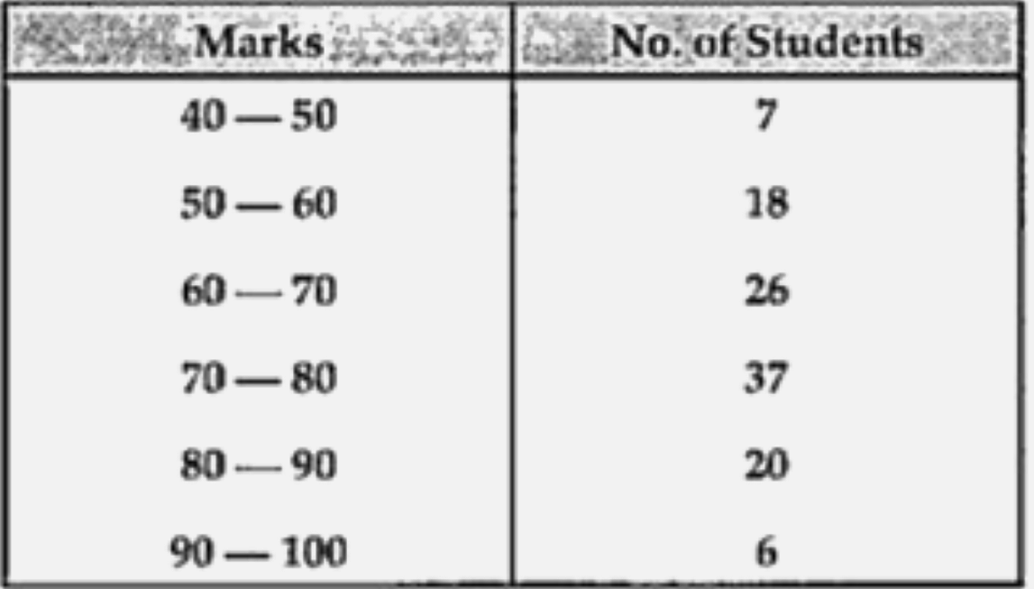
View SolutionConstruct a frequency polygon for the following frequency distribution , using a graph sheet .

Use 2 cm = 10 Marks
2 cm = 5 Students [Specimen paper , 2019]
View SolutionCompute mean deviation from mean of the following distribution: Marks 10-20 20-30 30-40 40-50 50-60 60-70 70-80 80-90 No. of students 8 10 15 2 20 18 9 5
View SolutionFind the mean for the following data.
Marks obtained10−2020−3030−4040−5050−6060−70Number of students8612527
View SolutionGiven the following frequency distribution with some missing frequencies .
Class10−2020−3030−4040−5050−6060−7070−80 f 180 − 34 180 136 − 50
If the total frequency is 685 and median is 42.6 then the missing frequencies are
View SolutionFind the first decile for the following data:
Size0.1010−2020−3030−4040−5050−6060−7070−80Frequency 2 18 30 45 35 20 6 3
View SolutionDraw histograms for the following frequency distributions :
Class interval 0−1010−2020−3030−4040−5050−60Frequency 12 20 26 18 10 6
View Solution
