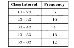
When we take class intervals on the x-axis and corresponding frequencies on the y-axis, and draw rectangles with the areas proportional to the frequencies of the respective class intervals, the graph so obtained is called
bar diagram
frequency curve
ogive
None of the above
Step by step video & image solution for When we take class intervals on the x-axis and corresponding frequencies on the y-axis, and draw rectangles with the areas proportional to the frequencies of the respective class intervals, the graph so obtained is called by Maths experts to help you in doubts & scoring excellent marks in Class 14 exams.
Similar Questions
Knowledge Check
- Question 1 - Select One
When rectangles are drawn with the areas proportional to the frequencies of respective class intervals, what is the diagram called ?
ABar graphBFrequency polygonCPie graphDHistogram - Question 2 - Select One
Write the comulative frequency of class interval 30-40
 A21B24C28D8
 - Question 3 - Select One
If the distance is plotted on the x-axis and kinetic energy is plotted on the y-axis, then the slope of the graph so obained is proportional to
ADistanceBkinetic energyCvelocityDacceleration
The difference between the highest and lowest values of the observations is called frequency (b) mean (c) range (d) class-intervals
View SolutionGiven below is a frequency distribution table. Read it and answer the questions that follow:

What is the upper limit of the last class interval?View SolutionIn a histogram, class intervals and frequencies are taken along _______axis and _______axis.
View SolutionTo draw a frequency polygon we need ______of the class interval of x-axis and frequency of the respective class for y-axis.
View SolutionConsider the following statements in respect of a histogram:
1. The total area of the rectangles in a histogram is equal to the total area bounded by the corresponding frequnecy polygon and the x-axis.
2. When class intervals are unequal in a frequency distribution, the area of the rectangle is proportional to the frequency.
Which of the above statements is/are correct?View Solution

