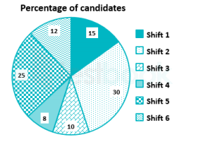
Directions: Read the following Pie chart carefully and answer the following questions:-
The pie chart shows the percentage of candidates in 6 different shifts of an examination.
Total number of candidates = 5500

Number of candidates in shift 6 is what percentage more/less than number of candidate in shift 4?
20%
50%
30%
10%
Step by step video & image solution for Directions: Read the following Pie chart carefully and answer the following questions:- The pie chart shows the percentage of candidates in 6 different shifts of an examination. Total number of candidates = 5500 Number of candidates in shift 6 is what percentage more/less than number of candidate in shift 4? by Maths experts to help you in doubts & scoring excellent marks in Class 14 exams.
Similar Questions
Directions: Read the following Pie chart carefully and answer the following questions:- The pie chart shows the percentage of candidates in 6 different shifts of an examination. Total number of candidates = 5500
The number of candidates in shift 1 is how much more than the number of candidates in shift 4?View SolutionDirections: Read the following Pie chart carefully and answer the following questions:- The pie chart shows the percentage of candidates in 6 different shifts of an examination. Total number of candidates = 5500

If 40% candidates in shift 6 were failed, then find the number of candidates passed the examination in the same shift.View Solution
Knowledge Check
- Question 1 - Select One
Study the following graph carefully and answer the question given below
Number of candidates appeared (in thousand) and percentage of candidates qualified in a competitive examination over the years.
No. of candidates appeared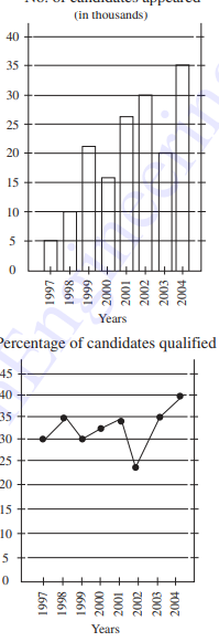
The number of candidates qualified in 1999 was what percentage of the number of candidates appeared in 1998?A68⋅5B66C32⋅5D67⋅5 - Question 2 - Select One
Study the following pie chart carefully and answer the questions. The pie chart represents the percentage of people involved in various occupations.
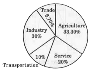
The ratio of the people involved in service to that in industry isA1:2B2:3C3:4D3:2 - Question 3 - Select One
Study the following pie chart carefully and answer the questions. The pie chart represents the percentage of people involved in various occupations.(total number of people-20000).
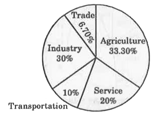
How many more people are involved in service than in trade?A3360B2660C1660D660
Directions: Read the following Pie chart carefully and answer the following questions:- The pie chart shows the percentage of candidates in 6 different shifts of an examination. Total number of candidates = 5500

If ratio of male to female candidates in shift 3 is 6 : 5, then find number of female candidates in shift 3) 1) 350 2) 225View SolutionDirections: Read the following Pie chart carefully and answer the following questions:- The pie chart shows the percentage of candidates in 6 different shifts of an examination. Total number of candidates = 5500

If 215 candidates in shift 2 were absent, then find the number of candidates present in the same shift.View SolutionDirections: Read the following Pie chart carefully and answer the following questions:- The pie chart shows the percentage of candidates in 6 different shifts of an examination. Total number of candidates = 5500

Find the average number of candidates in shift 2, shift 3 and shift 4 together in the examination.View SolutionStudy the following table and answer questions:
Number of candidates appeared in an examination from five cities:
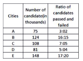
The number of candidates appearing for the examination from city D is what percent of the total number of candidates failed in cities A and B?View SolutionStudy the following pie chart carefully and answer the questions. The pie chart represents the percentage of people involved in various occupations.
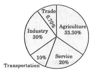
The angle made by the people involved in service in the given pie-chart isView Solution

