The following table gives the GDP in rupees (crore) by the three sectors

What conclusions can we draw from the bar graph?
Conclusions that can be drawn:
(a) Share of Primary sector has decreased from 2000 to 2013.
Share of the three sectors in GDP for 2013
Total GDP: (8,00, 500 + 10,74,000 + 38,68,000)
= 57,42,500 crores
% Share of primary sector
=(8,00,500/57,42,500 × 100) = 13.93%
% Share of secondary sector
= 10,74,000/57,42,500 × 100 = 18.70%
% Shape of Tertiary sectors
=38,68,0001/57,42,500 × 100 = 67.355%
(b) Share of Secondary Sector has also decreased from 2000 to 2013.
(c) Share of Tertiary Sector has increased from 2000 to 2013
Similar Questions
The following table gives the GDP in rupees (crore) by the three sectors

Show the data as a bar diagram similar to graph in the chapter.
View SolutionThe following table gives the GDP in rupees (crore) by the three sectors

Calculate the share of the three sectors in GDP for 2000 and 2013
View Solution
Knowledge Check
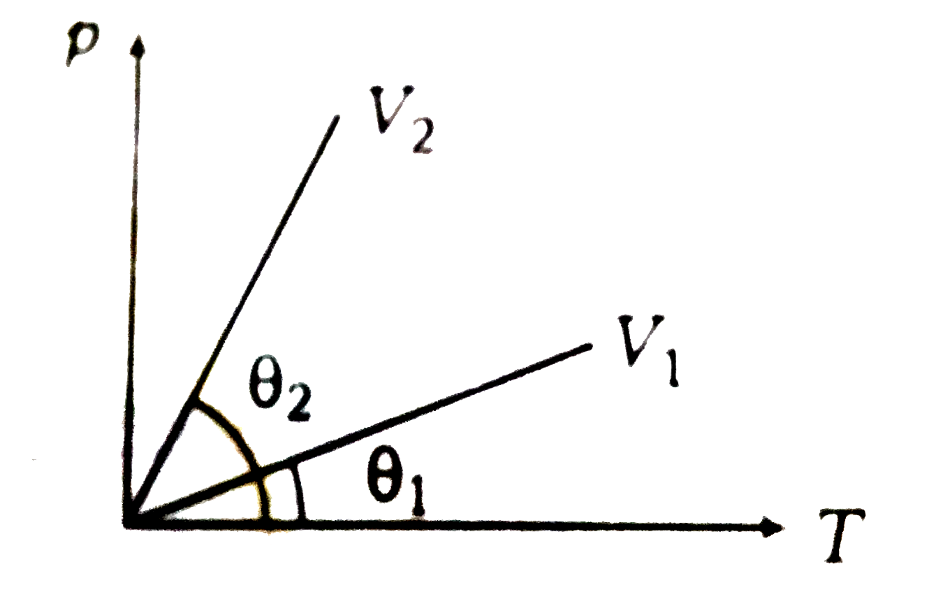
From the p-T graph want conclusion can be drawn?
 AV2=V1BV2<V1CV2>V1DNone of these
From the p-T graph what conclusion can be drawn?

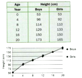
View SolutionThe table below shows the data on likely heights of boys and girls as they grow in age. Draw graphs of height and age for both boys and girls on the same graph paper. What conclusions can be drawn from these graphs?

View SolutionThe following table gives the height of five trees in a garden.

If the given data has to be represented as a bar graph, then select the most appropriate scale from the given options that can be used to draw the bar graph.
1 unit = 20 trees
View SolutionThe following table gives the height of five trees in a garden.
<
If the given data has to be represented as a bar graph, then select the most appropriate scale from the given options that can be used to draw the bar graph.
1 unit = 1 trees
View SolutionThe following table gives the height of five trees in a garden.

If the given data has to be represented as a bar graph, then select the most appropriate scale from the given options that can be used to draw the bar graph.
1 unit = 5 trees
View SolutionThe following table gives the height of five trees in a garden.

If the given data has to be represented as a bar graph, then select the most appropriate scale from the given options that can be used to draw the bar graph.
1 unit = 8 trees
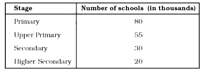
View SolutionThe following table gives the data of number of schools (stage-wise) of a country in the year 2002.

Draw a bar graph to represent the above data:
View Solution
