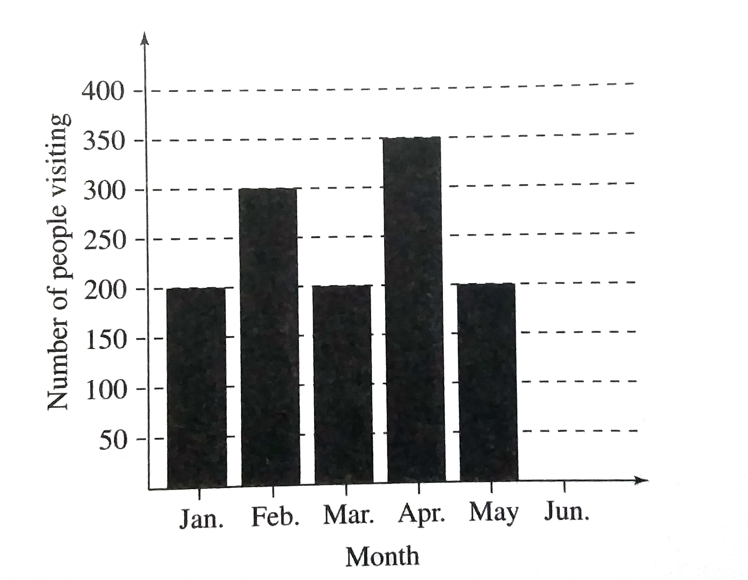
The graph below shows the number of people visiting a museum during the first 5 months of the year . How many people need to visit the museum during june for the mean of the first 6 months to equal to mean of the first 5 months ?

A
0
B
200
C
250
D
500
Video Solution
Text Solution
The correct Answer is:C
|
Answer
Step by step video, text & image solution for The graph below shows the number of people visiting a museum during the first 5 months of the year . How many people need to visit the museum during june for the mean of the first 6 months to equal to mean of the first 5 months ? by Maths experts to help you in doubts & scoring excellent marks in Class 12 exams.
Updated on:21/07/2023Topper's Solved these Questions
Similar Questions
Knowledge Check
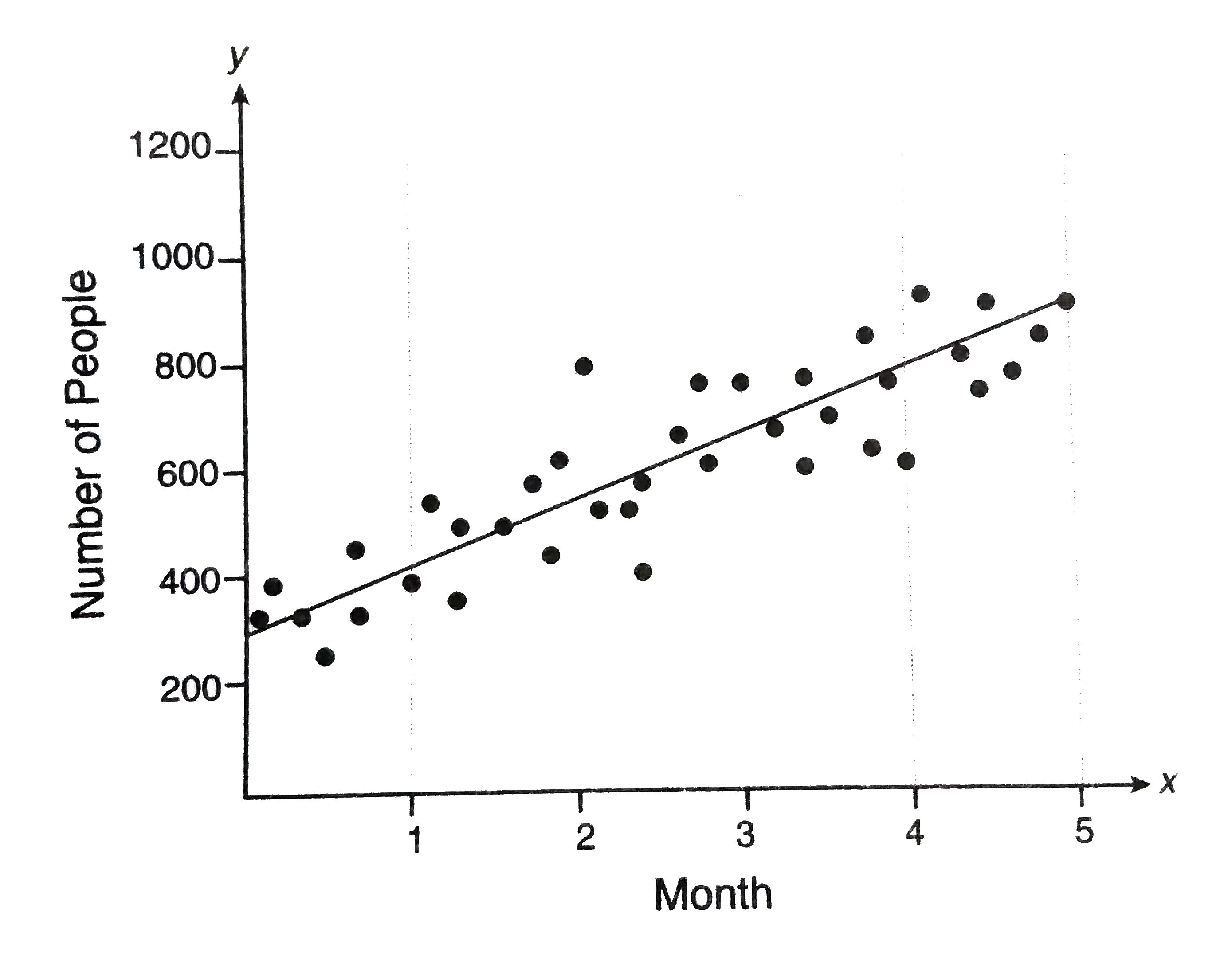
A new fitness class was started at a chain of fitness clubs owned by the same company. The scatter plot above shows the total number of people attending the class during the first 5 months in which the class was offered. The line of best fit is drawn. If n is the number of the month, which of the following functions could represent the equation of the graph's line of best fit?
Af(x)=300n+125Bf(n)=300+125nCf(n)=400+150nDf(n)=200n+300
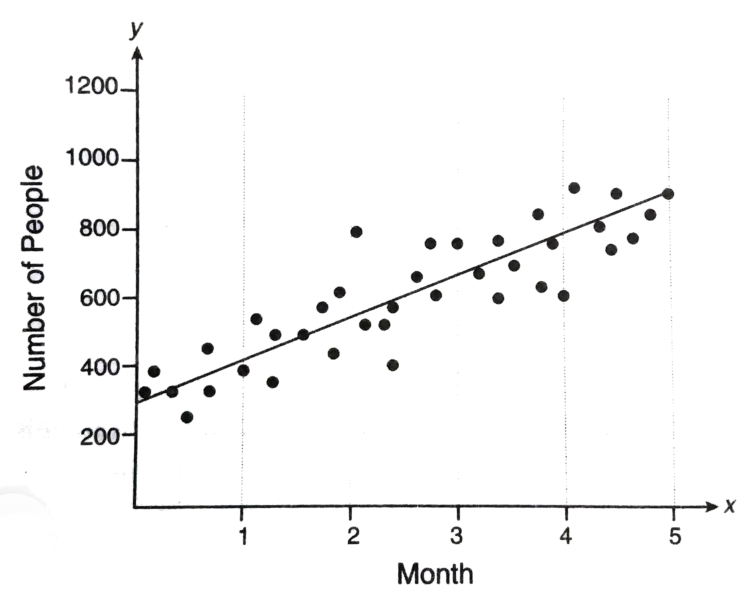
A new fitness class was started at several fitness clubs owned by the same company. The scatterplot shows the total number of people attending the class during the first five months in which the class was offered. The line of best fit is drawn.
Q. During the five-month period, the average increase in the number of people attending the class per month is closest to which of the following?A80B100C120D140
Question 5-7 refer to the scatterplot above.
A new fitness class was started at several fitness clubs owned by the same company. The scatterplot shows the total number of people attending the class during the first five months in which the class was offered. The line of best fit is drawn.
Q. At the beginning of which month did the actual number of people attending the class differ by the greatest amount from the number predicted by the line of best fit?AMonth 2BMonth 3CMonth 4DMonth 5
Find the arithmetic mean of first 6 natural numbers.
View SolutionFind the arithmetic mean of first 6 natural numbers.
View SolutionFind the mean of the first five whole numbers
View SolutionFind the mean of the first five whole numbers
View SolutionThe arithmetic mean of the squares of first n natural numbers is
View Solution
