Complete Solutions to EXAMPLE of chapter Introduction to Graphs of Class 8 book with complete answers and questions
| Class 8 | MATHS |
| Chapter | Introduction to Graphs |
| ASHOK PUBLICATION ASSAM | EXAMPLE |
| Number Of Questions | 47 |
| Academic Year | 2023-24 |
The following graph shows the temperature of a natient in a hospital, recorded every hour.
What was the patient's temperature at 1 p.m.?

View SolutionThe following graph shows the temperature of a patient in a hospital, recorded every hour.
When was the patients temperature `38.5^@ C`?
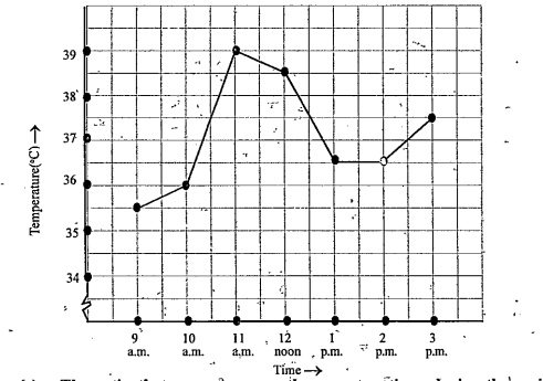
View SolutionThe patient's temperature was the same two times during period given. What were these two times?

View SolutionWhat was the temperature at 1.30 p.m.? How did you arrive at your answer?

View SolutionDuring which periods did the patient's temperature showed an upward trend?

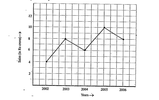
View SolutionThe following line graph shows the yearly sales figures for a manufacturing company.
What were the sales in (i) 2002 (ii) 2006 ?

View SolutionThe following line graph shows the yearly sales figures for a manufacturing company.
What were the sales in (i) 2003 (ii) 2005?

View SolutionThe following line graph shows the yearly sales figures for a manufacturing company.
Compute the differnece between the sales in 2002 and 2006

View SolutionThe following line graph shows the yearly sales figures for a manufacturing company.
In which year was there the greatest differene between the sales as compared to its previous year?
View SolutionFor an experiement in Botany, two different plants, plant A and plant B were grown under similar laboratory conditions. Their heigths were measured at the end of each week for 3 weeks. The results are shown by the following graph.

How high was Plant A after (i) 2 weeks (ii) 3 weeks?
View SolutionFor an experiment in Botany, two different plants, plant A and plant B were grown under similar laboratory conditions. Their heigths were measured at the end of each week for 3 weeks. The results are shown by the following graph.

How high was Plant B after (i) 2 weeks (ii) 3 weeks?
View SolutionFor an experiment in Botany, two different plants, plant A and plant B were grown under similar laboratory conditions. Their heigths were measured at the end of each week for 3 weeks. The results are shown by the following graph.

How much did Plant A grow during the 3rd week?
View SolutionFor an experiement in Botany, two different plants, plant A and plant B were grown under similar laboratory conditions. Their heigths were measured at the end of each week for 3 weeks. The results are shown by the following graph.
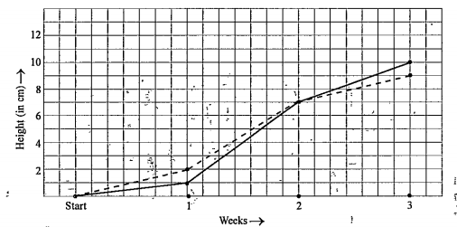
How much did Plant B grow from the end of the 2nd week to the end of the 3rd week?
View SolutionFor an experiment in Botany, two different plants, plant A and plant B were grown under similar laboratory conditions. Their heigths were measured at the end of each week for 3 weeks. The results are shown by the following graph.

During which week did Plant A grow most?
View SolutionFor an experiement in Botany, two different plants, plant A and plant B were grown under similar laboratory conditions. Their heigths were measured at the end of each week for 3 weeks. The results are shown by the following graph.

During which week did Plant B grow least?
View SolutionFor an experiment in Botany, two different plants, plant A and plant B were grown under similar laboratory conditions. Their heigths were measured at the end of each week for 3 weeks. The results are shown by the following graph.

Were two Plants of the same height during any week shown here? Specify.
View SolutionThe following graph shows the temperature forecast and the actual temperature for each day of a week.

On which days was the forecast temperature the same as the actual temperature?
View SolutionThe following graph shows the temperature forecast and the actual temperature for each day of a week.

What was the maximum forecast temperature during the week?
View SolutionThe following graph shows the temperature forecast and the actual temperature for each day of a week.
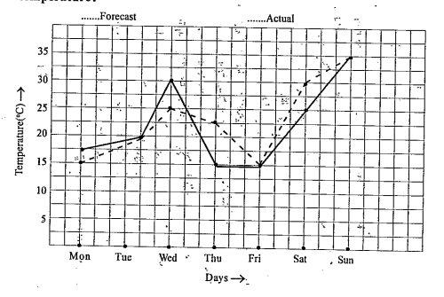
What was the minimum actual temperature during the week?
View SolutionThe following graph shows the temperature forecast and the actual temperature for each day of a week.

On which day did the actual temperature differ the most from the forecast temperature?
View SolutionUse the tables below to draw liner graphs.
The number of days a hill side city received snow in different years.

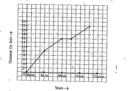
View SolutionA courier-person cycles from a town to a neighbouring suburban area to deliver a pated to a merchant. His distance from the town at different times is shown by the following graph.
What is the scale taken for the time axis?

View SolutionA courier-person cycles from a town to a neighbouring suburban area to deliver a parcel to a merchant. His distance from the town at different times is shown by the following graph.
How much time did the person take for the travel?

View SolutionA courier-person cycles from a town to a neighbouring suburban area to deliver a parcel to a merchant. His distance from the town at different times is shown by the following graph
How far is the place of the merchant from the town?

View SolutionA courier-person cycles from a town to a neighbouring suburban area to deliver a parcel to a merchant. His distance from the town at different times is shown by the following graph.
Did the person stop on his way? Explain.

View SolutionA courier-person cycles from a town to a neighbouring suburban area to deliver a parcel to a merchant. His distance from the town at different times is shown by the following graph.
During which period did he ride fastest?
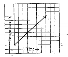
View SolutionCan there be a time-temperature graph as follows? Justify your answer.
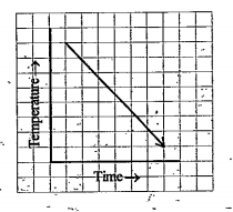
View SolutionCan there be a time-temperature graph as follows? Justify your answer.
View SolutionCan there be a time-temperature graph as follows? Justify your answer.
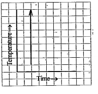
View SolutionCan there be a time-temperature graph as follows? Justify your answer.
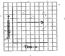
View SolutionPlot the following points on a graph sheet. Verify if they lie on a line.
A(4,0), B(4,2), C(4,6), D(4,2.5)`
View SolutionPlot the following points on a graph sheet. Verify if they lie on a line.
P(1,1), Q(2,2), R(3,3), S(4,4)
View SolutionPlot the following points on a graph sheet. Verify if they lie on a line.
K(2,3),L(5,3), M(5,5), N(2,5)
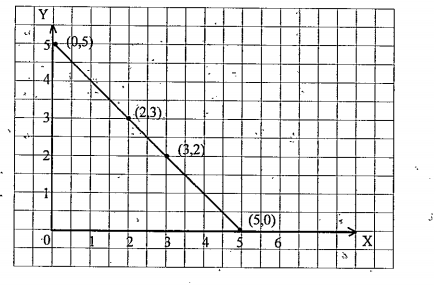
View SolutionDraw the line passing through (2,3) and (3,2). Find the coordinates of the points at which this line meets the x-axis and y-axis
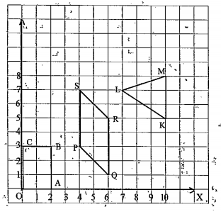
View SolutionWrite the coordinates of the vertices of each of these adjoining figures.
View SolutionState whether True or False. Correct that are false.
A point whose x-coordinate is zero and y-coordinate is non-zero will lie on the y-axis.
View SolutionState whether True or False. Correct that are false.
A point whose y-coordinate is zero and x-coordinate is 5 will lie on y-axis.
View SolutionState whether True or False. Correct that are false.
The coordinates of the orgin are (0,0).
View SolutionDraw the graphs for the following tables of values, with suitable scales on the axes.
Cost of apples

View SolutionDraw the graphs for the following tables of values, with suitable scales on the axes.
Distance travelled by a car.

How much distance did the car cover during the period 7.30 a.m. to 8 a.m.?
View SolutionDraw the graphs for the following tables of values, with suitable scales on the axes.
Distance travelled by a car

What was the time when the car had covered a distance of 100 km since it's start?
View SolutionDraw the graphs for the following tables of values, with suitable scales on the axes.
Interest on deposits for a year.

Does the graph pass through the origin?
View SolutionDraw the graphs for the following tables of values, with suitable scales on the axes.
Interest on deposits for a year.

Use the graph to find the interest on Rs 2500 for a year.
View SolutionDraw the graphs for the following tables of values, with suitable scales on the axes.
Interest on deposits for a year.

To get an interest of Rs 280 per year, how much money should be deposited?
View SolutionDraw a graph for the following.

Is it a linear graph?
View SolutionDraw a graph for the following.

Is it a linear graph?
View SolutionThe number of litres of petrol you buy to fill a car's petrol tank will decide the amount you have to pay. Which is the independent variable here? Think about it.
View Solution
EXAMPLE questions and complete solutions for chapter Introduction to Graphs of ASHOK PUBLICATION ASSAM of Class 8