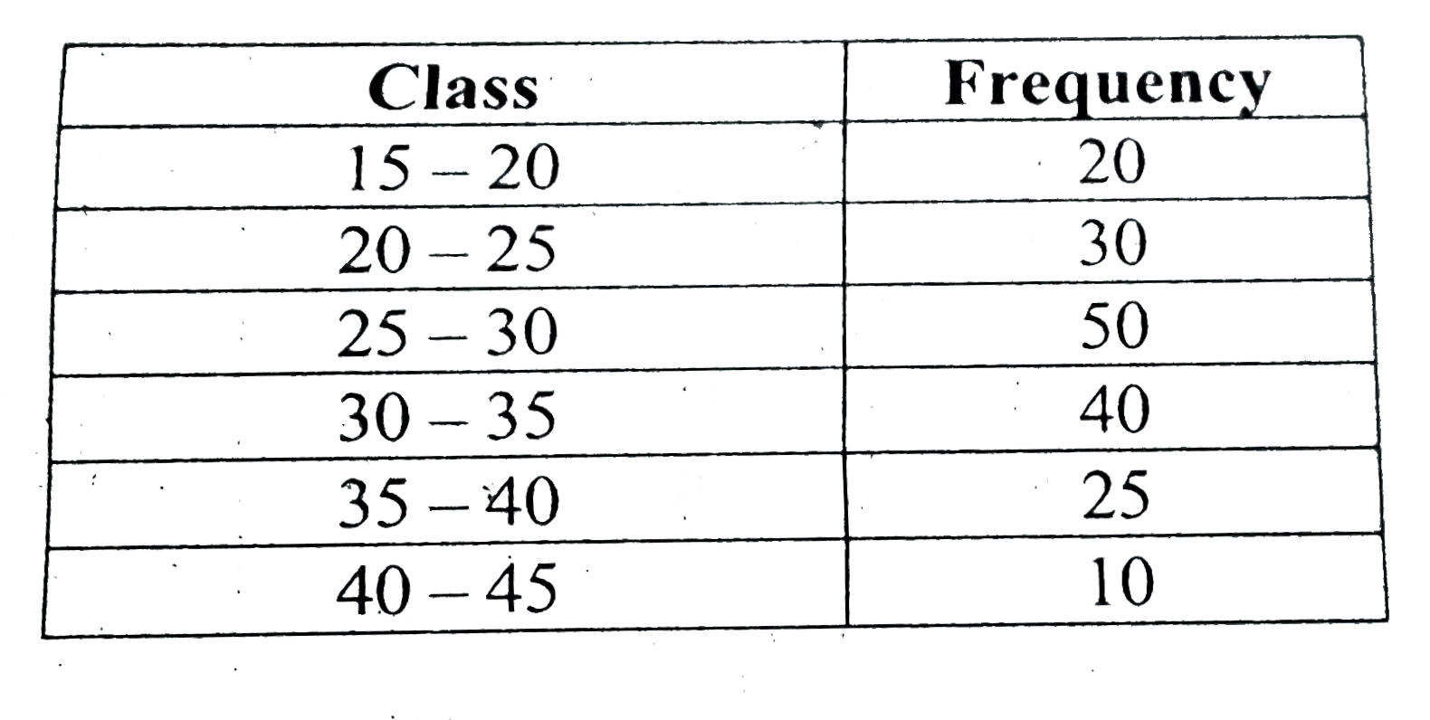
What are the various types of graphs of frequency distribution?
Frequency distribution can also be presented by means of graphs. Such graphs facilitate comparative study of two or more frequency distributions as regards their shape and pattern. The most commonly used graphs are as follows -i Line frequency diagram ii Histogram iii Frequency Polygon iv Frequency curves v cumulative frequency curves or Ogine curveLine Frequency Diagram : This diagram is mostly used to depict discrete series on a graph. The values are shown on the X-axis and the frequencies on the Y axis. The lines are drawn vertically on X-axis against the relevant values taking the height equal to respective frequencies.Histogram : It is generally used for presenting continuous series. Class intervals are shown on X-axis and the frequencies on Y-axis. The data are plotted as a series of rectangles one over the other. The height of rectangle represents the frequency of that group. Each rectangle is joined with the other so as to give a continuous picture.Histogram is a graphic method of locating mode in continuous series. The rectangle of the highest frequency is treated as the rectangle in which mode lies. The top corner of this rectangle and the adjacent rectangles on both sides are joined diagonally . The point where two lines interact each other a perpendicular line is drawn on OX-axis. The point where the perpendicular line meets OX-axis is the value of modeFrequency Polygon : Frequency polygon is a graphical presentation of both discrete and continuous series.For a discrete frequency distribution frequency polygon is obtained by plotting frequencies on Y-axis against the corresponding size of the variables on X-axis and then joining all the points ;by a straight line.In continuous series the mid-points of the top of each rectangle of histogram is joined by a straight line. To make the area of the frequency polygon equal to histogram the line so drawn is stretched to meet the base line X-axis on both sides.Frequency Curve : The curve derived by making smooth frequency polygon is called frequency curve. It is constructed by making smooth the lines of frequency polygon. This curve is drawn with a free hand so that its angularity disappears and the area of frequency curve remains equal to that of frequency polygon. Cumulative Frequency Curve or Ogine Curve : This curve is a graphic presentation of the cumulative frequency distribution of continuous series. It can be of two types - a Less than Ogive and b More than Ogive.Less than Ogive : This curve is obtained by plotting less than cumulative frequencies against the upper class limits of the respective classes. The points so obtained are joined by a straight line. It is an increasing curve sloping upward from left to right.More than Ogive : It is obtained by plotting more than‘ cumulative frequencies against the lower class limits of the respective classes. The points so obtained are joined by a straight line to give more than ogive‘. It is a decreasing curve which slopes downwards from left to right.Median and partition values can be known from this curve. The point at which the less than‘ and more than‘ ogive curves intersect gives the value of median.
Related Solutions
Histogram is a graph of a ________ frequency distribution.
View SolutionTypes Of Frequency Distributions
View SolutionA graph of cummulative frequency distribution is called
View SolutionA table šlowing the frequency of various observations is called a frequency distribution table. ?
View Solutionनिम्नलिखित बंटन को एक अधिक प्रकार के संचयी बारम्बारता बंटन में रूपांतरित कीजिये ।

उपरोक्त बंटन की कम प्रकार की संचयी बारम्बारता वितरण लिखिए
View SolutionVariance of a discrete frequency distribution
View SolutionACCELERATION-TIME GRAPH OF VARIOUS TYPES OF MOTION OF A PARTICLE
View SolutionRepresent the following frequency distribution by a bar graph :

View SolutionIn statistics, the bar graph of a frequency distribution is called
View SolutionA ________ is a line graph for the graphical representation of the continuous frequency distribution.
View SolutionThe graph which shows the cumulative frequency distribution is -
View SolutionA graph of a cumulative frequency distribution function is known as
View SolutionRepresent the following frequency distribution as a bar graph:
View SolutionIn statistics, the bar graph of a frequency distribution is called
View SolutionDraw an ogive (less than type) from the following frequency distribution table and hence find the median of this graph.

View SolutionDraw histrogram and frequency polygon on the same graph paper for the following frequency distribution:

View SolutionConvert the following distribution to more than type, cumulative frequency distribution :

View SolutionIn what type of graph comparison among the class frequencies is possible?
View SolutionVariance of a grouped or continuous frequency distribution
View SolutionFollowing distribution gives cumulative frequencies of 'more than type': Change the above data to a continuous grouped frequency distribution.
View Solution