A frequency polygon is constructed by plotting frequency of the class interval and the
1)upper limit of the class
2)lower limit of the class
3)mid value of the class
4)any values of the class
To solve the question regarding how a frequency polygon is constructed, we will analyze the options provided and determine the correct answer step by step.
1. Understanding Frequency Polygon: A frequency polygon is a graphical representation of the distribution of a dataset. It is created by plotting points for the frequency of each class interval and connecting these points with straight lines.
Hint: Remember that a frequency polygon is related to the representation of data in a graphical form.
2. Identifying the Points to Plot: The points plotted on the frequency polygon represent the frequencies of the class intervals. The question asks what values are used for the x-axis (horizontal axis) when plotting these frequencies.
Hint: Consider the characteristics of the data representation in a histogram, as a frequency polygon is derived from it.
3. Evaluating the Options:
- Option 1: Upper limit of the class: This is not typically used for plotting frequency polygons.
- Option 2: Lower limit of the class: Similar to the upper limit, this is not the standard practice.
- Option 3: Mid value of the class: This is the correct option. The mid value (or midpoint) of each class interval is used to plot the frequency against.
- Option 4: Any values of the class: This is too vague and not specific to the method of constructing a frequency polygon.
Hint: Think about how midpoints are calculated and their significance in representing the data accurately.
4. Conclusion: Based on the analysis, the frequency polygon is constructed by plotting the frequency of the class interval against the mid value of the class.
Final Answer: The correct answer is 3) mid value of the class.
- Option 1: Upper limit of the class: This is not typically used for plotting frequency polygons.
- Option 2: Lower limit of the class: Similar to the upper limit, this is not the standard practice.
- Option 3: Mid value of the class: This is the correct option. The mid value (or midpoint) of each class interval is used to plot the frequency against.
- Option 4: Any values of the class: This is too vague and not specific to the method of constructing a frequency polygon.
Topper's Solved these Questions
Similar Questions
Knowledge Check
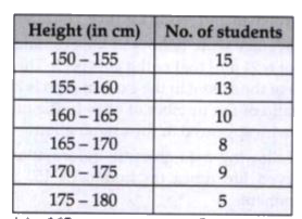
Find the lower limit of the median class
 A165B155C160D170
In a frequency distribution, the mid value of a class is 10 and the width of the class is 6. The lower limit of the class is
A8B7C10D12Consider the data

The difference between the upper limit of the median class and the lower limit of the modal class isA0B19C20D38
In the following frequency distribution, what is the upper limit of the median class ?

View SolutionFrom the following frequency table.

Find : (a) The frequency of fifth class interval
(b) The upper class limit of third class interval.
(c) The lower class limit of second class interval.
(d) The class mark of sixth class interval.
View SolutionConsider the data

The difference of the upper limit of the median class and the lower limit of the modal class is
View SolutionUpper limit of class interval 75-85 is
View SolutionThe difference between upper limit and lower limit of a class is called
View Solution

