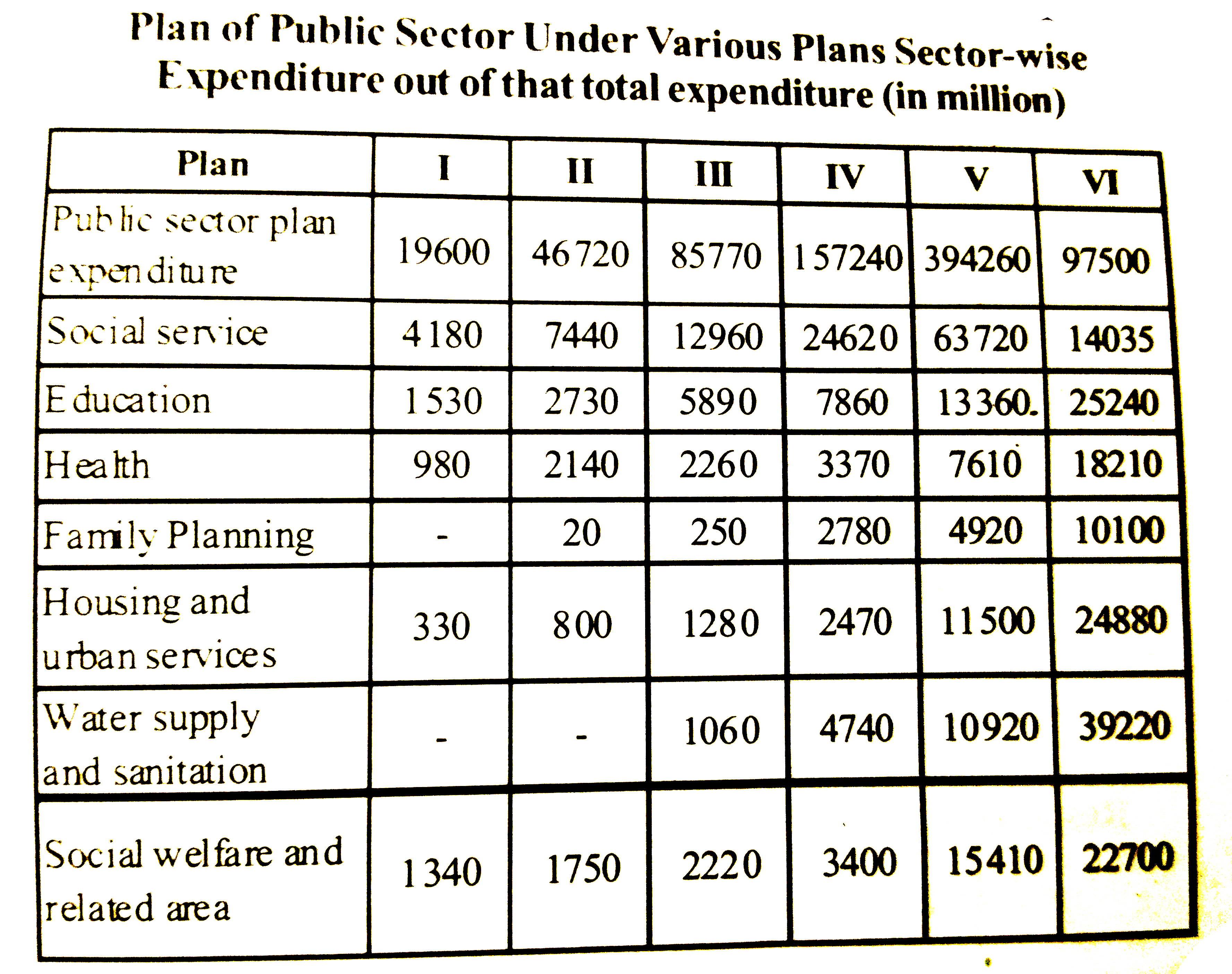
In various plans in the ratio of expenditure on public sector, which of the following graphs explain best the expenditure on water supply and sanitation ?


The correct Answer is:A
From table we can say that expenditure on watere supply and sanitation are incresaing in every plan. So, the graph represent in option (a) is best explain of it.
Topper's Solved these Questions
Similar Questions
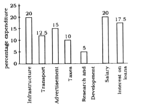
The bar-graph given below shows the percentage distribution of total expenditures of a company under various expense heads during 2013. Study the graph and answer the given questions.

The ratio of the total expenditure on infrastructure and transport to the total expenditure on taxes and interest on loans is
View SolutionExplain in brief the various components of expenditure method.
View Solution
Knowledge Check
Which of the following is a part of Expenditure Method ?
ARent and RoyaltyBMixed IncomeCNet ExportsDSalesWhich one of the following is a development expenditure ?
AA) Irrigation expenditureBB) Civil administrationCC) Debt servicesDD) Grant-in-AidWhich of the following is capital expenditure?
AWagesBWages paid for building constructionCRepair expenses of buildingDAdvertisment Expenses
Each of the questions is based on the table given below -----
Which of the following graphs well illustrates expenditure for water supply and cleaning in the ratio of expenditure in public sector under various plannings ?

View SolutionWhich of the following is the Capital expenditure?
View SolutionWhich of the following is not a public sector company ?
View SolutionWhich of the following is not a Public Sector Bank?
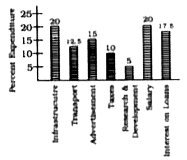
View SolutionThe bar graph shows the percentage distribution of the total expenditure of a company under varios expense heads during 2005. Study the bar graph and answer the following four questions.

The ratio of the total expenditure on infrastructure and transport to the total expenditure on taxes and interest on loans is
View Solution
