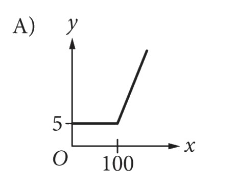
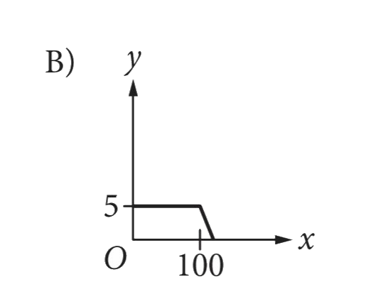
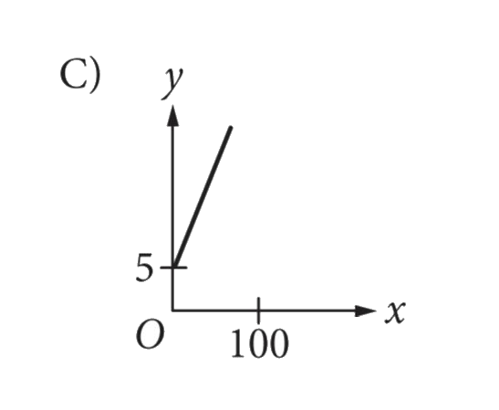
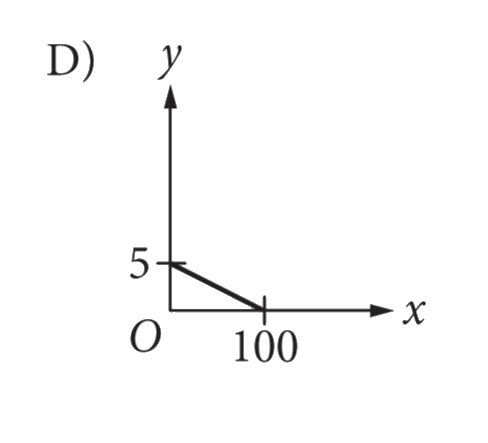
A text messaging plan charges a flat fee of $5 per month for up to 100 text messages sent plus $0.25 for each additional text message sent that month. Which of the following graphs represents the cost, y, of sending x texts in a month?


The correct Answer is:A
To solve the problem, we need to analyze the text messaging plan and determine how the cost y changes with the number of text messages sent x.
1. Understand the Pricing Structure:
- The plan charges a flat fee of $5 for up to 100 text messages.
- For any text messages sent beyond 100, there is an additional charge of $0.25 for each extra message.
2. Define the Cost Function:
- For x (the number of text messages) less than or equal to 100:
y=5
- For x greater than 100:
y=5+0.25(x−100)
- This means that for every additional text message sent beyond 100, the cost increases by $0.25.
3. Graph the Cost Function:
- For 0≤x≤100, the cost y is constant at $5. This will be a horizontal line at y=5.
- For x>100, the cost will increase linearly. The slope of this line is 0.25, starting from the point (100,5).
4. Identify the Characteristics of the Graph:
- The graph should show a horizontal line at y=5 for x from 0 to 100.
- After x=100, the graph should show a line that rises with a slope of 0.25.
5. Evaluate the Given Graph Options:
- We need to find a graph that matches the characteristics described above:
- A horizontal line at y=5 for x from 0 to 100.
- A line that increases after x=100.
6. Select the Correct Graph:
- After evaluating the options, we find that:
- Option A shows a horizontal line at y=5 for x≤100 and then a line that increases after x=100.
- Option B shows a decrease in cost after x=100, which is not possible according to the pricing structure.
Conclusion:
The correct graph that represents the cost y of sending x texts in a month is Option A.
- The plan charges a flat fee of $5 for up to 100 text messages.
- For any text messages sent beyond 100, there is an additional charge of $0.25 for each extra message.
- For x (the number of text messages) less than or equal to 100:
y=5
- For x greater than 100:
y=5+0.25(x−100)
- This means that for every additional text message sent beyond 100, the cost increases by $0.25.
- For 0≤x≤100, the cost y is constant at $5. This will be a horizontal line at y=5.
- For x>100, the cost will increase linearly. The slope of this line is 0.25, starting from the point (100,5).
- The graph should show a horizontal line at y=5 for x from 0 to 100.
- After x=100, the graph should show a line that rises with a slope of 0.25.
- We need to find a graph that matches the characteristics described above:
- A horizontal line at y=5 for x from 0 to 100.
- A line that increases after x=100.
- After evaluating the options, we find that:
- Option A shows a horizontal line at y=5 for x≤100 and then a line that increases after x=100.
- Option B shows a decrease in cost after x=100, which is not possible according to the pricing structure.
The correct graph that represents the cost y of sending x texts in a month is Option A.
Similar Questions
नेताजी का चश्मा' पाठ का संदेश क्या है?
View SolutionWhat message do you get from the text ‘Ibadat in Naubatkhana’?
View SolutionHow are messages sent and routed?
View SolutionFind the slope of a line perpendicular to the line which passes through each pair of the following points: \[{\text{(}}{{\text{x}}_1}{\text{,}}{{\text{y}}_1}{\text{) and (}}{{\text{x}}_2}{\text{,}}{{\text{y}}_2}{\text{)}}{\text{.}}\]
02:07View SolutionSMS is the ability to send and receive text message at a
View SolutionMessages are sent through a short messaging service
View SolutionHow are message sent and routed ?
View SolutionHow are messages sent and routed?
View Solution

