Given below are the seats won by different political parties in the polling outcome of a state assembly elections: (i) Draw a bar graph to represent the polling result

To draw a bar graph to represent the polling results we will first plot the political parties on the x-axis and seats won by different political parties on the y-axis. Then we will use vertical bars for each of the political parties which will represent the seats won by them. Plotting all vertical bars for all the parties will give us the required bar graph.
Topper's Solved these Questions
- STATISTICSBOOK - NCERTCHAPTER - STATISTICSEXERCISE - EXERCISE 14.1
2 Videos
- STATISTICSBOOK - NCERTCHAPTER - STATISTICSEXERCISE - Exercise 14.2
9 Videos
- QUADRILATERALSBOOK - NCERTCHAPTER - QUADRILATERALSEXERCISE - SOLVED EXAMPLES
8 Videos
- SURFACE AREAS AND VOLUMESBOOK - NCERTCHAPTER - SURFACE AREAS AND VOLUMESEXERCISE - EXERCISE 13.8
10 Videos
Similar Questions
Given below are the seats won by different political parties in the polling outcome of a state assembly elections :

Which political party won the minimum number of seats?
View SolutionGiven below are the seats won by different political parties in the polling outcome of a state assembly elections :

Which political party won the maximum number of seats?
View SolutionThe income of a family i different year are as follows. Draw a bar graph to represent the data
View SolutionThe approximate speeds of some objects are given below. Draw a bar graph to represent them:

View SolutionWrite some of the successful slogans given by different political parties in various elections.
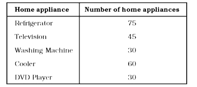
View SolutionHome appliances sold by a shop in one month are given as below:

Draw a bar graph to represent the above information.
View SolutionThe percentage of expenditure on different heads in a budget of a state is as shown below :

Draw a pie diagram to represent the information .
View SolutionThe expenditure of a family of different heads in a month is given below

Draw a bar graph to represent the data above.
View SolutionGiven below is the data of school going students (boys and girls):

Draw the bar graph to represent the above data.
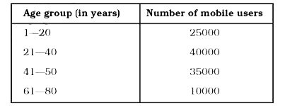
View SolutionNumber of mobile phone users in various age groups in a city is listed below:

Draw a bar graph to represent the above information.
View Solution
