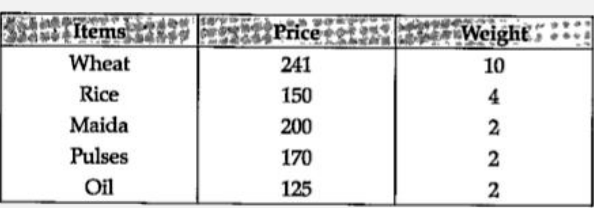
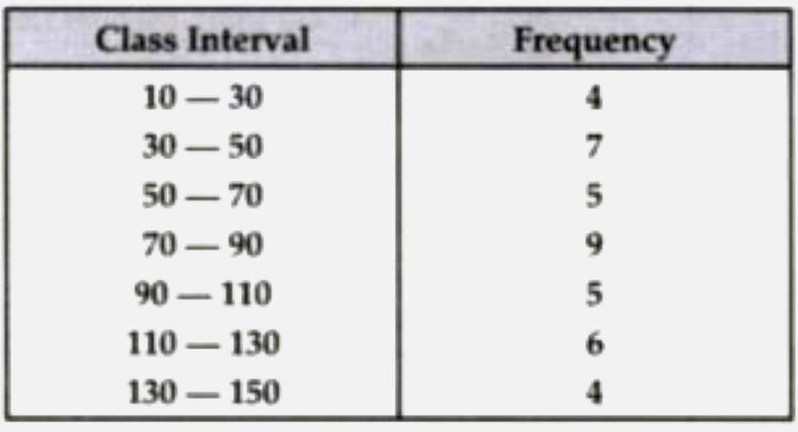
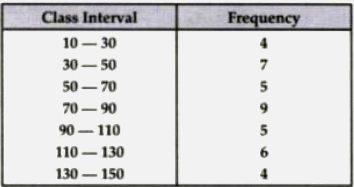
In a city of weekly observations made in a study on the cost of loving index are given in the following tadraw a frequency polygon (without constructing histogram )
To draw a frequency polygon based on the given data about the cost of living index, we will follow these steps:
Step 1: Identify the Class Intervals and Frequencies
Assuming we have the following data (as the original data is not provided, this is an example):
| Class Interval | Frequency |
|----------------|-----------|
| 140 - 150 | 5 |
| 150 - 160 | 10 |
| 160 - 170 | 20 |
| 170 - 180 | 9 |
| 180 - 190 | 6 |
| 190 - 200 | 2 |
Step 2: Calculate the Class Marks
The class mark is calculated using the formula:
Class Mark=Upper Class Limit+Lower Class Limit2
Calculating the class marks for each interval:
- For 140 - 150: 140+1502=145
- For 150 - 160: 150+1602=155
- For 160 - 170: 160+1702=165
- For 170 - 180: 170+1802=175
- For 180 - 190: 180+1902=185
- For 190 - 200: 190+2002=195
Step 3: Determine Points for Frequency Polygon
To plot the frequency polygon, we need to include points where the frequency is zero. We will extend the x-axis by 10 units on both ends:
- Start point: 145−10=135 (frequency = 0)
- End point: 195+10=205 (frequency = 0)
Step 4: Prepare the Data for Plotting
Now we have the following points to plot:
- (135, 0)
- (145, 5)
- (155, 10)
- (165, 20)
- (175, 9)
- (185, 6)
- (195, 2)
- (205, 0)
Step 5: Draw the Axes
1. Draw the x-axis and y-axis.
2. Label the x-axis as "Cost of Living Index" and the y-axis as "Number of Weeks".
3. Mark the x-axis with values from 135 to 205 and the y-axis with values from 0 to 20.
Step 6: Plot the Points
Plot the points calculated in Step 4 on the graph.
Step 7: Connect the Points
Connect the plotted points with straight lines to form the frequency polygon.
Final Graph
You should now have a frequency polygon that visually represents the frequency distribution of the cost of living index.
---
Assuming we have the following data (as the original data is not provided, this is an example):
|----------------|-----------|
| 140 - 150 | 5 |
| 150 - 160 | 10 |
| 160 - 170 | 20 |
| 170 - 180 | 9 |
| 180 - 190 | 6 |
| 190 - 200 | 2 |
The class mark is calculated using the formula:
Class Mark=Upper Class Limit+Lower Class Limit2
- For 140 - 150: 140+1502=145
- For 150 - 160: 150+1602=155
- For 160 - 170: 160+1702=165
- For 170 - 180: 170+1802=175
- For 180 - 190: 180+1902=185
- For 190 - 200: 190+2002=195
To plot the frequency polygon, we need to include points where the frequency is zero. We will extend the x-axis by 10 units on both ends:
- Start point: 145−10=135 (frequency = 0)
- End point: 195+10=205 (frequency = 0)
Now we have the following points to plot:
- (135, 0)
- (145, 5)
- (155, 10)
- (165, 20)
- (175, 9)
- (185, 6)
- (195, 2)
- (205, 0)
1. Draw the x-axis and y-axis.
2. Label the x-axis as "Cost of Living Index" and the y-axis as "Number of Weeks".
3. Mark the x-axis with values from 135 to 205 and the y-axis with values from 0 to 20.
Plot the points calculated in Step 4 on the graph.
Connect the plotted points with straight lines to form the frequency polygon.
You should now have a frequency polygon that visually represents the frequency distribution of the cost of living index.
Similar Questions
Construct Cost of Living Index on the basis of the following data :

View SolutionDraw a histogram to represent the following:

Also draw a frequency polygon with the help of histogram
View SolutionDraw frequency polygons for each of the following :
Using histogram

View SolutionConstruct a frequency polygon for the following distribution :

View SolutionDraw frequency polygons for each of the following frequency distributions :
without using histogram.

View SolutionConstruct a frequency polygon for the following data:

View SolutionConstruct a frequency polygon for the following data :

View SolutionDraw frequency polygons for each of the following :
Without using histogram.

View SolutionDraw frequency polygons for each of the following frequency distributions :
using histogram

View SolutionDraw a histogram and frequency polygon from the following data:

View Solution