The chart below shows the expenditure of two countries X and Y on consumer goods in 2020 in US million dollars.
Summarise and write an analytic paragraph highlighting main features and necessary details in 150-200 words. Compare where relevant.
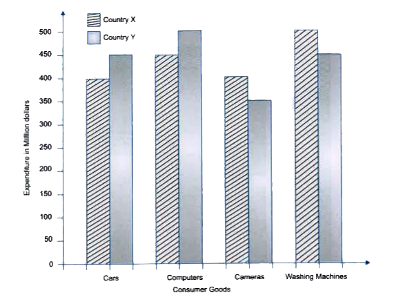
The Bar chart given above illustrates the money spent by two countries X and Y on consumer goods like cars, computers, cameras and washing machines in 2020. The expenditure is in US dollars. The general trend of both the countries is not uniform. So far, as the expenditure on cars is concerned, X, spent 400 million dollars while Y spent a slightly higher amount at 450 millions. In the expenditure on computers, the same trend is followed. Y spent 50 million dollars more on the purchase of computers. However, this trend was reversed in their expenditure on cameras. Here, it is X that spends 50 million more than Y. The expenditure on washing machines repeated the same pattern. X spent 500 million dollars while Y spent 450 millions, 50 millions less than X. One noticeable thing about the expenditure of X and Y is that on all the four consumer goods, their difference is constant, i.e. 50 million dollars. It can be safely concluded that the race of expenditure on consumer goods of two countries X and Y is rather close without any dramatic rises or falls.
Topper's Solved these Questions
- COMPOSITION - II (WRITING ANALYTICAL PARAGRAPH ON MAP/CHART/REPORT/ LINE GRAPH)BOOK - FULL MARKSCHAPTER - COMPOSITION - II (WRITING ANALYTICAL PARAGRAPH ON MAP/CHART/REPORT/ LINE GRAPH)EXERCISE - PIE CHARTS
4 Videos
- COMPOSITION - II (WRITING ANALYTICAL PARAGRAPH ON MAP/CHART/REPORT/ LINE GRAPH)BOOK - FULL MARKSCHAPTER - COMPOSITION - II (WRITING ANALYTICAL PARAGRAPH ON MAP/CHART/REPORT/ LINE GRAPH)EXERCISE - NUMERICAL TABLES
5 Videos
- COMPOSITION - II (WRITING ANALYTICAL PARAGRAPH ON MAP/CHART/REPORT/ LINE GRAPH)BOOK - FULL MARKSCHAPTER - COMPOSITION - II (WRITING ANALYTICAL PARAGRAPH ON MAP/CHART/REPORT/ LINE GRAPH)EXERCISE - ANALYTIC STUDY OF MAPS
3 Videos
- CLOZE PASSAGEBOOK - FULL MARKSCHAPTER - CLOZE PASSAGEEXERCISE - Fill in the most appropriate option in each blank from those given below to complete the following passage.
112 Videos
- COMPOSITION-IBOOK - FULL MARKSCHAPTER - COMPOSITION-IEXERCISE - IV. OFFICIAL LETTERS ON ALL SITUATIONS (SOLVED EXAMPLES)
29 Videos
Similar Questions
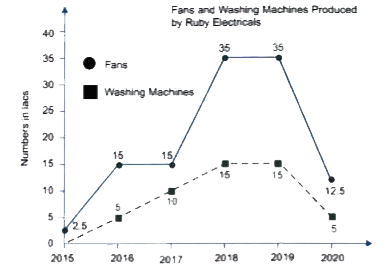
The line graph given below shows the number of Fans and Washing Machines produced by Ruby Electricals between 2015 and 2020. Summarise and write an analytic paragraph highlighting the main trends and the necessary details. Compare wherever relevant.
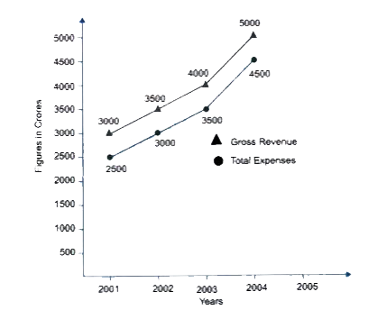
View SolutionThe Line graph given below represents Railway Finance from 2001-2002 to 2004-2005 (Northern Zone). It breaks down the gross revenue collected as well as the total expenses incurred during these years. Summarise and write an analytic paragraph highlighting the general trend and necessary details. Compare wherever relevant.
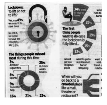
View SolutionThe survey conducted by TOI involving 11000 respondents what people think about the lockdowns and the first things they would do if they are lifted. Summarise and write an analytic paragraph highlighting the general trends and other necessary details. Compare wherever relevant.
View SolutionGiven above is the bar graph that represents the Total Sales Turnover of four major corporate giants of India. The figures shown record the total sales turnover in 3rd Quarter (September to December) and 4th Quarter (January to March). Summarise and write an analytic paragraph highlighting the general features and necessary details. Compare where you feel relevant.
View SolutionThe line graph shown below illustrates the main trends in garments of young ladies of 18 to 25 years. Summarise and write an analytic paragraph in your own words highlighting the main features and details. Compare wherever relevant.
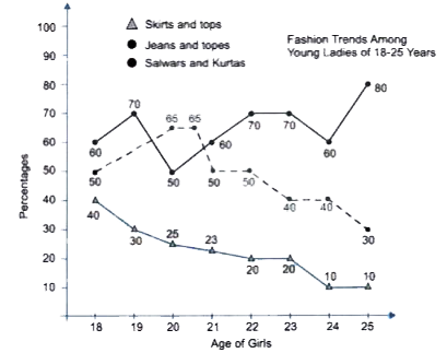
View SolutionThe bar chart given below illustrates the total Foreign Direct Investment (FDI) into India from all over the world. Summarise and write an analytic paragraph selecting the main features and giving all the necessary details. Compare where you find it relevant.
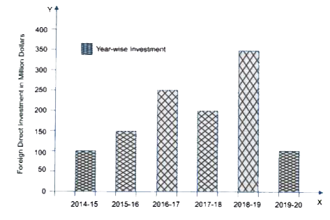
View SolutionThe given report presented by Times News Network illustrates the average salaries of India Inc. to its employees for 2020. Summarise by writing an analytic paragraph (150-200 words) highlighting the main features and details. Compare wherever relevant.
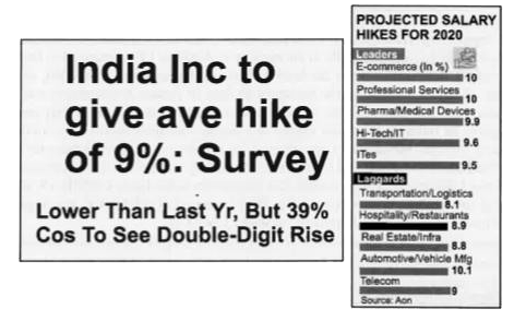
View SolutionThe pie-chart given below illustrates how internet users of aged 17+ prefer to browse the web. Summarise by writing an analytic paragraph in 150-200 words given necessary details and the general trend. Compare where relevant.
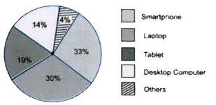
View SolutionThe Bar graph given above illustrates the popular games and sports that are played in India and Pakistan. Summarise by writing an analytic paragraph (150-200 words) selecting the main features and details. Compare wherever relevant.
View SolutionThe following pie chart shows the foreign Direct Investment in India during 2019-2020. Write an analytic paragraph showing the general trends and the necessary details. Compare the segments where relevant.
View Solution
