The bar graph given alongside shows the amount of wheat purchased by government during the year 1998-2002.
Read the bar graph and write down your observations. In which year was
(a) the wheat production maximum?
(b) the wheat production minimum?
Step by step video & image solution for The bar graph given alongside shows the amount of wheat purchased by government during the year 1998-2002. Read the bar graph and write down your observations. In which year was (a) the wheat production maximum? (b) the wheat production minimum? by Maths experts to help you in doubts & scoring excellent marks in Class 7 exams.
Updated on:21/07/2023Topper's Solved these Questions
- DATA HANDLING AND MEASURES OF CENTRAL TENDENCYBOOK - ICSECHAPTER - DATA HANDLING AND MEASURES OF CENTRAL TENDENCYEXERCISE - EXERCIES 18.1
37 Videos
- DATA HANDLING AND MEASURES OF CENTRAL TENDENCYBOOK - ICSECHAPTER - DATA HANDLING AND MEASURES OF CENTRAL TENDENCYEXERCISE - EXERCIES 18.2
16 Videos
- CONSTRUCTIONS BOOK - ICSECHAPTER - CONSTRUCTIONS EXERCISE - REVISION EXERCISE
12 Videos
- DATA HANDLING BOOK - ICSECHAPTER - DATA HANDLING EXERCISE - EXERCISE 24D
13 Videos
Similar Questions
The bar graph given alongside shows the amount of wheat purchasedby government during the year 1998-2002. Read the bar graph andwrite down your observations. In which year was(a) the wheat production maximum?(b) the wheat production minimum?
View SolutionRead the bar graph given below :
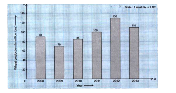
In which year there was maximum increase in production of wheat?
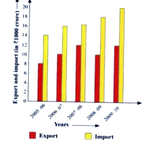
View SolutionRead the bar graph and answer the following questions.
in which year the value of the export is greater than that of the import?
View SolutionRead the bar graph given below :
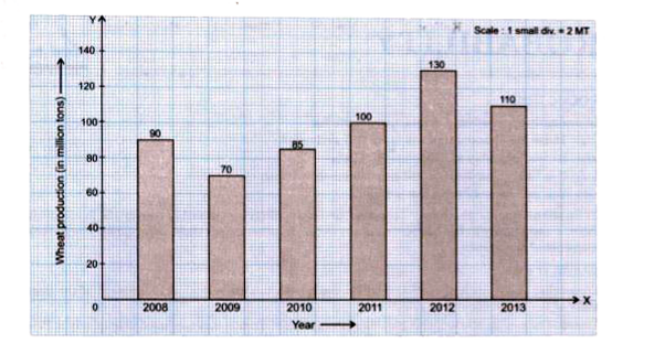
In which year the production was minimum?
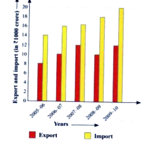
View SolutionRead the bar graph and answer the following questions.
In which year the difference of the values of export and import is maximum?
View SolutionRead the bar graph given below :
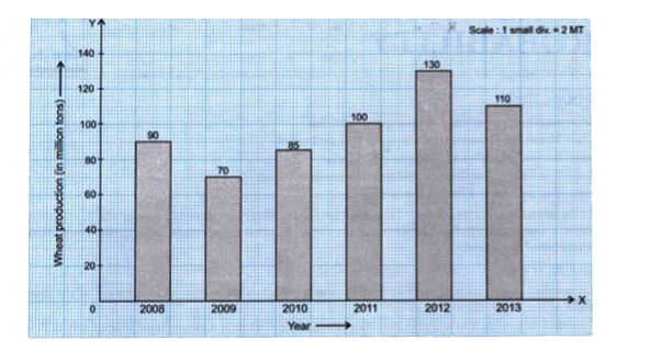
Find the percentage increase in wheat production in the year 2012.
View SolutionObserve the bar graph given below :
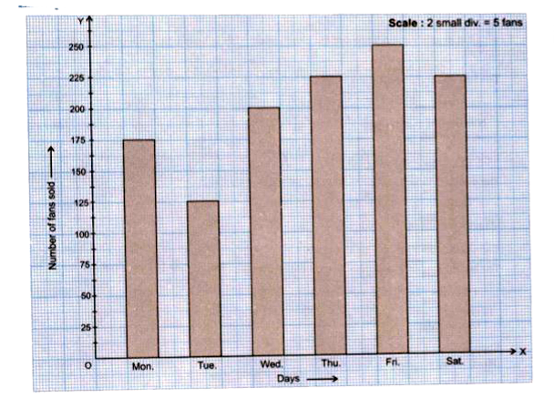
Read the bar graph carefully and answer the following questions :
On which day of the week was the sale maximum?
View SolutionRead the bar graph given below :
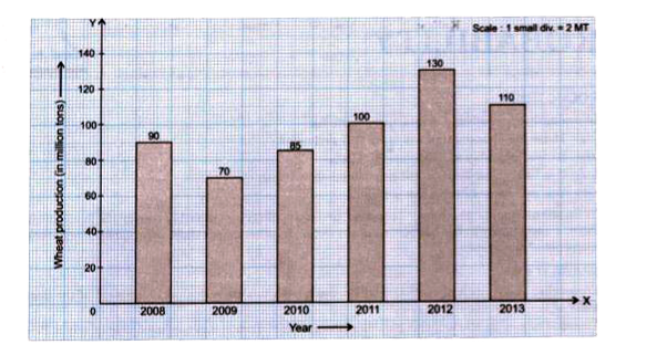
What was the wheat production in 2010?
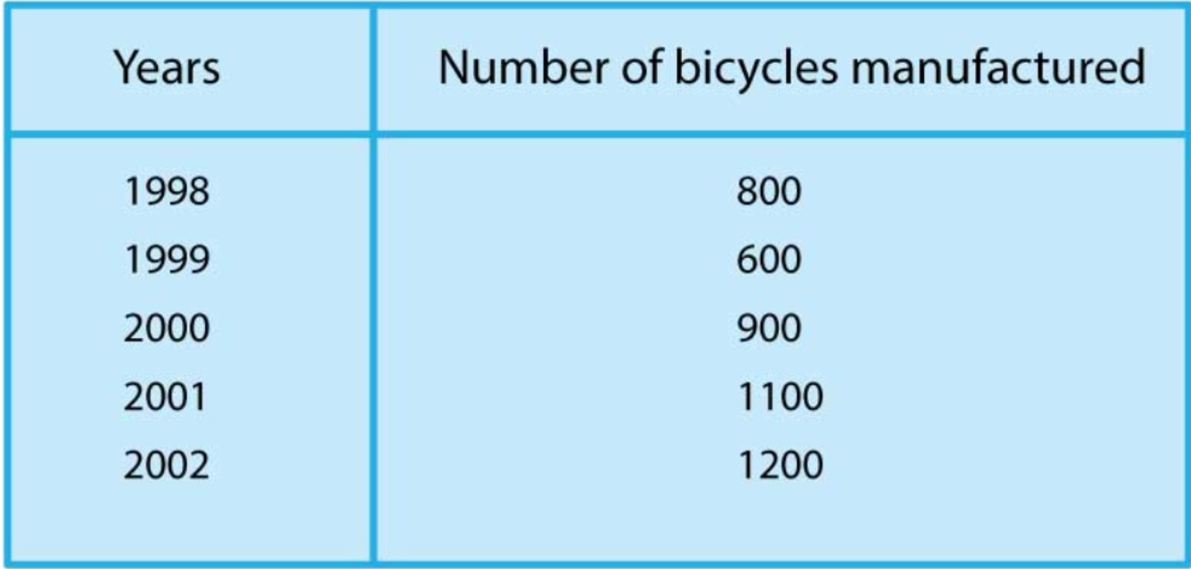
View SolutionFollowing table shows the number of bicycles manufactured in a factory during the years 1998 to 2002. Illustrate this data using a bar graph. Choose a scale of your choice
View SolutionObserve the bar graph given below :
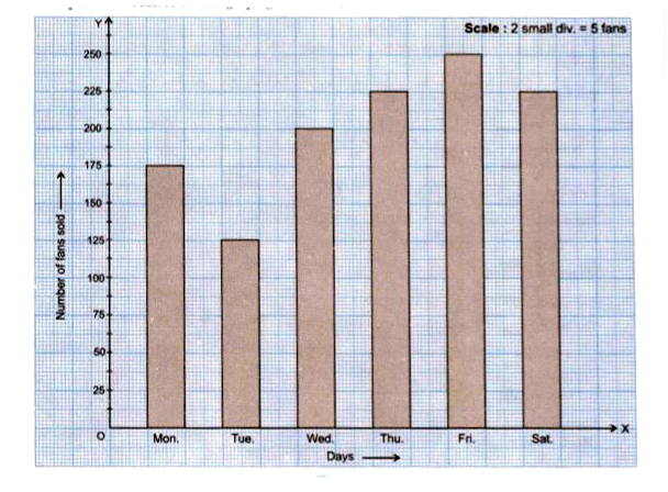
Read the bar graph carefully and answer the following questions :
What was the total sale during the week?
View Solution
