The following table shows the favourite sports of 250 students in a school :
SportsCricketFootballTennisBadmintonSwimmingNumber of students7535502565
Represent the above data by a column graph.
To represent the favorite sports of 250 students in a column graph, we will follow these steps:
1. Identify the Data:
We have the following data from the table:
- Cricket: 75 students
- Football: 35 students
- Tennis: 50 students
- Badminton: 25 students
- Swimming: 65 students
2. Draw the Axes:
- Draw a vertical line (Y-axis) and a horizontal line (X-axis).
- Label the Y-axis as "Number of Students" and the X-axis as "Sports".
3. Set the Scale:
- On the Y-axis, set a scale that can accommodate the highest number of students (which is 75 for Cricket).
- A suitable scale could be increments of 20: 0, 20, 40, 60, 80.
4. Label the Sports on the X-axis:
- Divide the X-axis into equal sections and label them with the sports:
- Cricket
- Football
- Tennis
- Badminton
- Swimming
5. Plot the Data:
- For each sport, draw a vertical bar up to the corresponding number of students:
- Cricket: Draw a bar up to 75.
- Football: Draw a bar up to 35.
- Tennis: Draw a bar up to 50.
- Badminton: Draw a bar up to 25.
- Swimming: Draw a bar up to 65.
6. Finalize the Graph:
- Make sure each bar is clearly marked and the graph is neat. You can also add colors to each bar for better visualization.
We have the following data from the table:
- Cricket: 75 students
- Football: 35 students
- Tennis: 50 students
- Badminton: 25 students
- Swimming: 65 students
- Draw a vertical line (Y-axis) and a horizontal line (X-axis).
- Label the Y-axis as "Number of Students" and the X-axis as "Sports".
- On the Y-axis, set a scale that can accommodate the highest number of students (which is 75 for Cricket).
- A suitable scale could be increments of 20: 0, 20, 40, 60, 80.
- Divide the X-axis into equal sections and label them with the sports:
- Cricket
- Football
- Tennis
- Badminton
- Swimming
- For each sport, draw a vertical bar up to the corresponding number of students:
- Cricket: Draw a bar up to 75.
- Football: Draw a bar up to 35.
- Tennis: Draw a bar up to 50.
- Badminton: Draw a bar up to 25.
- Swimming: Draw a bar up to 65.
- Make sure each bar is clearly marked and the graph is neat. You can also add colors to each bar for better visualization.
Topper's Solved these Questions
Similar Questions
The following table shows the favourite sports of 250 students of a school. Represent the data by a bar graph.
View SolutionThe following table shows the heights of 50 students of a class :
Height (in cm)152148150153149151147Number of students834712106
Find the mean and the median.
Using empirical formula, calculate its mode.
View SolutionThe following data shows the average age of men in varicus countries in a certain year: Country, India, Nepal, China, Pakistan, U.K., U.S.A Average age (in years), 55, 52, 60, 50, 70, 75 Represent the above information by a bar graph.
View SolutionThe following data shows the average age of men in varicus countries in a certain year: Country, India, Nepal, China, Pakistan, U.K., U.S.A Average age (in years), 55, 52, 60, 50, 70, 75 Represent the above information by a bar graph.
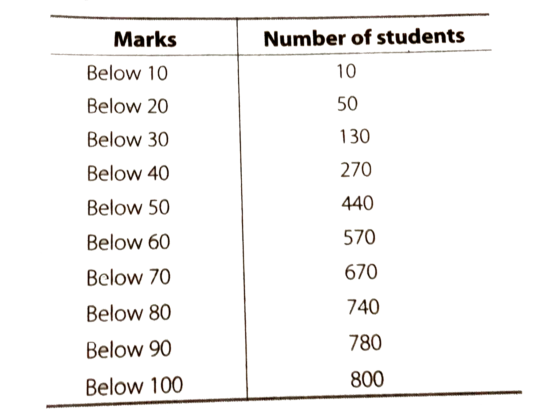
View SolutionThe following table show tha cumulative frequency distribution of marks of 800 students in an examination.

Construct a frequency distribution table for the data above.
View SolutionTwo hundred students of class VI and VII were asked to name their favourite colours so as to decide upon what should be the colour of their school house. The results are shown in the following table. Colour:, Red, Green, Blue, Yellow, Orange Number of student, 43, 19, 55, 49, 34 Represent the given data on a bar graph. Which is the most preferred colour and which is the least? How many colours are there in all?
View SolutionThe following table shows the distribution of the heights of a group of students:

Use a graph sheet to draw an Ogive for the distribution. Use the Ogive to find:
the number of students whose height is more than 168 cm
View SolutionThe following table shows the distribution of the heights of a group of students:

Use a graph sheet to draw an Ogive for the distribution. Use the Ogive to find:
the number of students whose height is less than 148 cm.
View SolutionThe following are the details or the number of students in a class of 30 students present during a week. Day, No. of Students present Monday Tuesday Wednesday Thursday Friday Saturday, 24 20 28 30 26 22 Represent the above data by a pictograph.
View SolutionThe following data shows the average age of men in various countries in a certain year: Country India Nepal China Pakistan U.K. U.S.A. Average age (in years) 55 52 60 50 70 75 Represent the above information by a bar graph.
View Solution
