Read the following graph and answer the following question.
What information does the graph represent?
To answer the question "What information does the graph represent?", we can break it down into a few steps:
1. Identify the Axes:
- The graph has two axes: the x-axis and the y-axis.
- The x-axis represents different languages in which newspapers are published.
- The y-axis represents the number of newspapers published.
2. List the Languages:
- The languages indicated on the x-axis are:
- Urdu
- Tamil
- English
- Hindi
- Marathi
- Punjabi
3. Analyze the Data:
- Each language has a corresponding number of newspapers published, which can be summarized as follows:
- Urdu: 200 newspapers
- Tamil: 100 newspapers
- English: 500 newspapers
- Hindi: 800 newspapers
- Marathi: 300 newspapers
- Punjabi: 400 newspapers
4. Interpret the Information:
- The graph provides a visual representation of the number of newspapers published in various languages.
- It shows that Hindi has the highest number of newspapers published (800), followed by English (500), Punjabi (400), Marathi (300), Urdu (200), and Tamil (100).
5. Conclusion:
- The information represented by the graph is about the quantity of newspapers published in different languages, highlighting the popularity or prevalence of newspapers in each language.
Final Answer:
The graph represents the number of newspapers published in various languages, with Hindi having the highest number of publications, followed by English, Punjabi, Marathi, Urdu, and Tamil.
- The graph has two axes: the x-axis and the y-axis.
- The x-axis represents different languages in which newspapers are published.
- The y-axis represents the number of newspapers published.
- The languages indicated on the x-axis are:
- Urdu
- Tamil
- English
- Hindi
- Marathi
- Punjabi
- Each language has a corresponding number of newspapers published, which can be summarized as follows:
- Urdu: 200 newspapers
- Tamil: 100 newspapers
- English: 500 newspapers
- Hindi: 800 newspapers
- Marathi: 300 newspapers
- Punjabi: 400 newspapers
- The graph provides a visual representation of the number of newspapers published in various languages.
- It shows that Hindi has the highest number of newspapers published (800), followed by English (500), Punjabi (400), Marathi (300), Urdu (200), and Tamil (100).
- The information represented by the graph is about the quantity of newspapers published in different languages, highlighting the popularity or prevalence of newspapers in each language.
The graph represents the number of newspapers published in various languages, with Hindi having the highest number of publications, followed by English, Punjabi, Marathi, Urdu, and Tamil.
Topper's Solved these Questions
- DATA HANDLING AND MEASURES OF CENTRAL TENDENCYBOOK - ICSECHAPTER - DATA HANDLING AND MEASURES OF CENTRAL TENDENCYEXERCISE - EXERCIES 18.1
37 Videos
- DATA HANDLING AND MEASURES OF CENTRAL TENDENCYBOOK - ICSECHAPTER - DATA HANDLING AND MEASURES OF CENTRAL TENDENCYEXERCISE - EXERCIES 18.2
16 Videos
- CONSTRUCTIONS BOOK - ICSECHAPTER - CONSTRUCTIONS EXERCISE - REVISION EXERCISE
12 Videos
- DATA HANDLING BOOK - ICSECHAPTER - DATA HANDLING EXERCISE - EXERCISE 24D
13 Videos
Similar Questions
Read the bar graph and answer the following questions.
What information is given by the bar graph?

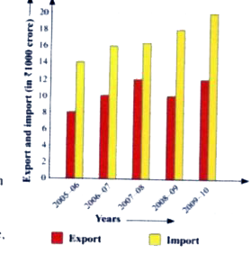
View SolutionRead the following bar graph and answer the following questions: What information is given by the bar graph? In which year the export is minimum ? In which year the import is maximum ? In which year the difference of the values of export and import is maximum?
View SolutionRead the following bar graph and answer the following questions: What information is given by the bar graph? Which state is the largest producer of rice? Which state is the largest producer of wheat? Which state has total production of rice and wheat as its maximum? Which state has the total production of wheat and rice minimum?
View SolutionLook at the bar graph given below.
Read it care fully and answer the following questions.
(i) What information does the bar graph give?
(ii) In which subject is the student very good?
(iii) In which subject is the poor? (iv) What is the average of his marks?
View SolutionRead the following bar graph (Figure) and answer the following questions: What information is given by the bar graph? What was the production of cement in the year 1980-81? What is the minimum and maximum productions of cement and corresponding years?
View SolutionThe following bar graph shows the number of vehicles passing through a road crossing in Delhi in different time intervals on a particular day. Read the bar graph and answer the following questions: What does the bar graph represent? Also, give the maximum number of vehicles. When is the hourly traffic maximum? Also give the minimum number of vehicles. When is the hourly traffic minimum? What is the total number of vehicles passing through a crossing during a particular day?
View SolutionRead the following bar graph (Figure) and answer the following questions: What is the information given by the bar graph? State each of the following whether true or false. The number of government companies in 1957 is that of 1982 is 1:9. The number of government companies have decreased over the year 1957 to 1983
View SolutionRead the following bar graph given in Figure and answer the following questions: What information is given by this bar graph? Which two states have same production in 1993-94? Name the state having same production in both the years? Which state has minimum production?
View SolutionRead the following bar graph given in Figure and answer the following questions: What information is given by this bar graph? Which two states have same production in 1993-94? Name the state having same production in both the years? Which state has minimum production?
View SolutionRead the following graph and answer the following question.
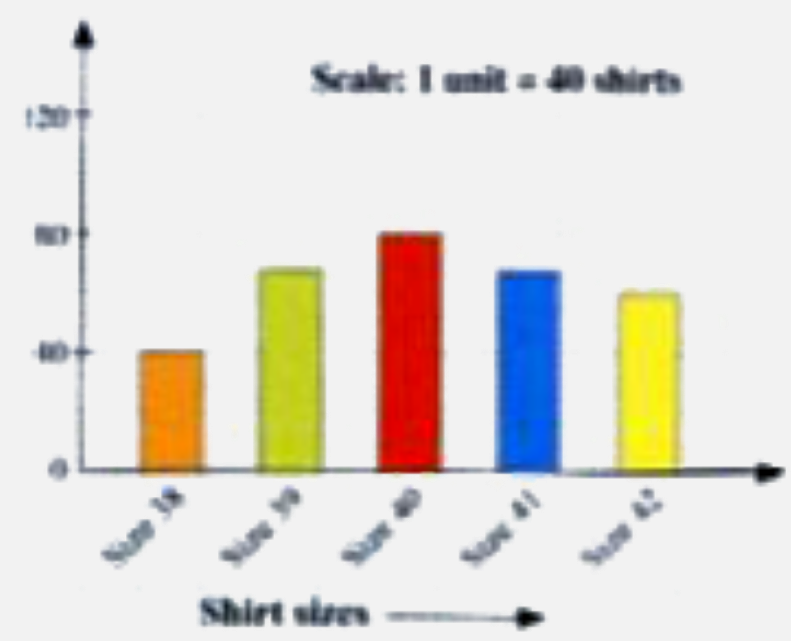
Find the ratio of the number of shirts of size 38 sold to the number of shirts of size 42 sold.

View Solution
