
This graph indicates:
Stabilizing selection
Directional selection
Disruptive selection
Industrial selection
The correct Answer is:A
Step by step video & image solution for This graph indicates: by Biology experts to help you in doubts & scoring excellent marks in Class 12 exams.
Updated on:21/07/2023Similar Questions
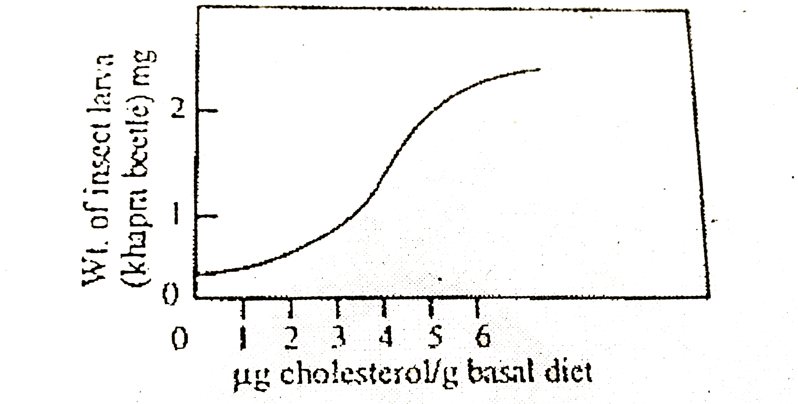
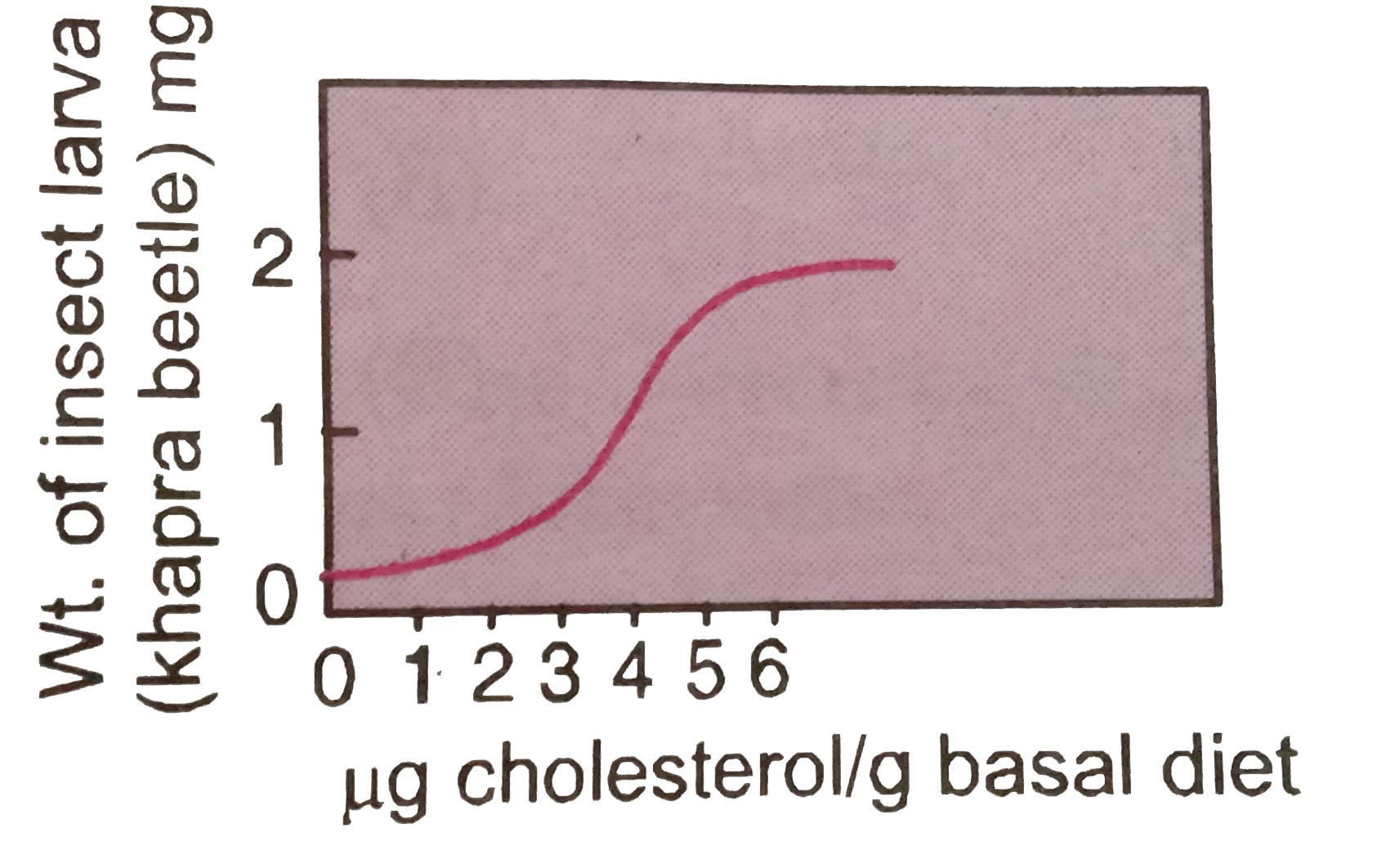
In an experiment freshly hatched larvae of an insect (Khapra beetle) were reared on a basal diet (complete diet without cholesterol) with increasing amounts of cholesterol. Results obtained are shown in the graph given in the table : The graph indicates that
View Solution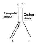
This diagram indicates
View Solution
Knowledge Check
When two plants L and M were exposed to different light intensities and temperature they showed changes in their rates of photosynthesis. Which have been represented in the following graph.
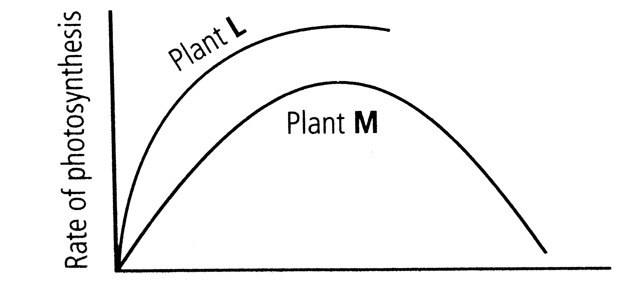
The graph indicates thatAPlant L is a C3 plant for which the light saturation point is 100% of full sunlightBPlant M is a C4 plant for which the optimum temperature s around 20∘CCPlant M is a C3 plant which is more affected at higher temperature and higher light intensity as compared to palnt LDplant L is a C4 plant and cannot function at light intensities above the saturation point.Animal cells are suspended in a culture medium that contains excess glucose. The graph below shows glucose utilisation under different growth conditions (A),(B), and (C) in the graph indicate
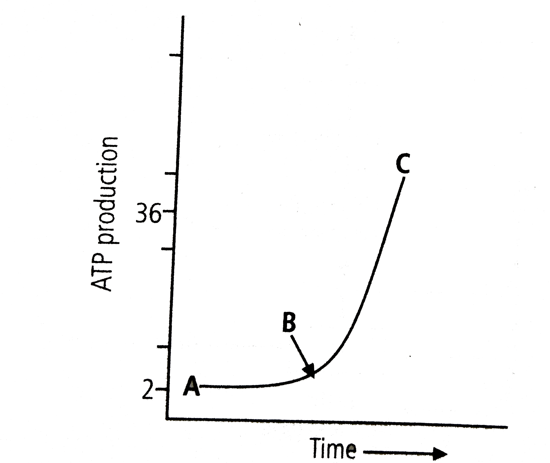 AA-Anaerobic respiration
B-Introduction of O2 to culture medium
C- Aerobic respirationBA-Aerobic respiration
B-Introduction of O2 to culture medium
C- Anaerobic respirationCA-Aerobic respiration
B-Supply of organic triphosphate
C-Aerobic respirationDA-Aerobic respiration
B-Introduction of CO to culture medium
C-Anaerobic respiration.
MNP indicates
View SolutionWhat does the graph indicate ?
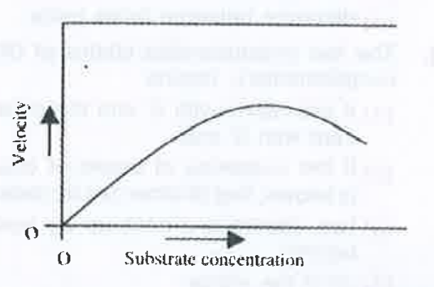
The graph given below shows the effect of substrate concentration on the rate of reaction of the enzyme green- gram-phos-phatase.
View SolutionA block rests on a rough plane whose inclination θ to the horizontal can be varied. Which of the following graphs indicates how the friction force F between the block and the plane varies as θ is increased?
View SolutionKhapra beetle larvae were raised on basal diet to which was added increasing amount of cholesterol. The result is shown in the accompanying graph. It indicates
View SolutionHigh BOD indicates
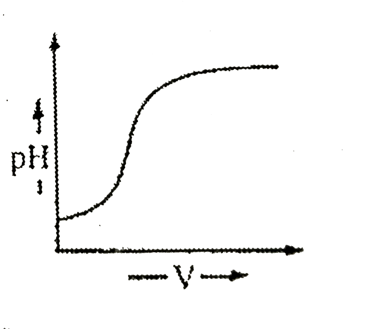
View SolutionDuring titration of acetic acid with aq. NaOH solution, the neutralisation graph has a vertical line. This line indicates
View Solution
