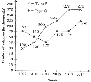
The following graph shows production (in thousands) of two types (P and Q) of vehicles by a factory over the years 2009 to 2014. Study the graph and answer the given questions.
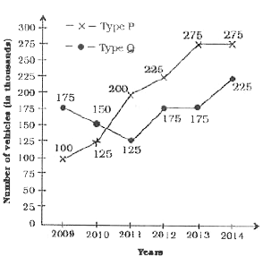
The ratio of total production of Type P vehicles to total production of type Q vehicles over the years is
5:8
8:5
41:48
48:41
Step by step video solution for The following graph shows production (in thousands) of two types (P and Q) of vehicles by a factory over the years 2009 to 2014. Study the graph and answer the given questions. The ratio of total production of Type P vehicles to total production of type Q vehicles over the years is by Maths experts to help you in doubts & scoring excellent marks in Class 14 exams.
Updated on:21/07/2023Topper's Solved these Questions
Similar Questions
The following graph shows the production of wheat flour (in 1000 tonnes) by three companies X, Y and Z over the years. Study the graph and answer the questions.
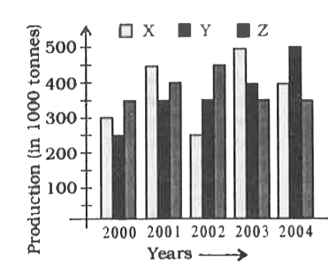
The average production for five years was maximum for which company ?
View SolutionStudy the following graph and answer the question based on the graph.
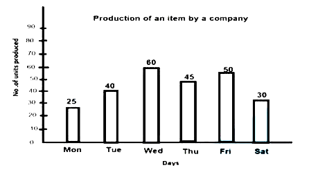
On which day the production was 1/5th of the total production?
View Solution
Knowledge Check
The following graph shows production (in thousands) of two types (P and Q) of vehicles by a factory over the years 2009 to 2014. Study the graph and answer the given questions.
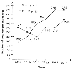
The production of type Q vehicles in 2010 was approximately what percent of Type P vehicles in 2014?A60B45.5C54.5D75The following graph shows production (in thousands) of two types (P and Q) of vehicles by a factory over the years 2009 to 2014. Study the graph and answer the given questions.
the total production of Type P vehicles in the years 2009 and 2011 is what percent of total production of Type Q vehicles in 2010 and 2014?A75B69.25C80D81.25The following graph shows production (in thousands) of two types (P and Q) of vehicles by a factory over the years 2009 to 2014. Study the graph and answer the given questions.
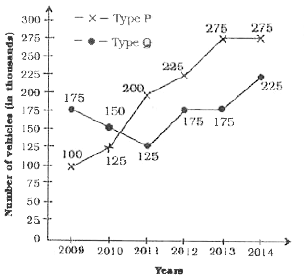
In how many of the given years, was the production of Type P vehicles of the comapny more than the average production of this type vehicles in the given years ?A3B4C2D5
The following graph shows production (in thousands) of two types (P and Q) of vehicles by a factory over the years 2009 to 2014. Study the graph and answer the given questions.
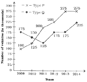
Approximate percentage decrease in production of Type Q vehicles from 2010 to 2011 is
View SolutionStudy the graph and answer the following questions-
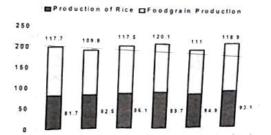
Over the given years what is average production of rice?
View SolutionThe bar diagram given below shows the productions (in the unit of thousand pieces) of three types of biscuits by a company in the five consecutive years. Study the diagram and answer the following questions.
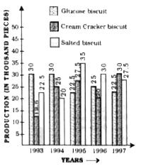
The ratio of production of glucose biscuits and total production of biscuits in that year was maximum in
View SolutionStudy the graph and answer the following questions-
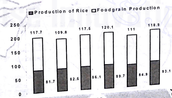
Average production of rice is what percent of the maximum recorded production of food grains over the years?
View SolutionThe table shows the production of different types of cars (in thousands).
यह तालिका अलग-अलग प्रकार के कारों का उत्पादन ( हज़ार में) दर्शाती है |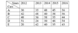 The number of years, in which the production of cars of type B is less than the average production of type D cars over the years is:
कितने वर्ष B प्रकार की कारों का उत्पादन इन वर्षों के दौरान D प्रकार की कारों के औसत उत्पादन से कम रहा है ?
View Solution
