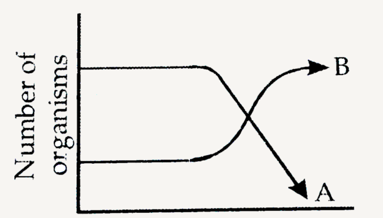
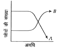
The following graph depicts changes in two populations (A and B) of herbivores in a grassy field A possible reason for these changes is that
 Solution in Kannada
Population B competed more success- fully for food than population A
Population A produced more offspring than population B
Population A consumed the members of population B
Both plant populations in this habitat decreased
Step by step video & image solution for The following graph depicts changes in two populations (A and B) of herbivores in a grassy field A possible reason for these changes is that by Biology experts to help you in doubts & scoring excellent marks in Class 12 exams.
Updated on:21/07/2023Topper's Solved these Questions
- (AIPMT(NEET Phase-1)-2016)(Conducted by CBSE on 01-05-2016)(Solved Paper)BOOK - TRUEMAN BIOLOGYCHAPTER - (AIPMT(NEET Phase-1)-2016)(Conducted by CBSE on 01-05-2016)(Solved Paper)EXERCISE - MCQs
90 Videos
- AIPMT-(2015)(Re-conducted by CBSE)(solved paperBOOK - TRUEMAN BIOLOGYCHAPTER - AIPMT-(2015)(Re-conducted by CBSE)(solved paperEXERCISE - MCQs
90 Videos
Similar Questions
In a testcross involving F1 dihybrid flies, more parental-type offsping were produces than the recombinant-type offspring. This indicates
View SolutionRoot pressure develops due to
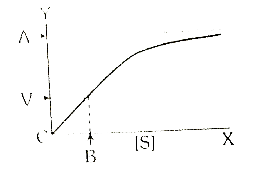
View SolutionThe given adjacent graph depicts the change in conc. of substrate on enzyme activity. Identify A, B abd C
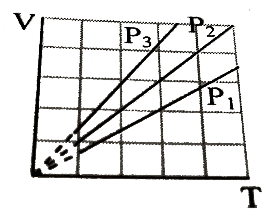
View SolutionThe state of an ideal gas was changed isobarically. The graph depicts three such isobaric lines. Which of the following is true about the pressures of the gas ?
View SolutionThe following graphs (A and B) depicts changes in DNA Content during cell cycle. Identify the cell divison from A and B :-
View SolutionThe graph below shows the changes in two populations of herbivores in a grassy field. A possible reason for these changes is that

View Solutionदिए गए ग्राफ (a) व (b) में आवृत्ति के सापेक्ष परिपथ की धारा के विरोध के मान में परिवर्तन को दर्शाया गया है। प्रत्येक परिपथ के अवयव को पहचानिए।
View Solutionकिन कारणों से आबादी सदा परिवर्तनशील होती है?
View Solution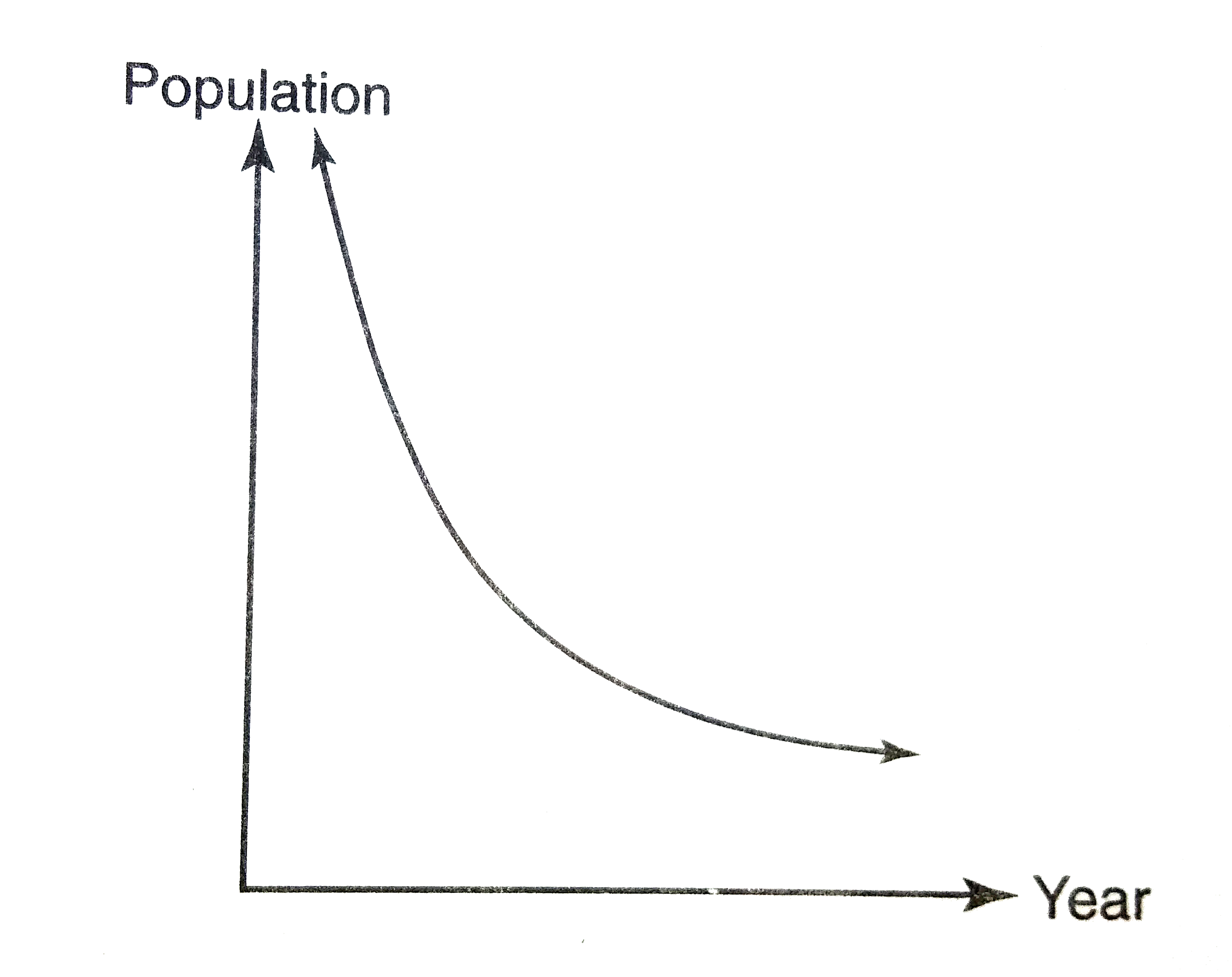
The graph above shows how the size of a country's population has changed over time. Which of the following are the most likely underlying reasons for the type of graph shown?
View SolutionWhich of the following graphs best depicts the changes in one cycle of PCR ?
View Solutionदिया गया ग्राफ विस्थापन के साथ वेग में परिवर्तन को दर्शाते है। निचे दिए गए ग्राफ में से कोण सही रूप में विस्थापन के साथ त्वरण में परिवर्तन को दर्शाते है?
(##ARH_HIN_41Y_JEE_PHY_SP_C02_E01_010_Q01.png" width="80%">
View Solutionनिम्नलिखित ग्राफ एक घासीय मैदान में शाकाहारियों समष्टियों ( और ) में होने वाले परिवर्तनों को बताता है परिवर्तनों का सम्भावी कारण है कि
View SolutionWhat is population change? What is the Spatial Rate of population change?
View SolutionExplain the three components of population change in the world. Analyse the impacts of population change.
View Solutionकिसी कण के वेग-विस्थापन ग्राफ को नीचे दिए गए चित्र में दर्शाया गया है।
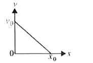
निम्न में से कौन-सा ग्राफ विस्थापन के साथ त्वरण के परिवर्तन को सही रूप में दर्शाता है?
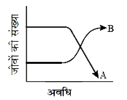
View Solutionनिम्नलिखत ग्राफ एक घासीय मैदान में शाकाहारयों की दो | समष्टियों (A और B) में होने वाले परिवर्तनों को बताता हैं। इन परिवर्तनों का संभावी कारण है कि :
View Solution
