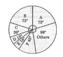
The following Pie Chart shows the export of different foodgrains from India in 2010. Study the chart and answer the questions :
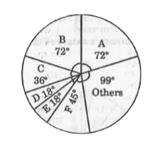
The three crops which combine to contribute to exactly 50% of the total export of foodgrains are
a. A, F and others
b. B, C and F
c. A, B and C
d. C, F and others
The correct Answer is:C
Step by step video & image solution for The following Pie Chart shows the export of different foodgrains from India in 2010. Study the chart and answer the questions : The three crops which combine to contribute to exactly 50% of the total export of foodgrains are by Maths experts to help you in doubts & scoring excellent marks in Class 14 exams.
Updated on:21/07/2023Topper's Solved these Questions
- STATISTICS AND DATA INTERPRETATIONBOOK - KIRAN PUBLICATIONCHAPTER - STATISTICS AND DATA INTERPRETATIONEXERCISE - TYPE-VIII
8 Videos
- STATISTICS AND DATA INTERPRETATIONBOOK - KIRAN PUBLICATIONCHAPTER - STATISTICS AND DATA INTERPRETATIONEXERCISE - TYPE-VI
86 Videos
- SIMPLIFICATIONBOOK - KIRAN PUBLICATIONCHAPTER - SIMPLIFICATIONEXERCISE - TEST YOURSELF
25 Videos
- TIME AND DISTANCEBOOK - KIRAN PUBLICATIONCHAPTER - TIME AND DISTANCEEXERCISE - Type -XI
74 Videos
Similar Questions
The following Pie Chart shows the export of different foodgrains from India in 2010. Study the chart and answer the questions :

Of the total export of foodgrains, the percentage of crop B exported is
View SolutionThe following Pie Chart shows the export of different foodgrains from India in 2010. Study the chart and answer the questions :

If a total of 1.5 million quintals of crop F was exported, the amount of total foodgrains exported (in million) quintals was
View Solution
Knowledge Check
The following bar chart represents the birth rate (per thousand)of six different countries. Study the bar chart and answer the question given below.
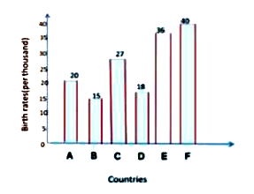
The birth rate of which Country is exactly 50% more than that of Country D ?ACountry FBCountry CCCountry ADCountry EThe given bar graph shows the biscuit exports of India over a period of five years. Study the graph and answer the questions that follows
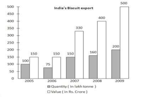
In which two year was the value per tonne equal?A2006 and 2007B2008 and 2009C2007 and 2008D2005 and 2006The following questions arfe based on the pie-chart given below. Study the pie-chart and answer the questions.
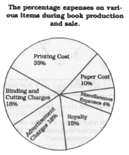
The central angle for the sector on ''Paper-Cost'' isA221(2)∘B16∘C54.8∘D36∘
The following Pie Chart shows the export of different foodgrains from India in 2010. Study the chart and answer the questions :
If the revenue from 1 quintal of crop A is thrice that from 1 quintal of crop C, then the ratio of the total revenues of A and C is
View SolutionThe following Pie Chart shows the export of different foodgrains from India in 2010. Study the chart and answer the questions :
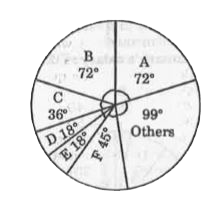
If a total of 1.5 million quintals of crop F was exported, then the total quantity of D and E that was exported (in million quintals) was
View SolutionStudy the graph and answer the question
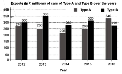
In which year, were the exports of type B cars exactly 20% more than the exports of type A cars in 2014?
View SolutionStudy the graph and answer the question.
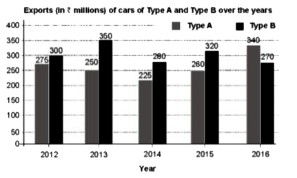
In which year, were the exports of type B cars exactly 20% more than the exports of type A cars in 2014?
View SolutionThe following pie-chart shows the study-time of different subjects of a student in a day. Study the pie-chart and answer the following questions
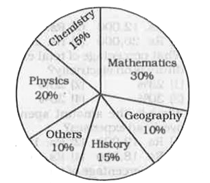
If the student studied chemistry for 3 hours, then he / she studied geography for
View Solution
