The bar diagram below shows the production of potatoes (in quintals) from the year 2000 to 2006. Study the diagram and answer the questions
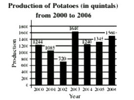
Considering the average production during this period, the number of years in which the production is above average is
4
1
2
3
The correct Answer is:D
Step by step video & image solution for The bar diagram below shows the production of potatoes (in quintals) from the year 2000 to 2006. Study the diagram and answer the questions Considering the average production during this period, the number of years in which the production is above average is by Maths experts to help you in doubts & scoring excellent marks in Class 14 exams.
Updated on:21/07/2023Topper's Solved these Questions
Similar Questions
The bar diagram below shows the production of patatoes (in quintal) from the year 2000 ta 2006. Study the diagram and answer the questions.

Considering the average production during this period. the number of years in which the production is above average is—
View SolutionThe bar diagram below shows the production of potatoes (in quintals) form the year 2001 to 2006. Study the diagram and answer the following questions.
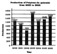
Considering the average production during this period, the number of years in which the production is above average is :
View Solution
Knowledge Check
Study the bar diagram and answer the questions.
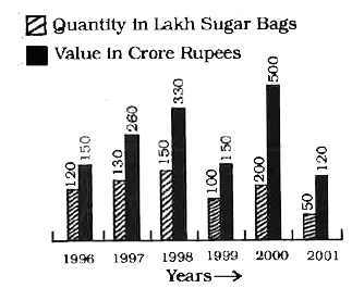
Value per bag was minimum in the yearA2001B1999C1996D1997The bar graph shows the production of the different departments of a company. Study the diagram and answer the following questions.
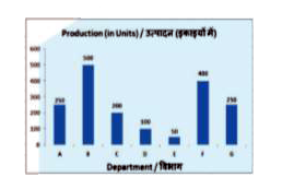
Which department has the second lowest production in units ?ACBDCEDAStudy the graph and answer the following questions-
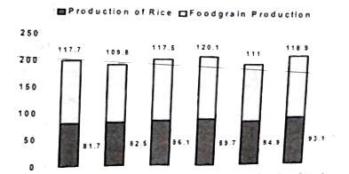
Over the given years what is average production of rice?A86.33 million tonnesB88.66 million tonnesC85 million tonnesD88 million tonnes
The bar diagram below shows the production of potatoes (in quintals) from the year 2000 to 2006. Study the diagram and answer the questions
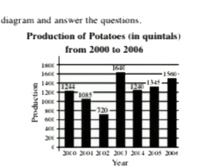
During this period, the highest rate of decline in production is -
View SolutionThe bar diagram below shows the production of potatoes (in quintals) form the year 2001 to 2006. Study the diagram and answer the following questions.
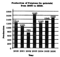
During this period, the highest rate of decline in production is :
View SolutionThe following table shows the productions of food-grains (in million tons) in a state for the period 1999-2000 to 2003-2004. Read the table and answer the questions
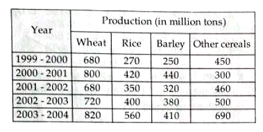
The difference of average production of rice and the average production of barley over the years is
View SolutionThe line graph shows the production of steel of a certain country. Study the diagram and answer the following questions.
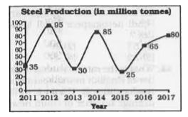
In which year was the steel production lesser than that of the previous year?
View SolutionStudy the following graph to answer the given questions -----
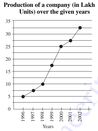
What is the approximate average production (in lakhs) for the given years ?
View Solution
