Study the pie charts given below carefully and answer each of the questions based on it. The following pie charts represent the percentage of the workers of five types for two years.
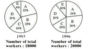
a = Award staff b = Managers of first class c=Managers of second class d = Managers of third class e = Executives
What was the difference in the numbers of award staff during 1995 and 1996 ?
840
400
360
Data inadequate
The correct Answer is:A
Step by step video & image solution for Study the pie charts given below carefully and answer each of the questions based on it. The following pie charts represent the percentage of the workers of five types for two years. a = Award staff b = Managers of first class c=Managers of second class d = Managers of third class e = Executives What was the difference in the numbers of award staff during 1995 and 1996 ? by Maths experts to help you in doubts & scoring excellent marks in Class 14 exams.
Updated on:21/07/2023Topper's Solved these Questions
Similar Questions
Study the pie charts given below carefully and answer each of the questions based on it. The following pie charts represent the percentage of the workers of five types for two years.
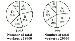
a = Award staff b = Managers of first class c=Managers of second class d = Managers of third class e = Executives
In 1996 if 500 managers of second class are on duty in the company then in 1996 how many managers of third class was on duty in the company?
View SolutionStudy the pie charts given below carefully and answer each of the questions based on it. The following pie charts represent the percentage of the workers of five types for two years.
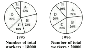
a = Award staff b = Managers of first class c=Managers of second class d = Managers of third class e = Executives
In 1996 if 1000 executives joined the company then in the year 1995 how many executives left the company ?
View Solution
Knowledge Check
Study the Pie chart carefully and answer the questions.
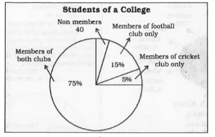
Percentage of students who are not members of any club is :A5%B8%C10%D6%Study the following pie chart carefully and answer the questions. The pie chart represents the percentage of people involved in various occupations.(total number of people-20000).
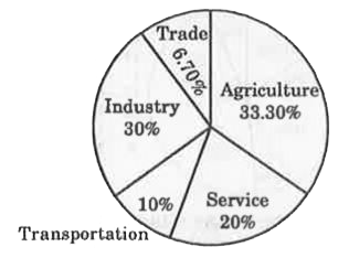
How many more people are involved in service than in trade?A3360B2660C1660D660Study the following pie chart carefully and answer the questions. The pie chart represents the percentage of people involved in various occupations.
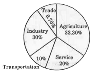
The ratio of the people involved in service to that in industry isA1:2B2:3C3:4D3:2
Study the pie chart given below and answer the question that follow
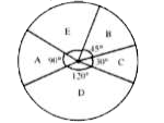
Which heads is allocated maximum funds?
View SolutionStudy the following line chart carefully and answer the questions given below it. The following line chart represents the number of employees recrulted in different years in a company.
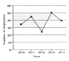
If the number of employees before 2010 was 640, what was percentage increase in 2010?
View SolutionStudy the following pie chart carefully and answer the questions. The pie chart represents the percentage of people involved in various occupations.
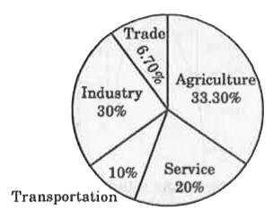
The angle made by the people involved in service in the given pie-chart is
View SolutionStudy the following line chart carefully and answer the questions given below it. The following line chart represents the number of employees recrulted in different years in a company.
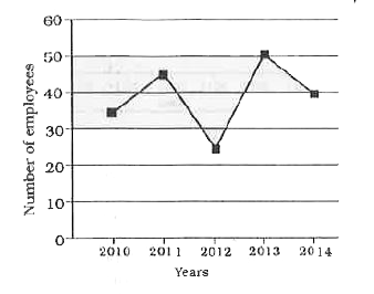
What was the ratio of number of employees recruited in the year 2011 to that in the year 2013?
View SolutionStudy the given pie chart carefully and answer the question based on it.
Below pie chart given the expenditure (in percentage) on various items and savings of a family during a month.
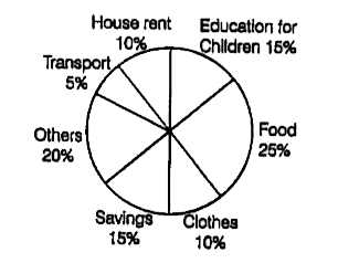
Expenditure on which item is equal to the total savings of the family?
View Solution
