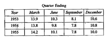
The following table gives the quarterly death rate per thousand of a city for the years 1953 to 1955

Plot these figures on a graph. Calculate the suitable moving averages and plot them on the same graph
The correct Answer is:4 quarterly moving averange is most suitable 4 quarterly moving averages are 10.71, 10.64, 10.54, 10.53, 10.6, 10.7, 10.7, 10.63
Topper's Solved these Questions
Similar Questions
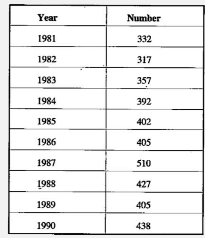
The following table gives the number of failures of commercial industries in a country during the year 1975 to 1990

Draw a graph illustrating these figures. Calculate the 4 yearly moving averages and plot them on the same graph.
View SolutionThe following table gives the numbers of failures of commercial industries in a country during the years 2000 to 2015.

Draw a graph illustrating these figure.
Calculate the 4 yearly moving averages and plot them on the same graph.
View SolutionUsing the following data. Find out the trend using Quarterly moving average and plot them on graph

View SolutionDaily absence from a school during three weeks is recorded as follows :

Draw a graph , illustrating the above data . Calculate the 5 - days moving average and plot them on the same graph .
View SolutionThe table below gives details of the electricity generated in kilowatt hours in each quarter for the years 2012 to 2014

Calculate the four-quarterly moving averages and display these and the original figures on the same graph .
View SolutionThe following table gives the average temperatures, during the year 2006 and 2007. Draw a double bar graph for the given data.

View SolutionCalculate the 5 yearly moving averages of the number of students in a College from the following data and plot them on a graph paper :

View SolutionIn a typhoid epidemic ,the number of cases diagnosed were as follows. Calculate 6 days moving average and display them and the original figures on the same graph.

View SolutionPlot the following points on the same graph paper:
(0,4)
View SolutionPlot the following points on the same graph paper:
(3,6)
View Solution
