The following table gives the numbers of failures of commercial industries in a country during the years 2000 to 2015.

Draw a graph illustrating these figure.
Calculate the 4 yearly moving averages and plot them on the same graph.
The correct Answer is:Trend values are : 26.88,24.75,21,16.25,12.13,10.88,11.25,12.13,12.00,10.5,7.88
Step by step video & image solution for The following table gives the numbers of failures of commercial industries in a country during the years 2000 to 2015. Draw a graph illustrating these figure. Calculate the 4 yearly moving averages and plot them on the same graph. by Maths experts to help you in doubts & scoring excellent marks in Class 11 exams.
Updated on:21/07/2023Topper's Solved these Questions
Similar Questions
The following table gives the number of failures of commercial industries in a country during the year 1975 to 1990

Draw a graph illustrating these figures. Calculate the 4 yearly moving averages and plot them on the same graph.
View SolutionDaily absence from a school during three weeks is recorded as follows :

Draw a graph , illustrating the above data . Calculate the 5 - days moving average and plot them on the same graph .
View SolutionUsing the following data. Find out the trend using Quarterly moving average and plot them on graph

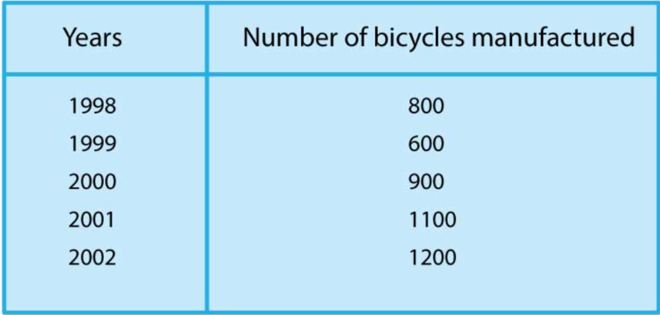
View SolutionFollowing table shows the number of bicycles manufactured in a factory during the years 1998 to 2002. Illustrate this data using a bar graph. Choose a scale of your choice

View SolutionThe table below gives details of the electricity generated in kilowatt hours in each quarter for the years 2012 to 2014

Calculate the four-quarterly moving averages and display these and the original figures on the same graph .
View SolutionIn a typhoid epidemic ,the number of cases diagnosed were as follows. Calculate 6 days moving average and display them and the original figures on the same graph.

View SolutionThe table given below shows the number of visitors ( in hundreds ) to a certain exhibition over a period of two weeks :

Calculate the 7 day moving averages and illustrate these and the original information on the same table.
View SolutionThe averge number , in thousands , of working hours lost in strikes each year of the period 2000-2009 was as under

. Calculate the three - yearly moving averages .
View SolutionThe following table gives the number of branches and number of plants in the garden of a school. No. of branches (x) : 2 3 4 5 6 No. of plants (f) : 49 43 57 38 13 Calculate the average number of branches per plant.
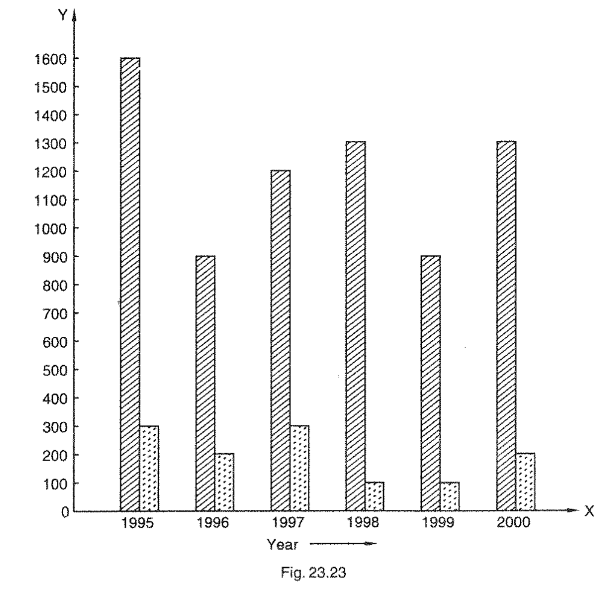
View SolutionThe following bar graph shows the number of persons killed in industrial accidents in a country for some years (Figure) Read the bar graph and choose the correct alternative in each of the following: The year which shows the maximum percentage increase in the number of persons killed in coal mines over the preceding year is:

View Solution
