Following data gives total marks (out of 600) obtained by six children ofa particular class. Represent the data on a bar graph.
To represent the given data on a bar graph, follow these steps:
Step 1: Gather the Data
The total marks obtained by the six children are as follows:
- Bali: 500
- Dipti: 300
- Fayaz: 360
- Githiga: 400
- Hariz: 540
- Student Count: 450
Step 2: Set Up the Axes
- Draw two perpendicular lines to create the axes of the graph.
- The vertical axis (Y-axis) will represent the total marks.
- The horizontal axis (X-axis) will represent the names of the students.
Step 3: Label the Axes
- Label the Y-axis with marks, starting from 0 up to 600.
- Since the maximum marks are 600, you can mark intervals of 100 for easier reading. For example, mark 0, 100, 200, 300, 400, 500, and 600 on the Y-axis.
- Label the X-axis with the names of the students: Bali, Dipti, Fayaz, Githiga, Hariz, and Student Count.
Step 4: Draw the Bars
- For each student, draw a bar that corresponds to their total marks:
- Bali: Draw a bar up to 500 on the Y-axis.
- Dipti: Draw a bar up to 300 on the Y-axis.
- Fayaz: Draw a bar up to 360 on the Y-axis.
- Githiga: Draw a bar up to 400 on the Y-axis.
- Hariz: Draw a bar up to 540 on the Y-axis.
- Student Count: Draw a bar up to 450 on the Y-axis.
Step 5: Color the Bars (Optional)
- You can color each bar differently for better visualization or use the same color for all bars.
Step 6: Title the Graph
- Give your bar graph a title, such as "Total Marks Obtained by Students".
Step 7: Review the Graph
- Check to ensure all bars are correctly drawn and labeled.
The total marks obtained by the six children are as follows:
- Bali: 500
- Dipti: 300
- Fayaz: 360
- Githiga: 400
- Hariz: 540
- Student Count: 450
- Draw two perpendicular lines to create the axes of the graph.
- The vertical axis (Y-axis) will represent the total marks.
- The horizontal axis (X-axis) will represent the names of the students.
- Label the Y-axis with marks, starting from 0 up to 600.
- Since the maximum marks are 600, you can mark intervals of 100 for easier reading. For example, mark 0, 100, 200, 300, 400, 500, and 600 on the Y-axis.
- Label the X-axis with the names of the students: Bali, Dipti, Fayaz, Githiga, Hariz, and Student Count.
- For each student, draw a bar that corresponds to their total marks:
- Bali: Draw a bar up to 500 on the Y-axis.
- Dipti: Draw a bar up to 300 on the Y-axis.
- Fayaz: Draw a bar up to 360 on the Y-axis.
- Githiga: Draw a bar up to 400 on the Y-axis.
- Hariz: Draw a bar up to 540 on the Y-axis.
- Student Count: Draw a bar up to 450 on the Y-axis.
- You can color each bar differently for better visualization or use the same color for all bars.
- Give your bar graph a title, such as "Total Marks Obtained by Students".
- Check to ensure all bars are correctly drawn and labeled.
Topper's Solved these Questions
- BOOK - NCERTCHAPTER - DATA HANDLINGEXERCISE - EXERCISE 3.44videos
DATA HANDLING
- BOOK - NCERTCHAPTER - DATA HANDLINGEXERCISE - EXERCISE 3.18videos
DATA HANDLING
- BOOK - NCERTCHAPTER - CONGRUENCE OF TRIANGLESEXERCISE - SOLVED EXAMPLES9videos
CONGRUENCE OF TRIANGLES
- BOOK - NCERTCHAPTER - EXPONENTS AND POWERSEXERCISE - EXERCISE 13.34videos
EXPONENTS AND POWERS
Similar Questions
Following data gives total marks (out of 600) obtained by six children ofa particular class. Represent the data on a bar graph.
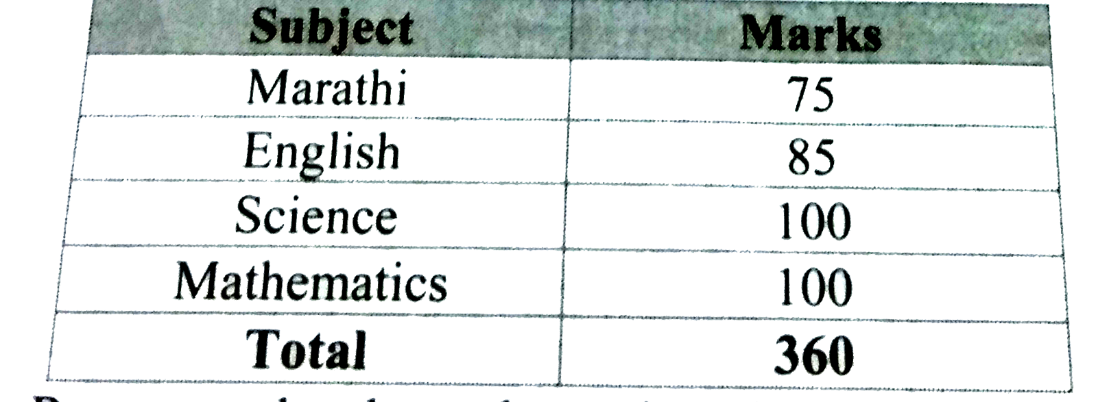
View SolutionThe marks obtained by a student in an examination are given below: The total marks out of 100 obtained in various subjects are as follows:

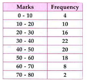
Represent the data using pie diagram.View SolutionFollowing data gives the marks obtained by 100 students in a test. Find the median
 View Solution
The marks obtained by a student in an examination are given below :

Represent the data using a pie diagram.View SolutionThe marks obtained by a student in an examination are given below:

Represent the data using pie diagram.View SolutionThe following table gives the data on the marks obtained by two students 'A and B' in five subjects :

Represent the data by a multiple bar diagram.View SolutionThe following table gives the marks scored by 100 students in an entrance examination

Represent this data in the form of a histogram.View SolutionThe marks obtained by a student in an examination are given below:

Represent the data using pie diagramView SolutionThe following data shows the number of students born in different months of a particular year of class VI. Make the bar graph based on the given information.
 View Solution
The following table shows the interest of students of a school in different games :

Represent the data by using a simple bar diagram.View Solution

