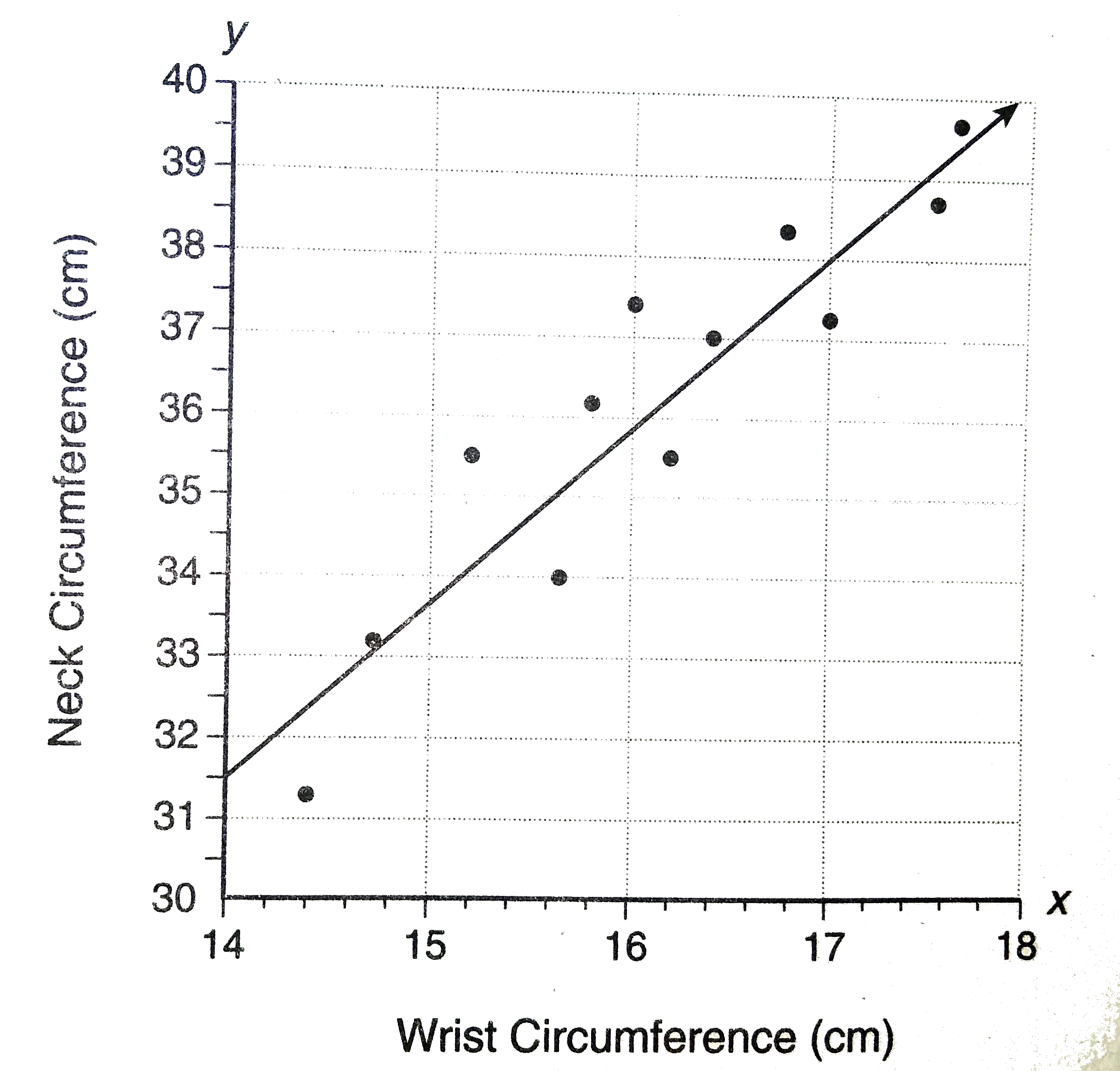
The scatterplot above summarizes the wrist and neck circumference measurements, in centimeters, for 12 people. The line of best fit is drawn. What proportion of the measurements satisfy the inequality |o−p|≤d, where o is the observed measurement, p is corresponding measurement predicted by the line of best fit, and d is 0.5cm?
16
14
13
12
The correct Answer is:C
Step by step video, text & image solution for The scatterplot above summarizes the wrist and neck circumference measurements, in centimeters, for 12 people. The line of best fit is drawn. What proportion of the measurements satisfy the inequality |o-p|led, where o is the observed measurement, p is corresponding measurement predicted by the line of best fit, and d is 0.5cm? by Maths experts to help you in doubts & scoring excellent marks in Class 12 exams.
Topper's Solved these Questions
Similar Questions
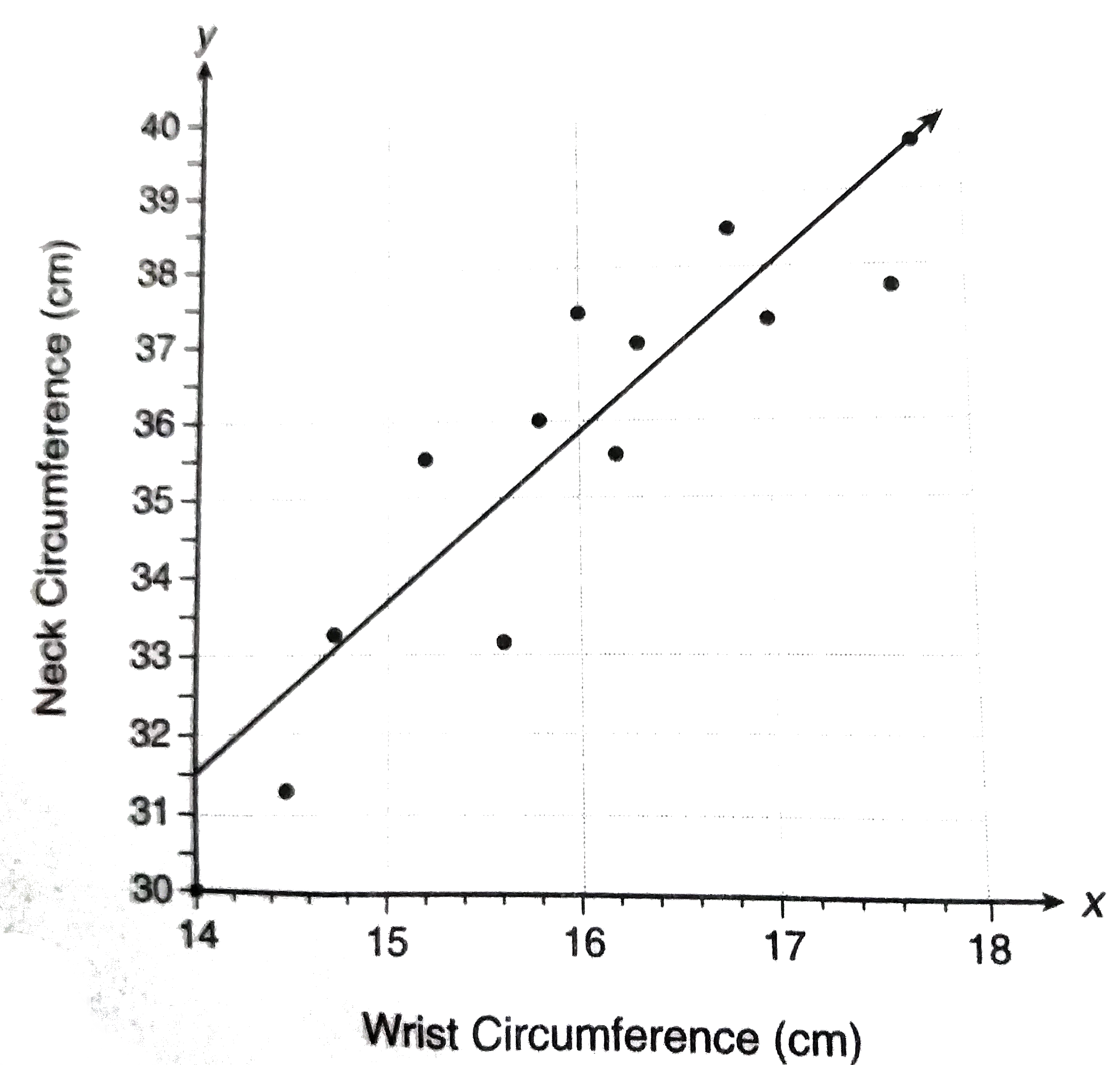
Question 1-3 refer to the above scatterplot, which shows wrist and neck cicumference measurements, in centimeters, for 12 people. The line of beat fit is drawn.
Q. How many of the 12 people have an actual neck circumference that differs by more than 1 centimeters from the neck circumference predicted by the line of best fit?View Solution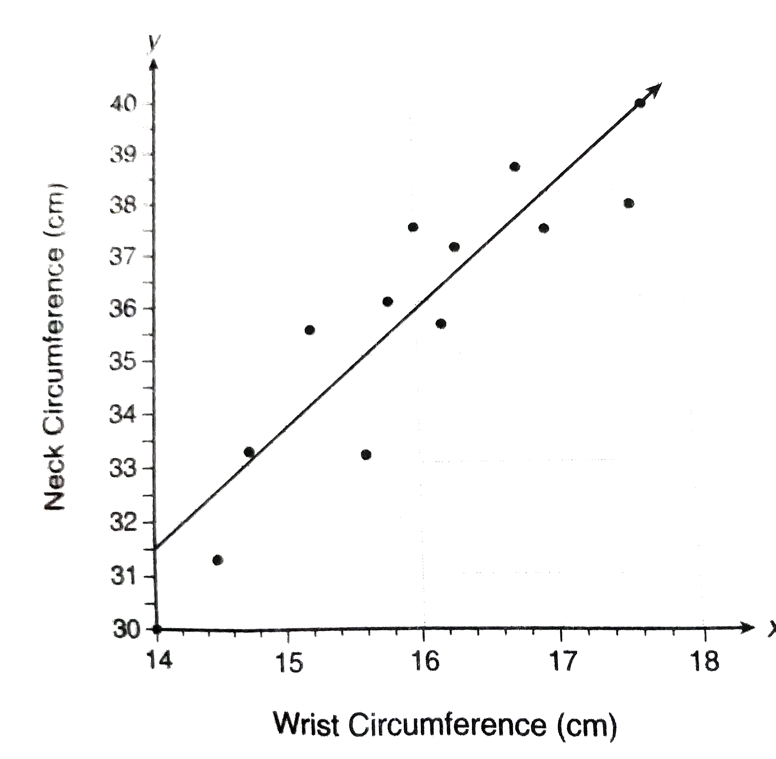
Question 1-3 refer to the above scatterplot, which shows wrist and neck cicumference measurements, in centimeters, for 12 people. The line of beat fit is drawn.
Q.What is the predicted neck circumference centimeters, for someone whose wrist circumference is 17.0cm?View Solution
Knowledge Check
- Question 1 - Select One
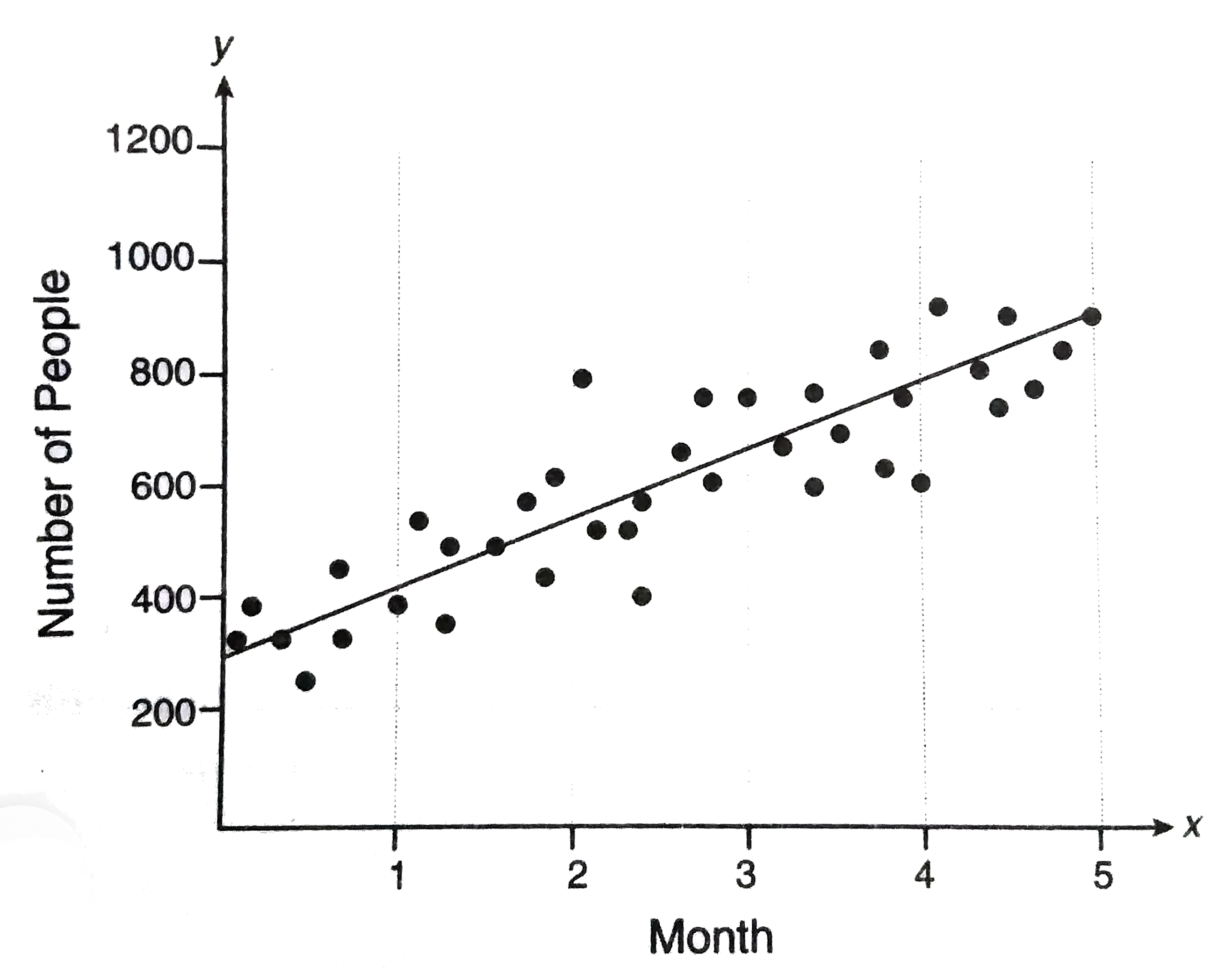
Question 5-7 refer to the scatterplot above.
A new fitness class was started at several fitness clubs owned by the same company. The scatterplot shows the total number of people attending the class during the first five months in which the class was offered. The line of best fit is drawn.
Q. At the beginning of which month did the actual number of people attending the class differ by the greatest amount from the number predicted by the line of best fit?AMonth 2BMonth 3CMonth 4DMonth 5 - Question 2 - Select One
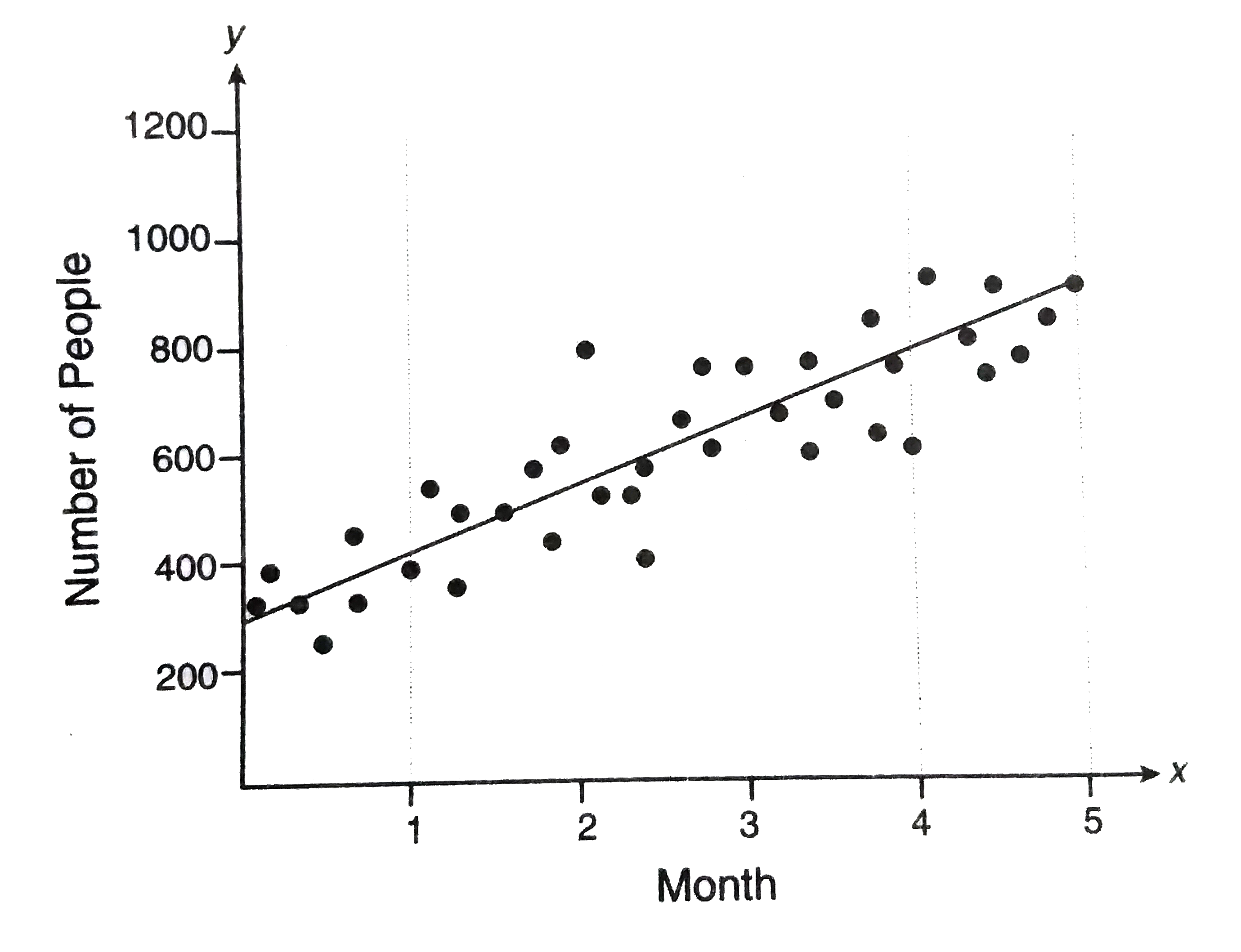
A new fitness class was started at several fitness clubs owned by the same company. The scatterplot shows the total number of people attending the class during the first five months in which the class was offered. The line of best fit is drawn.
Q. For month 4, the predicted number of people attending the class was approximately what percent greater than the actual number of people attending the class?A15%B20%C30%D36%
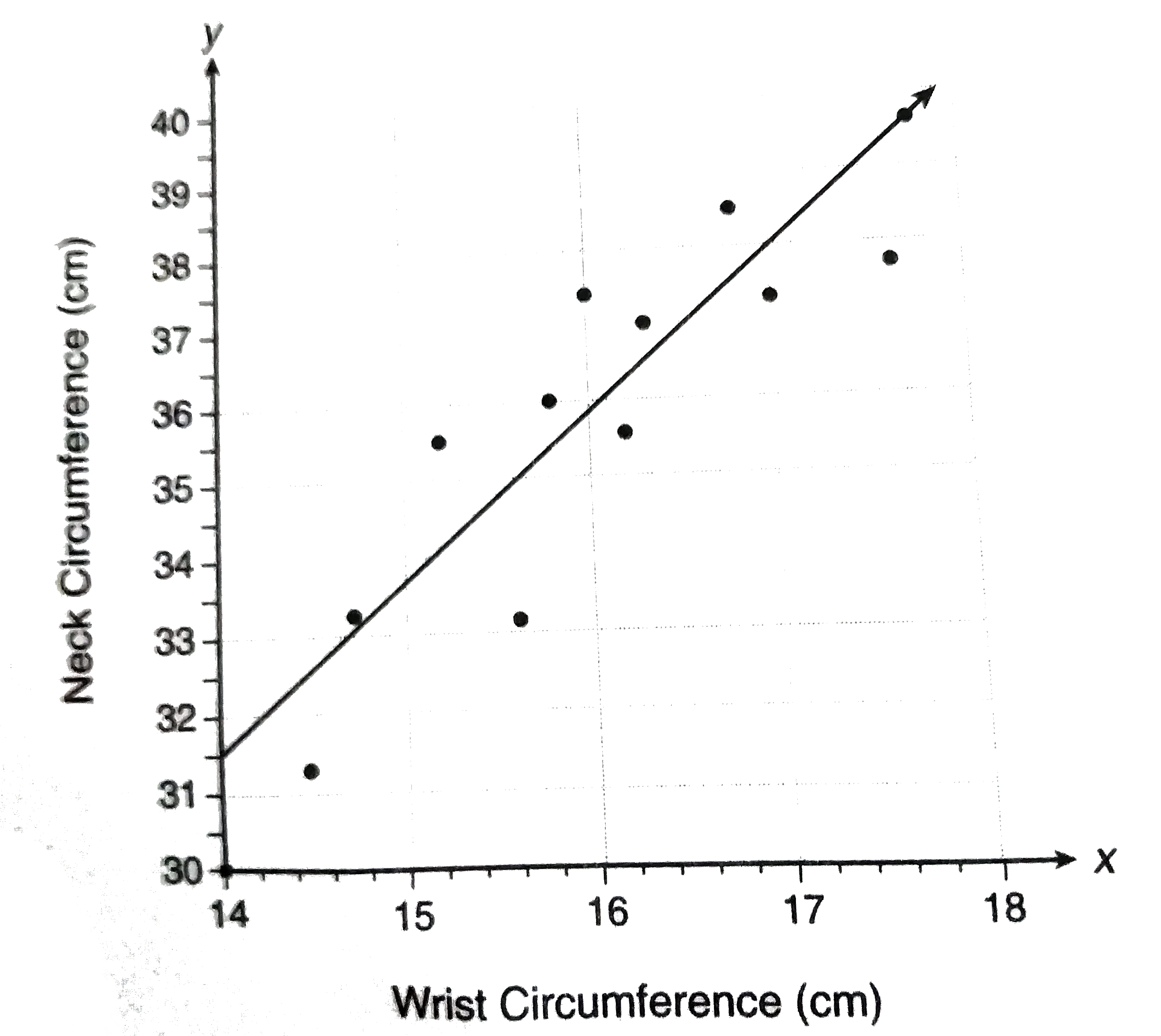
Question 1-3 refer to the above scatterplot, which shows wrist and neck cicumference measurements, in centimeters, for 12 people. The line of beat fit is drawn.
Q. What is the average increase in neck circumference per centimeter increase in wrist circumference, correct to the nearest tenth?View Solution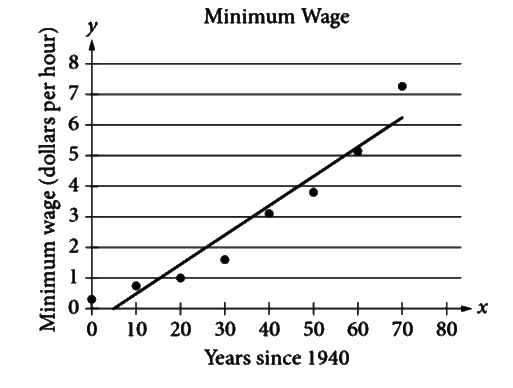
The scatterplot above shows the federal-mandated minimum wage every 10 years between 1940 and 2010. A line of best fit is shown, and its equation is y = 0.096x − 0.488.What does the line of best fit predict about the increase in the minimum wage over the 70-year period?View SolutionSea ice extent is a measurement of the area of ocean with at least 15% sea ice. The graph below shows data for the extent of Artic sea ice between 2000 and 2012 as reported by the National Snow and Ice Data Center. The line of best fit is also shown. The equations of the line is A(t)=−0.187t+380.5, where A(t) represents the area of measurement sea ice in the Artic Ocean in the year t.
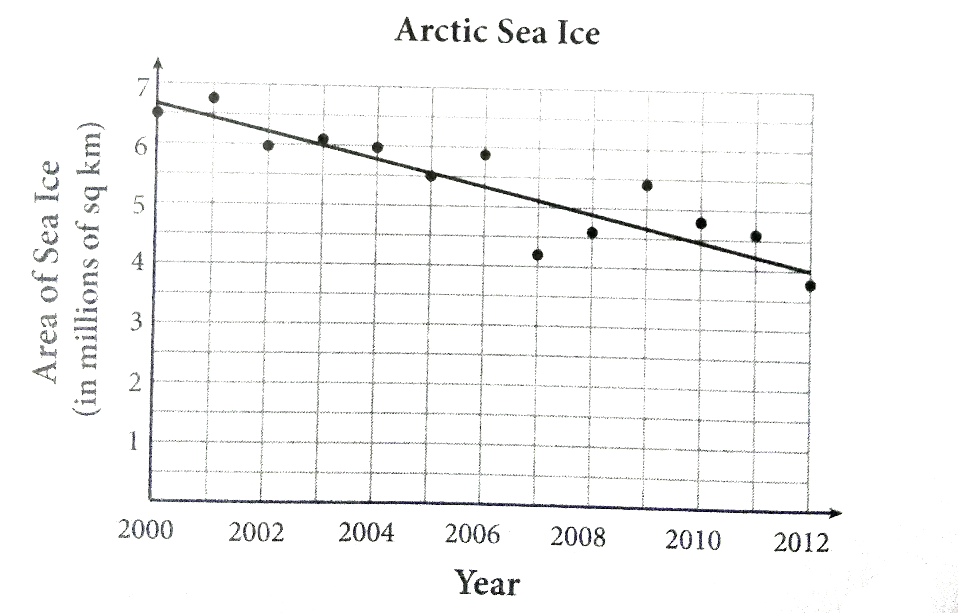
Q. Based on the equation of the line of best fit, which of the following statements accurately of measurable Arctic sea ice during the given times period?View SolutionSea ice extent is a measurement of the area of ocean with at least 15% sea ice. The graph below shows data for the extent of Artic sea ice between 2000 and 2012 as reported by the National Snow and Ice Data Center. The line of best fit is also shown. The equations of the line is A(t)=−0.187t+380.5, where A(t) represents the area of measurement sea ice in the Artic Ocean in the year t.

Q. Assuming the trand of the data continues, what is the predicted area, in millions of square kilometers, of measurable Arctic sea ice in the year 2020?View SolutionSea ice extent is a measurement of the area of ocean with at least 15% sea ice. The graph below shows data for the extent of Artic sea ice between 2000 and 2012 as reported by the National Snow and Ice Data Center. The line of best fit is also shown. The equations of the line is A(t)=−0.187t+380.5, where A(t) represents the area of measurement sea ice in the Artic Ocean in the year t.
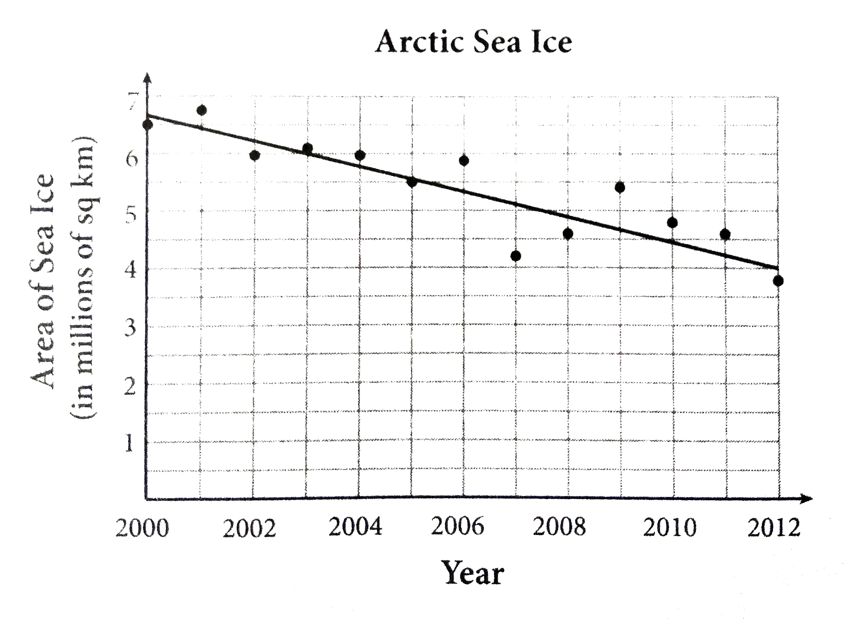
Q. Assuming the trend of the data continues in what year will the measurable sea ice in the Arctic Ocean cease to exist?View SolutionFind the distance of the line 4x -y = 0 from the point P(4, 1) measured along the line making an angle of 135o with the positive xaxis.
View Solution
