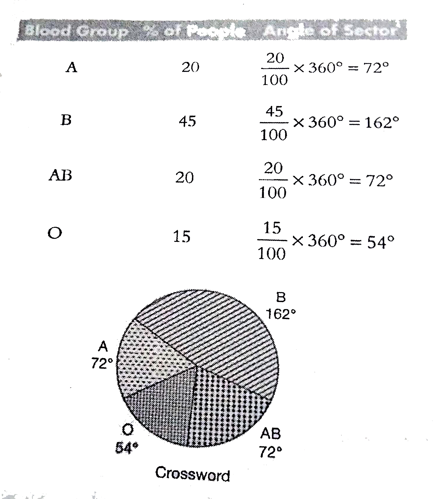
The following table shows the percentage of people having different blood groups. Draw a pie chart to represent the given data.
Blood groupABCDPercentage of people20452015
Steps :
(1) Draw a circle with suitable radius.
(2) Mark the angles at the centre of the circle and draw the sectors.
Blood Group% of PeopleAngle of SectorA2020100×360∘=72∘B4545100×360∘=162∘AB2020100×360∘=72∘O1515100×360∘=54∘

Topper's Solved these Questions
Similar Questions
The following table shows the percentage of buyers of four different brands of bathing soaps.

Represent the above data by a pie chart.View SolutionThe following table shows the household expenditure of family on different items. Draw a pie chart to represent the given data.
ItemRentFoodClotingEducationOthersExpenditure25%30%10%15%20%View Solution
Knowledge Check
- Question 1 - Select One
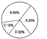
Given, figure showing the percentage of people staying in given four Villages A, B, C and D. Then, that is called
 Apie chartBline chartCbar chartDNone of these
 - Question 2 - Select One
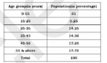
The following table showing the percentage of the total population of a state in different age groups. Out of every 50,000 people, find the approximate number of persons below the age of 35?
निम्नलिखित तालिका एक राज्य में अलग-अलग आयु वर्ग की कुल आबादी के प्रतिशत को दर्शाती है |
प्रत्येक 50,000 लोगों में से, 35 वर्ष से कम उम्र के लोगों की संख्या (लगभग) ज्ञात करें |A25230B26260C26250D25250 - Question 3 - Select One
People of AB blood group have :
Aantigen 'B' and antibodies 'a'Bantibodies 'a' and 'b',but no antigensCantigens 'A' and 'B' but no antibodiesDantigens 'A' and 'B' and their antibodies
The following table shows various sports played by students in a school. Draw a pie chart to represent the given data.
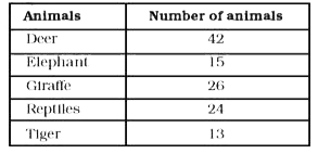
SportsChessCricketCarromsFootballNumber of students35704263View SolutionThe following data represents the different number of animals in a zoo. Prepare a pie chart for the given data.
 View Solution
The tatste of 500 people of a sociaety for different type of food was recorded as follows :

Draw a pie diagram to represent the above data.View SolutionThe following table shows the expenditure of a family whose monthly income is * 22,000.Represent the above data by a pie chart.
View SolutionThe following data represents the approximate percentage of water in various oceans. Prepare a pie chart for the given data.
Pacific40%Atlantic30%Indian20%Others10%View Solution
